7 blog format types and 15 tips to improve website engagement
Afoma Umesi
GatherContent Contributor, Writer
Let’s say you have a great blog strategy, value-packed content, and a killer distribution strategy—but you’re still struggling to keep website visitors engaged. Your blog formatting might be the culprit. After you’ve done all the work to get prospects to visit your website, don’t put them off with poor content structure or overall website user experience.
In this article, we’ll review common blog post formats and dive into how you can make each one more appealing to your target audience and improve your chances of conversion.
Understanding blog format types
A crucial part of strategizing for a blog post is deciding what format in which to present the information. Knowing this allows you to create a brief to guide the writer in the right direction. Depending on the topic in question, you can use several common blog formats.
How-to
The how-to article shows readers a practical, step-by-step guide to achieving a desired goal. This format is great for content that teaches your audience. You can enrich it by including illustrative images, screenshots, or even video tutorials.
For example, this Wix article shows readers how to start a blog in 10 steps. It includes images and screenshots that help users grasp the main ideas.
Listicle
The listicle is a popular blog format for sharing information in a highly readable and quickly digestible format—a list. Listicles itemize tips, examples, or other information within the scope of a topic with some explanation to help readers understand. Bring listicles to life with actionable examples and a TL;DR section.
This GatherContent article on content marketing examples includes relevant examples and a takeaway section for visitors who only have time for a quick skim.
What-is or Explainer
The “what-is” post focuses on explaining a complex topic over multiple subheadings, ensuring readers end the article with a solid grasp of the subject matter. Larger explainer pieces are also known as “ultimate guides” as they tend to be pillar posts on a sprawling topic.
Hubspot’s guide to freelancing is a comprehensive explainer article.
Adding a table of contents or navigation bar is helpful for these voluminous posts. A good example is this Hubspot guide to freelancing. It’s broken into several large sections tackling important questions about becoming a freelancer and building a sustainable business.
The roundup
This blog format has become popular as it can be a great way to score backlinks for your website.
A roundup includes a curated list of data, products, individuals, or brands which share a common thread. The key to a good roundup is providing accurate, verifiable information—especially if you’re sharing a round up of industry statistics.
This PrimoStats roundup of the best content marketing researchers (featuring us!) is a strong example of a roundup blog post.
Feature articles
Feature articles focus on providing commentary about a specific person, subject, or industry trend. They’re typically based on industry research and tend to be journalistic-style articles—as opposed to being SEO-centric.
This Banknotes article about marketing to a Gen Z audience is a good example. It focuses on highlighting a pressing marketing industry issue and presenting solutions.
Comparison article
Using comparison articles, weigh two product, method, or brand options against each other. This blog post format aims to highlight the pros, cons, and hows of two things and showcase how they differ.
Adding extra elements like a comparison table can make comparison articles more valuable. This Wynter article showcases a table to highlight the differences between qualitative and quantitative research.
Thought leadership
Like feature articles, thought leadership pieces are more journalistic than reliant on SEO. However, unlike most feature articles, they require the author to take a stand on an industry topic instead of simply reporting the state of affairs. Influential thought leadership content positions a brand as an authority or expert in the field.
This Hotjar article on challenging exploitation in business takes a strong stand and is a great example of thought leadership content.
Good to Know: Whatever blog format you choose, you can create it on GatherContent’s content hub. Build blog post templates from scratch and reuse them as needed. To get started, document which content types you’re already using the most with our free Content Model Template.
15 blog formatting tips to keep readers engaged
To choose the right blog post format, a good rule of thumb is to see how top-ranking competitor articles have approached the subject matter.
Also, consider the best way to fulfill search intent and provide the most useful information to your readers. For example, if you’re creating an article on search engine optimization, you may need to decide between an “explainer/what-is” style article and a “how-to” format.
It will boil down to your angle. If the goal is to provide a comprehensive guide, then the explainer piece would be appropriate, but if you’d rather focus on showing how to do SEO, a step-by-step how-to article might be better.
"To choose the right blog post format, a good rule of thumb is to see how top-ranking competitor articles have approached the subject matter. Also, consider the best way to fulfill search intent and provide the most useful information to your readers.”
Whatever blog format you choose, you’ll want to ensure that you’re keeping readers interested by making readability-friendly formatting choices. Here are some tips to keep in mind.
Use the right headings
In addition to your article’s headline, your blog headings guide readers through your content, helping them understand the flow and structure of the piece.
To ensure that the headings work as needed, use the right heading hierarchical structure, beginning with H2, then H3 and H4. Naturally, nest subheadings under major headings.
Most people who land on blog content do so because they’re already interested in the topic. They likely searched for it and got referred by a search engine. They’re ready for answers. So keep your introduction to the point and start sharing the solutions to their query as soon as possible. We recommend 2-3 paragraphs of text.
Short introductions mean readers can find answers more quickly.
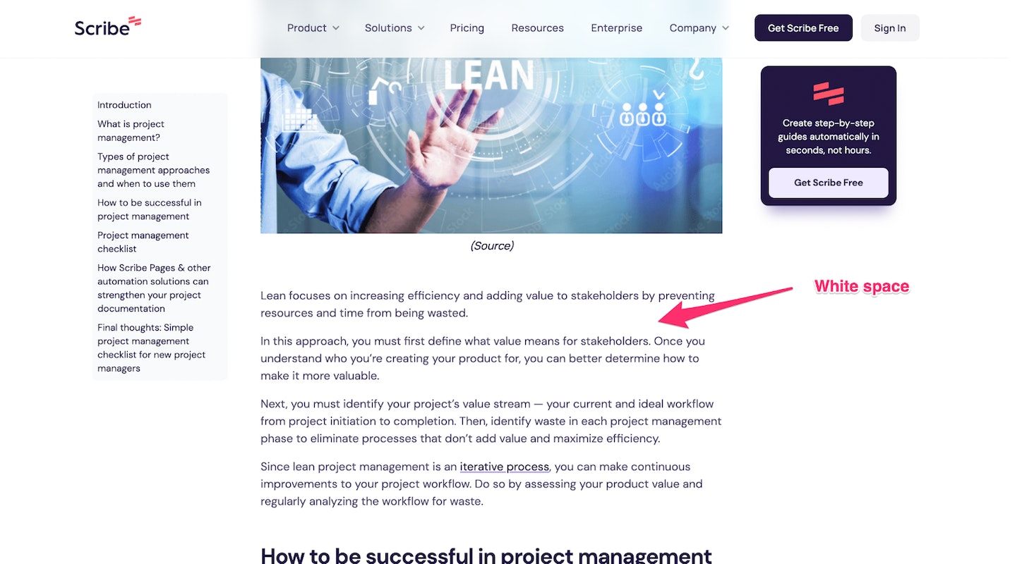
Make room for white space
White space is the space without text on a page. It’s important because it helps readers focus on words and understand written text faster by reducing the surrounding distractions. Notice how the Scribehow article below uses white space to enhance readability.
White space makes content easier to read.
Write short paragraphs
One way to introduce white space and make content more appealing to readers is by writing short paragraphs. While long paragraphs (more than five lines long) can resemble intimidating walls of text, shorter paragraphs are more accessible and allow for plenty of white space, which encourages reading.
Writing short paragraphs doesn’t mean all your sentences need to be short. In contrast, you should vary the length of your sentences. This ensures that your sentences have an enjoyable rhythm that makes them pleasurable to read.
We can all learn from Gary Provost’s famous example:
Varied sentences make for enjoyable reading. (source)
Add internal links
Internal links are not only helpful for SEO but also for an improved user experience. It’s convenient when readers can check out a linked article you’ve referenced in your content to read more on the subject. Include internal links to help readers navigate your site efficiently.
When adding internal links, use relevant anchor text, link to only related content, and be careful not to overdo it. Too many internal links will distract your audience from the content they should be focused on.
Relevant internal links add value to your content.
Use bullets correctly
Bullet points improve your content’s readability by increasing the presence of white space and changing the rhythm of your sentences. Numbered lists help present steps in chronological order. However, you only gain these benefits if you use bulleted lists correctly. This includes:
Keeping bullet points brief. As with all paragraphs, chunks of text over five lines long can be intimidating to read.
Formatting lists similarly. If you’re using shorter one-line phrases, use that format throughout the list. The same applies if your list begins with bold text.
Space out your list. Adding space between your bullets (especially if they’re longer than one line) makes them easier to read and provides those white space benefits.
Consistency is key with bullet lists.
This Hotjar article uses similarly formatted bullet points; all roughly the same length, with sufficient white space to encourage readability.
Watch your font
Many companies build their website font into their brand style guide and focus more on the aesthetics of the font than its functionality.
Choose a font (and font size) that readers can see and read without strain or needing to magnify their screens. This removes friction from the user experience and makes your website more accessible.
Your font should be easy on the eyes.
The Woola website uses a lovely font that is clear and easy to read.
Consider adding a table of contents
A table of contents makes it easier for website visitors to navigate blog posts—especially if they’re very long. Users can jump across sections and read the content they’re most interested in.
Choose an unobtrusive table of contents for more straightforward navigation.
Your table of contents doesn’t need to be obtrusive. Semrush uses one aligned to the left so users can read the article without distraction and still have the table of contents accessible.
Add relevant images
Visuals make your content pop, so it’s tempting to throw a bunch of stock photos or random illustrations into your article for that visual element. However, visuals are most effective when they’re relevant to the content and add an extra layer of depth or understanding to the reader—not just for the sake of it.
Your images should carry the message of your content.
This Shopify blog post uses a fun illustration related to the subject matter and includes screenshots that help drive a point home for readers.
Choose the right image size
Poor image sizing can break your website’s formatting. Whether it’s a featured image or infographics, large images take too long to render and may not even render well on all devices (especially mobile devices). This makes it a pain to read your content. In contrast, overly small images are tough to see and benefit from.
Choose an image size that fits your site theme’s recommended dimensions. Most devices can only successfully render a maximum blog image width of 1200px. It’s also best to keep the image weight under 1 MB.
GatherContent’s components make it easier to add images to your content template.
Good to Know: GatherContent makes it easier to add images to your content using content templates. Templates consist of several components, and GatherContent allows you to add an asset component for uploading digital assets. You can even leave instructions about recommended image sizes and formats.
Caption images to provide context
To make your images even more valuable for readers, add a caption. This provides necessary context, particularly for screenshots or examples where you must highlight specific image features.
Keep your captions short and to the point to avoid a cluttered appearance—which discourages reading.
Captions provide necessary context for images.
The captions in this GatherContent article help readers compare two versions of a logo and increase the value they receive from the content.
Embed videos when possible
Like pictures, videos are a practical way to teach website visitors and help readers visualize a concept. Embedded videos are most helpful for step-by-step tutorials in how-to articles and can elevate your content above competitors’.
Wistia sets a great example by adding auto-play videos to its content. Here’s what it looks like in this article.
Use the sidebar with care
The blog sidebar can be useful for sharing pertinent information but can also distract some users. The decision to have one depends on your site’s needs.
Ensure that the information you share in your sidebar is essential. One way to do this is by using heatmap tools and seeing how often users interact with your site’s sidebar and whether it improves overall conversion rates.
Ensure that a sidebar will meet your site’s needs.
While the GatherContent blog has no sidebars, the Ahrefs blog has both a left and right sidebar. Both sidebars are minimal and barely interfere with the reading experience.
Don’t forget your CTA
Your blog is likely the center of your content marketing efforts. As such, you should never forget your final call to action (CTA).
Each blog post should call your readers to take a specific action. It could be joining your blog newsletter, getting a free trial, social shares, or following on social media. Calls-to-action ensure that readers don’t just leave after engaging (and potentially loving) your blog content.
Never sign off without a call to action.
Float invites readers to join its mailing list at the end of this blog post.
Add ease to your content creation workflow with GatherContent
Choosing the right blog format and supportive elements can be the cherry on top of your content marketing efforts. A well-formatted blog makes your content more appealing and encourages prospects to visit again and again, increasing your chances of converting.
GatherContent is the #1 content marketing platform designed to help you plan and create blog content in the best format. It is collaboration-friendly and easy on the eyes. GatherContent also integrates with your favorite content management systems like WordPress, making it easier to publish content.
In this article, we’ll review common blog post formats and dive into how you can make each one more appealing to your target audience and improve your chances of conversion.
Understanding blog format types
A crucial part of strategizing for a blog post is deciding what format in which to present the information. Knowing this allows you to create a brief to guide the writer in the right direction. Depending on the topic in question, you can use several common blog formats.
How-to
The how-to article shows readers a practical, step-by-step guide to achieving a desired goal. This format is great for content that teaches your audience. You can enrich it by including illustrative images, screenshots, or even video tutorials.
For example, this Wix article shows readers how to start a blog in 10 steps. It includes images and screenshots that help users grasp the main ideas.
Listicle
The listicle is a popular blog format for sharing information in a highly readable and quickly digestible format—a list. Listicles itemize tips, examples, or other information within the scope of a topic with some explanation to help readers understand. Bring listicles to life with actionable examples and a TL;DR section.
This GatherContent article on content marketing examples includes relevant examples and a takeaway section for visitors who only have time for a quick skim.
What-is or Explainer
The “what-is” post focuses on explaining a complex topic over multiple subheadings, ensuring readers end the article with a solid grasp of the subject matter. Larger explainer pieces are also known as “ultimate guides” as they tend to be pillar posts on a sprawling topic.
Hubspot’s guide to freelancing is a comprehensive explainer article.
Adding a table of contents or navigation bar is helpful for these voluminous posts. A good example is this Hubspot guide to freelancing. It’s broken into several large sections tackling important questions about becoming a freelancer and building a sustainable business.
The roundup
This blog format has become popular as it can be a great way to score backlinks for your website.
A roundup includes a curated list of data, products, individuals, or brands which share a common thread. The key to a good roundup is providing accurate, verifiable information—especially if you’re sharing a round up of industry statistics.
This PrimoStats roundup of the best content marketing researchers (featuring us!) is a strong example of a roundup blog post.
Feature articles
Feature articles focus on providing commentary about a specific person, subject, or industry trend. They’re typically based on industry research and tend to be journalistic-style articles—as opposed to being SEO-centric.
This Banknotes article about marketing to a Gen Z audience is a good example. It focuses on highlighting a pressing marketing industry issue and presenting solutions.
Comparison article
Using comparison articles, weigh two product, method, or brand options against each other. This blog post format aims to highlight the pros, cons, and hows of two things and showcase how they differ.
Adding extra elements like a comparison table can make comparison articles more valuable. This Wynter article showcases a table to highlight the differences between qualitative and quantitative research.
Thought leadership
Like feature articles, thought leadership pieces are more journalistic than reliant on SEO. However, unlike most feature articles, they require the author to take a stand on an industry topic instead of simply reporting the state of affairs. Influential thought leadership content positions a brand as an authority or expert in the field.
This Hotjar article on challenging exploitation in business takes a strong stand and is a great example of thought leadership content.
Good to Know: Whatever blog format you choose, you can create it on GatherContent’s content hub. Build blog post templates from scratch and reuse them as needed. To get started, document which content types you’re already using the most with our free Content Model Template.
15 blog formatting tips to keep readers engaged
To choose the right blog post format, a good rule of thumb is to see how top-ranking competitor articles have approached the subject matter.
Also, consider the best way to fulfill search intent and provide the most useful information to your readers. For example, if you’re creating an article on search engine optimization, you may need to decide between an “explainer/what-is” style article and a “how-to” format.
It will boil down to your angle. If the goal is to provide a comprehensive guide, then the explainer piece would be appropriate, but if you’d rather focus on showing how to do SEO, a step-by-step how-to article might be better.
"To choose the right blog post format, a good rule of thumb is to see how top-ranking competitor articles have approached the subject matter. Also, consider the best way to fulfill search intent and provide the most useful information to your readers.”
Whatever blog format you choose, you’ll want to ensure that you’re keeping readers interested by making readability-friendly formatting choices. Here are some tips to keep in mind.
Use the right headings
In addition to your article’s headline, your blog headings guide readers through your content, helping them understand the flow and structure of the piece.
To ensure that the headings work as needed, use the right heading hierarchical structure, beginning with H2, then H3 and H4. Naturally, nest subheadings under major headings.
Most people who land on blog content do so because they’re already interested in the topic. They likely searched for it and got referred by a search engine. They’re ready for answers. So keep your introduction to the point and start sharing the solutions to their query as soon as possible. We recommend 2-3 paragraphs of text.
Short introductions mean readers can find answers more quickly.
Make room for white space
White space is the space without text on a page. It’s important because it helps readers focus on words and understand written text faster by reducing the surrounding distractions. Notice how the Scribehow article below uses white space to enhance readability.
White space makes content easier to read.
Write short paragraphs
One way to introduce white space and make content more appealing to readers is by writing short paragraphs. While long paragraphs (more than five lines long) can resemble intimidating walls of text, shorter paragraphs are more accessible and allow for plenty of white space, which encourages reading.
Writing short paragraphs doesn’t mean all your sentences need to be short. In contrast, you should vary the length of your sentences. This ensures that your sentences have an enjoyable rhythm that makes them pleasurable to read.
We can all learn from Gary Provost’s famous example:
Varied sentences make for enjoyable reading. (source)
Add internal links
Internal links are not only helpful for SEO but also for an improved user experience. It’s convenient when readers can check out a linked article you’ve referenced in your content to read more on the subject. Include internal links to help readers navigate your site efficiently.
When adding internal links, use relevant anchor text, link to only related content, and be careful not to overdo it. Too many internal links will distract your audience from the content they should be focused on.
Relevant internal links add value to your content.
Use bullets correctly
Bullet points improve your content’s readability by increasing the presence of white space and changing the rhythm of your sentences. Numbered lists help present steps in chronological order. However, you only gain these benefits if you use bulleted lists correctly. This includes:
Keeping bullet points brief. As with all paragraphs, chunks of text over five lines long can be intimidating to read.
Formatting lists similarly. If you’re using shorter one-line phrases, use that format throughout the list. The same applies if your list begins with bold text.
Space out your list. Adding space between your bullets (especially if they’re longer than one line) makes them easier to read and provides those white space benefits.
Consistency is key with bullet lists.
This Hotjar article uses similarly formatted bullet points; all roughly the same length, with sufficient white space to encourage readability.
Watch your font
Many companies build their website font into their brand style guide and focus more on the aesthetics of the font than its functionality.
Choose a font (and font size) that readers can see and read without strain or needing to magnify their screens. This removes friction from the user experience and makes your website more accessible.
Your font should be easy on the eyes.
The Woola website uses a lovely font that is clear and easy to read.
Consider adding a table of contents
A table of contents makes it easier for website visitors to navigate blog posts—especially if they’re very long. Users can jump across sections and read the content they’re most interested in.
Choose an unobtrusive table of contents for more straightforward navigation.
Your table of contents doesn’t need to be obtrusive. Semrush uses one aligned to the left so users can read the article without distraction and still have the table of contents accessible.
Add relevant images
Visuals make your content pop, so it’s tempting to throw a bunch of stock photos or random illustrations into your article for that visual element. However, visuals are most effective when they’re relevant to the content and add an extra layer of depth or understanding to the reader—not just for the sake of it.
Your images should carry the message of your content.
This Shopify blog post uses a fun illustration related to the subject matter and includes screenshots that help drive a point home for readers.
Choose the right image size
Poor image sizing can break your website’s formatting. Whether it’s a featured image or infographics, large images take too long to render and may not even render well on all devices (especially mobile devices). This makes it a pain to read your content. In contrast, overly small images are tough to see and benefit from.
Choose an image size that fits your site theme’s recommended dimensions. Most devices can only successfully render a maximum blog image width of 1200px. It’s also best to keep the image weight under 1 MB.
GatherContent’s components make it easier to add images to your content template.
Good to Know: GatherContent makes it easier to add images to your content using content templates. Templates consist of several components, and GatherContent allows you to add an asset component for uploading digital assets. You can even leave instructions about recommended image sizes and formats.
Caption images to provide context
To make your images even more valuable for readers, add a caption. This provides necessary context, particularly for screenshots or examples where you must highlight specific image features.
Keep your captions short and to the point to avoid a cluttered appearance—which discourages reading.
Captions provide necessary context for images.
The captions in this GatherContent article help readers compare two versions of a logo and increase the value they receive from the content.
Embed videos when possible
Like pictures, videos are a practical way to teach website visitors and help readers visualize a concept. Embedded videos are most helpful for step-by-step tutorials in how-to articles and can elevate your content above competitors’.
Wistia sets a great example by adding auto-play videos to its content. Here’s what it looks like in this article.
Use the sidebar with care
The blog sidebar can be useful for sharing pertinent information but can also distract some users. The decision to have one depends on your site’s needs.
Ensure that the information you share in your sidebar is essential. One way to do this is by using heatmap tools and seeing how often users interact with your site’s sidebar and whether it improves overall conversion rates.
Ensure that a sidebar will meet your site’s needs.
While the GatherContent blog has no sidebars, the Ahrefs blog has both a left and right sidebar. Both sidebars are minimal and barely interfere with the reading experience.
Don’t forget your CTA
Your blog is likely the center of your content marketing efforts. As such, you should never forget your final call to action (CTA).
Each blog post should call your readers to take a specific action. It could be joining your blog newsletter, getting a free trial, social shares, or following on social media. Calls-to-action ensure that readers don’t just leave after engaging (and potentially loving) your blog content.
Never sign off without a call to action.
Float invites readers to join its mailing list at the end of this blog post.
Add ease to your content creation workflow with GatherContent
Choosing the right blog format and supportive elements can be the cherry on top of your content marketing efforts. A well-formatted blog makes your content more appealing and encourages prospects to visit again and again, increasing your chances of converting.
GatherContent is the #1 content marketing platform designed to help you plan and create blog content in the best format. It is collaboration-friendly and easy on the eyes. GatherContent also integrates with your favorite content management systems like WordPress, making it easier to publish content.