When you plan a website redesign, you don’t jump straight in without thinking about the business goals and user needs. This important information impacts your strategy for how to best structure rich content pages like your home page or important landing pages. This also ensures that users are able to find what they’re looking for and accomplish the tasks they set out to accomplish.
Considering how the user needs and goals can be met with a focused and effective content hierarchy is an essential step in the website strategy process (and your digital marketing strategy in general!) Developing a clear visual hierarchy of prioritised content is also important.
In this article, we’ll talk about what content hierarchy is, why it's important, and how you can ensure that the pages you make are fit for their purpose.
"Considering how the user needs and goals can be met with a focused and effective content hierarchy is an essential step in the website strategy process."
Content hierarchy is the strategic arrangement of information on a web page (or another content asset) where the most important information is emphasized more than less important content. Often, this means that the important content is at the top of the page and less important information is toward the bottom.
There are other strategies that you can use to create content hierarchy beyond just where the content is located. You can also use font size, spacing, bold, italics, and color to emphasize important information on the page.
This is a great example of what a content hierarchy might look like on a web page with the most important information at the top and other details like the CTA in a bold color. (Source)
Why is content hierarchy important
With so much content being published on websites, social media, and other channels every day, it’s easy to understand why the attention span of an average internet user is short. It’s being pulled in a bunch of different directions at once.
You’ve got about 15 seconds to get your audience’s attention once they’re on your page. And still, between 35 and 40 percent of your visitors will bounce after just a few seconds. That’s why it’s so important that you place the most important information at the top of your webpage. That way, people will be able to determine very early on if the content is relevant to them or not.
Content hierarchy is also important from a usability perspective. You want to make your website as useful and user friendly as possible. That means making your content easy to scan. Scanning patterns suggest that people start at the top of the page, making it vital that you put the most important information there.
A look at content hierarchy vs visual hierarchy
The difference between content hierarchy and visual hierarchy is that visual hierarchy relies on visual elements to establish hierarchy whereas content hierarchy is focused on the written content itself. The two can actually work hand-in-hand as you use a visual hierarchy strategy to create content hierarchy.
Here’s a great example of a piece of content that uses visual hierarchy to emphasize different areas of the text so you’ll read them first:
Notice how you read different areas of the text in a certain order? That’s the power of visual hierarchy. (Source)
In this example, the size, color, and placement of the text all impacts how you read the content. It goes beyond just placing the most important information at the top to instead using all the visual elements available to guide you through the text.
Another common example of where you might see visual and content hierarchy working together is with a page header. Copywriters use headers to describe the information on that section of the page. Web designers will create the header in large text that’s often a different font, color, and/or size than the rest of the text on the page. The header becomes a focal point that allows readers (and search engines) to scan the page and understand what it's about.
ABC: Analytics Before Content
Analytics are always a good starting point. While I sit at one side of a table and say “In my experience of designing for the web, I think users will do X,” the client may sit on the other side and say “Well, we think they’ll do Y.” What trumps all of that is actual data, via analytics, and looking at what users are really doing or at least trying to do.
If you don’t have analytics set up on your current system or you’ve only had it for a few days, you won’t get much by the way of solid conclusions, so come back to this at a later date.
Once you have access to the analytics, you should:
Set a suitable date range to make sure you’re looking at a decent spread of data. Six months is a good range to use, but consider things like when the last big change to the site was. If you did a redesign four months ago, anything before that will be largely useless.
Identify what pages or sections are most popular. Look at those pages at the same time to see what’s on the page to get an idea of what your users want to read.
Look via the in-page behaviour tools that Google Analytics and others offer. These provide a breakdown of page clicks and give insight into what users visiting those pages are doing. Take a look at your homepage to see what content is most popular and what isn’t, and you’ll start to build a strategy for what to do next.
The aim of the analysis is to look at what's popular in certain areas of the site and what people are trying to find, then serve that content on key pages. If you find that a number of users are going to your e-commerce page, think about adding some of that key content to the homepage in a prominent place.
Keeping your eyes on the prize
Another key factor in ensuring that rich content pages, and indeed our websites in general, are successful, is having a clear strategy and direction for what we want the site to achieve. It might seem really obvious, but it can be challenging, especially on larger projects.
You’d be surprised how many kick-off meetings I’ve sat in and discussed project goals, only to find out people that thought their views aligned actually want completely different things. Stakeholders will have their own priority list and agenda, which is a good thing. The business needs different areas of focus, but if we throw everything at a user all at once, we won’t achieve a lot.
Goals themselves need to be considered and structured. If you set the goal of ‘Let’s make the site awesome!’, while the intention (and enthusiasm) is there, the word ‘awesome’ is too subjective. And how do we know if we’ve met that goal at the end? What defines minimum awesomeness?
You don’t have to follow this verbatim, but you can use the following formula (which seems to work well for my clients) to identify and document your goals: We want ___ (action) ___ , because ___ (reason) ___ , so that ___ (objective) ___ .
This works because we first lay out what we want to do (the action), and then we describe why we want to do it (the reason). It’s important to have a clear reason for taking action or the whole team will be less invested.
Lastly, and most importantly, we describe the measure of success (the objective). We’ll need a way of knowing if we’ve achieved what we set out to. An example of this might be:
We want to encourage more users to apply online rather than over the telephone, because it only costs us 2p for an employee to process an online application as opposed to 45p for telephone, so that we see a 50% increase in the number of online applications in the next six months.
The formula is handy when someone in the project team tries to stuff the wrong content in, as you can simply inquire as to which goal the new content aligns to.
Don’t write too many of these statements. Keep them over arching and make sure they are visible throughout the project. Look at the content blocks for these rich content pages and see which ones align to the project goals the most.
If you’re building a homepage and the first thing you’re putting on the page is a large space dedicated to marketing messages, and your project goal is similar to the example used above, think about putting the top tasks for online services before the marketing.
Remember the people
We also need to bear in mind that we’re producing content for people. People have a range of technical abilities, goals, mindsets and patience, so we’ll want to consider this with some user scenarios and journeys.
While we can't tell exactly what our actual users are thinking, we can start putting ourselves in their shoes with fictional examples.
A good method for writing the user scenarios is to split them into two paragraphs. The first will describe the person in general; who they are, where they are and what their problem or challenge is. The second will lay out what they are coming to the site for, how they found the site and what their current mindset is.
Creating an effective content hierarchy begins with understanding what the people reading the content will find most important.
Here’s an example of one I’ve recently used for a client:
Kyle is an award-winning sculptor from Doncaster, known for creating installations depicting industrial scenes in a natural setting using found materials. Commissioned by the National Trust for a large installation, he wants to depict the opposite – showing a natural scene in an outdoor industrial setting, using only industrial materials. Having never worked with metals before, he is worried about what he will need to do to treat the material and curious as to its potential. Being a struggling bohemian artist, he doesn’t own a computer, so uses a local library, using an old and slow machine running IE9.
It may seem like overzealous story telling (and sometimes it is) but everything that’s in there is for a reason. In the example above, we’re saying Kyle has got a commission from the National Trust, so it's a big deal and he needs answers rather than just browsing.
But he is an artist and “curious” as to the potential of metal, so he’ll be open to certain types of content, especially case studies. You should be able to form a clear picture through analytics and project goals of what content should go on what pages and in what visual order.
Let the user scenarios be the first test for this. Be sure to include all stakeholders when you write these, get input and sign off, and keep them visible throughout the project.
Workshopping
If you haven’t got buy-in from everyone involved in the project, conducting a workshop is a great way for these people to get their voices heard. It’s also the best time to make sure everyone is on the same page and educated on what is trying to be achieved.
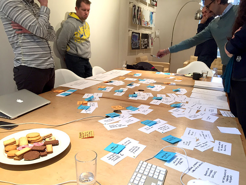
An exercise that always gets the discussion started (and uncovers some interesting results) is getting the whole project team to rank page content on what they feel is a priority.
Here’s what you’ll need for this exercise:
Cue cards
Post-its
Good clear marker pen
A time and place you can get all stakeholders in a room
Courage to manage a room of opinionated people
Biscuits
Prep: What you’ll need to do before the workshop is pick a key, rich content page you want to focus on.
Then follow these practical steps:
Write down all the content blocks for that page. Use a name that is more descriptive of the content than how it's presented e.g. ‘marketing messages’ not ‘carousel’.
Get an equal amount of post-it notes and number them 1 to 10 (or however many content blocks you have).
Spread the cards across the table, and put the Post-its at the side in a vertical line.
Load up the current website page you’re reviewing, and put a post-it number on each card, allocating a number based on its visual prominence on the page.
Essentially what you’re doing is scoring each element based on how much it gets your attention. For example, a large carousel or hero image will probably score a 10, whereas a small ‘further reading’ links block further down on the page might only score a 1. Do this exercise and document the results for reference.
On the day: Start with a presentation about your findings so far. Talk about the analytics, project goals and user scenarios. This will help to get the cogs turning and make sure people are all on the same page, as it will become apparent quite quickly if different stakeholders or departments have different ideas of what the site/page should do.
Think of it more like a discussion than a full-on formal presentation, but you’ll be the one to keep it on track and in motion. When you’ve done that, it's time for the workshop. You will be running a similar exercise to the one you did in your prep.
However, whereas before you were scoring on visual prominence, this time you’ll be awarding points for desired priority. When you run the exercise on the day, everyone is giving their input for what they would want the page to look like.
Workshopping is a great way to start a conversation about which content is most important based on the written information, not just the design.
Keep blank cards handy in case you need to create new content that doesn’t exist on the current page. Don’t be afraid to play devil’s advocate to get people talking. Challenge them on why something should have a high/low score and be sure to reference analytics/goals and user scenarios when doing so.
This should lead to discussion about content in terms of what it's doing rather than how it looks. If we did label the carousel as ‘carousel’, stakeholders might score it a 10 as they love the carousel and suggest “everyone has one”. But if we call it ‘marketing messages,’ they’ll think about the content only.
This is important when it comes to ensuring the content aligns with your goals. For example, if one of your project goals is to focus less time on marketing messages and more on guiding users to tasks they can complete online, the marketing messages section will be scored lower.
When everyone is done, reveal the scores from the current site you did in the preparation task. There are likely to be disparities that stakeholders weren’t aware of until now. This is valuable if you suspect there is someone in the group who thinks the site/page works fine as it is and doesn’t need changing.
The outcome of this workshop is a clear list of what needs to be on the page and in what order, taking into account analytics, business objectives and the sort of person who visits the site. After this exercise, you’ll have clear insight as to how to structure and design pages around your content.
Final thoughts
The methods outlined in this article will set you on the right track for producing content that enhances the user experience. You’ll be able to use analytics to determine what content people want and align business objectives with project goals.
The user scenarios surface how users might want to consume the content, and all of this information will inform your content hierarchy when it comes to web design. Introducing these practices into your own process and workflow will ensure content is purposeful and your next website redesign project is successful.
What are you waiting for?Try GatherContent for free to improve your content creation process today.
When you plan a website redesign, you don’t jump straight in without thinking about the business goals and user needs. This important information impacts your strategy for how to best structure rich content pages like your home page or important landing pages. This also ensures that users are able to find what they’re looking for and accomplish the tasks they set out to accomplish.
Considering how the user needs and goals can be met with a focused and effective content hierarchy is an essential step in the website strategy process (and your digital marketing strategy in general!) Developing a clear visual hierarchy of prioritised content is also important.
In this article, we’ll talk about what content hierarchy is, why it's important, and how you can ensure that the pages you make are fit for their purpose.
"Considering how the user needs and goals can be met with a focused and effective content hierarchy is an essential step in the website strategy process."
Content hierarchy is the strategic arrangement of information on a web page (or another content asset) where the most important information is emphasized more than less important content. Often, this means that the important content is at the top of the page and less important information is toward the bottom.
There are other strategies that you can use to create content hierarchy beyond just where the content is located. You can also use font size, spacing, bold, italics, and color to emphasize important information on the page.
This is a great example of what a content hierarchy might look like on a web page with the most important information at the top and other details like the CTA in a bold color. (Source)
Why is content hierarchy important
With so much content being published on websites, social media, and other channels every day, it’s easy to understand why the attention span of an average internet user is short. It’s being pulled in a bunch of different directions at once.
You’ve got about 15 seconds to get your audience’s attention once they’re on your page. And still, between 35 and 40 percent of your visitors will bounce after just a few seconds. That’s why it’s so important that you place the most important information at the top of your webpage. That way, people will be able to determine very early on if the content is relevant to them or not.
Content hierarchy is also important from a usability perspective. You want to make your website as useful and user friendly as possible. That means making your content easy to scan. Scanning patterns suggest that people start at the top of the page, making it vital that you put the most important information there.
A look at content hierarchy vs visual hierarchy
The difference between content hierarchy and visual hierarchy is that visual hierarchy relies on visual elements to establish hierarchy whereas content hierarchy is focused on the written content itself. The two can actually work hand-in-hand as you use a visual hierarchy strategy to create content hierarchy.
Here’s a great example of a piece of content that uses visual hierarchy to emphasize different areas of the text so you’ll read them first:
Notice how you read different areas of the text in a certain order? That’s the power of visual hierarchy. (Source)
In this example, the size, color, and placement of the text all impacts how you read the content. It goes beyond just placing the most important information at the top to instead using all the visual elements available to guide you through the text.
Another common example of where you might see visual and content hierarchy working together is with a page header. Copywriters use headers to describe the information on that section of the page. Web designers will create the header in large text that’s often a different font, color, and/or size than the rest of the text on the page. The header becomes a focal point that allows readers (and search engines) to scan the page and understand what it's about.
ABC: Analytics Before Content
Analytics are always a good starting point. While I sit at one side of a table and say “In my experience of designing for the web, I think users will do X,” the client may sit on the other side and say “Well, we think they’ll do Y.” What trumps all of that is actual data, via analytics, and looking at what users are really doing or at least trying to do.
If you don’t have analytics set up on your current system or you’ve only had it for a few days, you won’t get much by the way of solid conclusions, so come back to this at a later date.
Once you have access to the analytics, you should:
Set a suitable date range to make sure you’re looking at a decent spread of data. Six months is a good range to use, but consider things like when the last big change to the site was. If you did a redesign four months ago, anything before that will be largely useless.
Identify what pages or sections are most popular. Look at those pages at the same time to see what’s on the page to get an idea of what your users want to read.
Look via the in-page behaviour tools that Google Analytics and others offer. These provide a breakdown of page clicks and give insight into what users visiting those pages are doing. Take a look at your homepage to see what content is most popular and what isn’t, and you’ll start to build a strategy for what to do next.
The aim of the analysis is to look at what's popular in certain areas of the site and what people are trying to find, then serve that content on key pages. If you find that a number of users are going to your e-commerce page, think about adding some of that key content to the homepage in a prominent place.
Keeping your eyes on the prize
Another key factor in ensuring that rich content pages, and indeed our websites in general, are successful, is having a clear strategy and direction for what we want the site to achieve. It might seem really obvious, but it can be challenging, especially on larger projects.
You’d be surprised how many kick-off meetings I’ve sat in and discussed project goals, only to find out people that thought their views aligned actually want completely different things. Stakeholders will have their own priority list and agenda, which is a good thing. The business needs different areas of focus, but if we throw everything at a user all at once, we won’t achieve a lot.
Goals themselves need to be considered and structured. If you set the goal of ‘Let’s make the site awesome!’, while the intention (and enthusiasm) is there, the word ‘awesome’ is too subjective. And how do we know if we’ve met that goal at the end? What defines minimum awesomeness?
You don’t have to follow this verbatim, but you can use the following formula (which seems to work well for my clients) to identify and document your goals: We want ___ (action) ___ , because ___ (reason) ___ , so that ___ (objective) ___ .
This works because we first lay out what we want to do (the action), and then we describe why we want to do it (the reason). It’s important to have a clear reason for taking action or the whole team will be less invested.
Lastly, and most importantly, we describe the measure of success (the objective). We’ll need a way of knowing if we’ve achieved what we set out to. An example of this might be:
We want to encourage more users to apply online rather than over the telephone, because it only costs us 2p for an employee to process an online application as opposed to 45p for telephone, so that we see a 50% increase in the number of online applications in the next six months.
The formula is handy when someone in the project team tries to stuff the wrong content in, as you can simply inquire as to which goal the new content aligns to.
Don’t write too many of these statements. Keep them over arching and make sure they are visible throughout the project. Look at the content blocks for these rich content pages and see which ones align to the project goals the most.
If you’re building a homepage and the first thing you’re putting on the page is a large space dedicated to marketing messages, and your project goal is similar to the example used above, think about putting the top tasks for online services before the marketing.
Remember the people
We also need to bear in mind that we’re producing content for people. People have a range of technical abilities, goals, mindsets and patience, so we’ll want to consider this with some user scenarios and journeys.
While we can't tell exactly what our actual users are thinking, we can start putting ourselves in their shoes with fictional examples.
A good method for writing the user scenarios is to split them into two paragraphs. The first will describe the person in general; who they are, where they are and what their problem or challenge is. The second will lay out what they are coming to the site for, how they found the site and what their current mindset is.
Creating an effective content hierarchy begins with understanding what the people reading the content will find most important.
Here’s an example of one I’ve recently used for a client:
Kyle is an award-winning sculptor from Doncaster, known for creating installations depicting industrial scenes in a natural setting using found materials. Commissioned by the National Trust for a large installation, he wants to depict the opposite – showing a natural scene in an outdoor industrial setting, using only industrial materials. Having never worked with metals before, he is worried about what he will need to do to treat the material and curious as to its potential. Being a struggling bohemian artist, he doesn’t own a computer, so uses a local library, using an old and slow machine running IE9.
It may seem like overzealous story telling (and sometimes it is) but everything that’s in there is for a reason. In the example above, we’re saying Kyle has got a commission from the National Trust, so it's a big deal and he needs answers rather than just browsing.
But he is an artist and “curious” as to the potential of metal, so he’ll be open to certain types of content, especially case studies. You should be able to form a clear picture through analytics and project goals of what content should go on what pages and in what visual order.
Let the user scenarios be the first test for this. Be sure to include all stakeholders when you write these, get input and sign off, and keep them visible throughout the project.
Workshopping
If you haven’t got buy-in from everyone involved in the project, conducting a workshop is a great way for these people to get their voices heard. It’s also the best time to make sure everyone is on the same page and educated on what is trying to be achieved.
An exercise that always gets the discussion started (and uncovers some interesting results) is getting the whole project team to rank page content on what they feel is a priority.
Here’s what you’ll need for this exercise:
Cue cards
Post-its
Good clear marker pen
A time and place you can get all stakeholders in a room
Courage to manage a room of opinionated people
Biscuits
Prep: What you’ll need to do before the workshop is pick a key, rich content page you want to focus on.
Then follow these practical steps:
Write down all the content blocks for that page. Use a name that is more descriptive of the content than how it's presented e.g. ‘marketing messages’ not ‘carousel’.
Get an equal amount of post-it notes and number them 1 to 10 (or however many content blocks you have).
Spread the cards across the table, and put the Post-its at the side in a vertical line.
Load up the current website page you’re reviewing, and put a post-it number on each card, allocating a number based on its visual prominence on the page.
Essentially what you’re doing is scoring each element based on how much it gets your attention. For example, a large carousel or hero image will probably score a 10, whereas a small ‘further reading’ links block further down on the page might only score a 1. Do this exercise and document the results for reference.
On the day: Start with a presentation about your findings so far. Talk about the analytics, project goals and user scenarios. This will help to get the cogs turning and make sure people are all on the same page, as it will become apparent quite quickly if different stakeholders or departments have different ideas of what the site/page should do.
Think of it more like a discussion than a full-on formal presentation, but you’ll be the one to keep it on track and in motion. When you’ve done that, it's time for the workshop. You will be running a similar exercise to the one you did in your prep.
However, whereas before you were scoring on visual prominence, this time you’ll be awarding points for desired priority. When you run the exercise on the day, everyone is giving their input for what they would want the page to look like.
Workshopping is a great way to start a conversation about which content is most important based on the written information, not just the design.
Keep blank cards handy in case you need to create new content that doesn’t exist on the current page. Don’t be afraid to play devil’s advocate to get people talking. Challenge them on why something should have a high/low score and be sure to reference analytics/goals and user scenarios when doing so.
This should lead to discussion about content in terms of what it's doing rather than how it looks. If we did label the carousel as ‘carousel’, stakeholders might score it a 10 as they love the carousel and suggest “everyone has one”. But if we call it ‘marketing messages,’ they’ll think about the content only.
This is important when it comes to ensuring the content aligns with your goals. For example, if one of your project goals is to focus less time on marketing messages and more on guiding users to tasks they can complete online, the marketing messages section will be scored lower.
When everyone is done, reveal the scores from the current site you did in the preparation task. There are likely to be disparities that stakeholders weren’t aware of until now. This is valuable if you suspect there is someone in the group who thinks the site/page works fine as it is and doesn’t need changing.
The outcome of this workshop is a clear list of what needs to be on the page and in what order, taking into account analytics, business objectives and the sort of person who visits the site. After this exercise, you’ll have clear insight as to how to structure and design pages around your content.
Final thoughts
The methods outlined in this article will set you on the right track for producing content that enhances the user experience. You’ll be able to use analytics to determine what content people want and align business objectives with project goals.
The user scenarios surface how users might want to consume the content, and all of this information will inform your content hierarchy when it comes to web design. Introducing these practices into your own process and workflow will ensure content is purposeful and your next website redesign project is successful.
What are you waiting for?Try GatherContent for free to improve your content creation process today.
A multidisciplinary designer based in Leicester, UK, Jon has worked with a range of clients, from government bodies to luxury brands, in the UK, United States and Australia, to create user-centred, accessible and end-to-end web experiences.
He currently works as the Senior User Experience Designer at the award winning creative agency Un.titled. He also founded and was Editor-in-Chief of regional music newspaper The Monograph, a publication that ran quarterly from 2010 to 2013.