This article is an excerpt from Writing Is Designing: Words and the User Experience (Published in 2020 by Rosenfeld Media). Written by Andy Welfle and Michael J. Metts, the book will 'show you how to give your users clarity, test your words, and collaborate with your team.' This excerpt from chapter four focuses on practical advice for writing error messages.
Chapter 4: Errors and Stress Cases: Writing Error Messages
Once you understand what your users are going through, you’ll start to see what error messages are needed and when they’ll appear. But how should you write them? Here are three principles for using words to design error states—one of them doesn’t even involve writing:
Avoid: Find ways to help your user without showing them an error.
Explain: Tell your users what’s going on and what went wrong.
Resolve: Provide a solution to the problem that the user is facing.
To see how this plays out in the real world, let’s look at an increasingly popular technology as an example: online check deposits through a banking app.
Paper checks are alive and well, but now you don’t even have to leave your home to add funds to your account. This feature is so popular that according to Bank of America’s CEO, more checks were deposited through their mobile app than in local branches from April to June of 2018.
If the following conditions aren’t met, the check-cashing feature could generate an error:
Users must enter an amount for their check.
The amount entered by the user must match the amount shown on the check.
The image of the check must be clear enough that the software can read the account numbers, routing numbers, and amount.
The check must be signed.
The user must write the words “For online deposit only” on the back (a legal requirement as of 2018).
These are just a few possibilities! There could be many, many more situations to account for. Let’s see how these concepts play out in the real world.
Avoid
Avoiding errors is really about preventing frustration, while helping people accomplish their tasks. Ideally, it leads people to deposit their checks without any problems, allowing them to move on with their lives. The fewer issues they face, the more convenient an experience it is for the customer and the lower the cost for the bank.
The best experiences reduce the need for errors by using visual cues and interaction patterns to guide their users. Figure 4.2 shows the Chase Bank mobile app’s check deposit feature. The user must enter the amount before taking a photo of the check, so the designers made that input stand out in large text and grayed out all the other options, guiding the user to enter the amount, before making the photo-taking buttons available. If users could select the “Next” button without entering an amount, they would encounter an error state.
Another approach to avoid an error is to design the software so that it assists users with formatting and data entry. Some systems require users to enter their birthdates, and that data is required in the mm/dd/yyyy format. To prevent errors, the forms can be created to add the slashes automatically. You could also use a date-picker, which allows a user to choose the date from a calendar or a “wheel” of years, days, and months, but there are speed trade-offs to consider. Someone may have to click or tap through many years to find the one they were born in.
Conversational interfaces like voice assistants and chatbots take similar steps to reduce errors. If you’re writing dialog for one of these interfaces, you’ll likely want to hint at the correct way to enter information. If you’ve ever called an airline’s automated phone system and heard it tell you, “You can say things like ‘check the status of a flight’ or ‘change my reservation,’” the system’s designers are working to reduce errors before they happen by helping users understand the system’s capabilities and what types of commands it responds to.
There are many, many ways to avoid or reduce errors before they happen. It takes a design mindset, a strong understanding of the technology involved, and a deep familiarity with the business constraints to do it effectively.
Explain
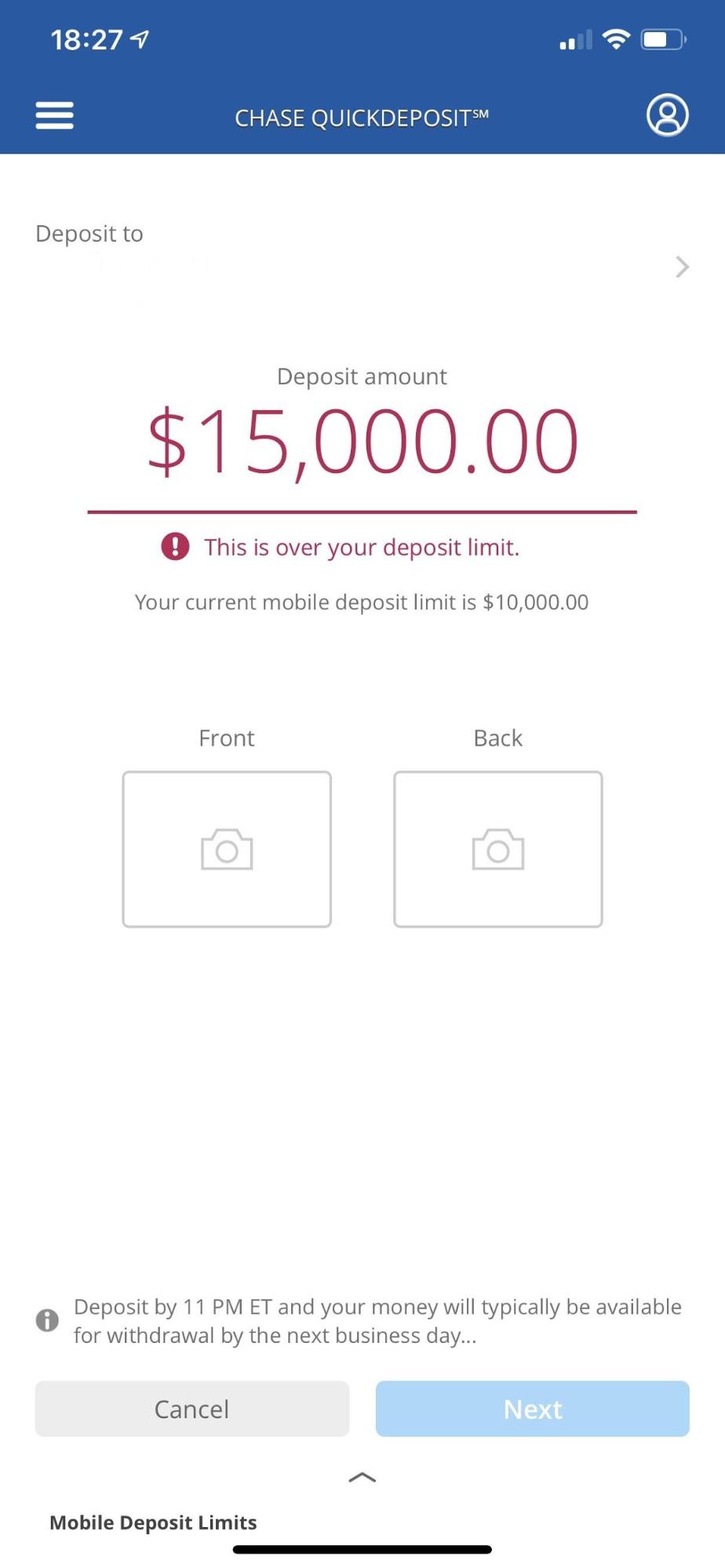
Back to depositing checks: There are cases where you won’t be able to avoid an error message. Let’s say one of your users gets a large check (lucky them!), and they enter the amount. In this case, the bank has imposed a “mobile deposit limit” of $10,000.
Figure 4.3 shows how the Chase app handles this scenario. In these cases, the idea is to tell the user clearly and quickly what went wrong. The Chase app does a decent job here, but it would fall short if the user wanted to know why the deposit limit was $10,000. They might also want to know where the check could be deposited. It’s implied that this is a “mobile” deposit limit, but does it apply to ATMs, too?
But that information isn’t here. Why? Maybe there was a limited character count for the error field. Or maybe the business didn’t feel it was necessary. Or it could be that the design team just didn’t think of including it.
Again, it’s critical that you foresee and solve problems before they happen, and by doing that, you’re treating writing like what it is— design. If you think of your contribution as writing a message for a specific field with a limited character count, you’re limiting the ways you can help your users. No matter what your title is, you can work with your team to explore options like the ones shown below for approaching the problem differently:
Adding a tooltip (a small message that appears when you click or tap an icon)
Increasing the character count of the field, or if you’re building from scratch, collaborate with the team to figure out what the character count should be
Adding a link to an explanation of this limit (websites are great for that) The best way to figure out the right level of detail for an error message is to let your users tell you. You can test the words with users just like any other aspect of the interface.
Showing solutions is what ultimately builds trust with your users. When you fail to explain what’s going wrong, it can mean the difference between a user embracing or rejecting your product.
Resolve
If, after following both of the previous principles, you still have to write an error message, then resolving the issue that led to the error is easily the most critical component—for both your users and the business. It’s one thing to explain what’s wrong, but you certainly don’t want to leave the user asking, “Now what?” and abandoning the product entirely.
Resolving is about offering next steps. Often, this involves backing up and understanding the user’s intent.
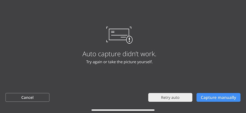
Figure 4.4 shows what happens when the Chase app’s “auto capture” feature isn’t able to capture a clear image of the user’s check. “Auto capture” takes a photo of the check by detecting whether it’s in the frame, and then it triggers the camera.
This is more than an error message. “Capture manually” and “Retry auto” give the user two ways to resolve the issue and move closer to their goal of depositing a check. “Take the picture yourself” might come off as bossy, but testing would tell you whether users perceive it that way.
Resolution is about meeting users where they are and providing a path forward. It’s about helping users get things done.
This article is an excerpt from Writing Is Designing: Words and the User Experience (Published in 2020 by Rosenfeld Media). Written by Andy Welfle and Michael J. Metts, the book will 'show you how to give your users clarity, test your words, and collaborate with your team.' This excerpt from chapter four focuses on practical advice for writing error messages.
Chapter 4: Errors and Stress Cases: Writing Error Messages
Once you understand what your users are going through, you’ll start to see what error messages are needed and when they’ll appear. But how should you write them? Here are three principles for using words to design error states—one of them doesn’t even involve writing:
Avoid: Find ways to help your user without showing them an error.
Explain: Tell your users what’s going on and what went wrong.
Resolve: Provide a solution to the problem that the user is facing.
To see how this plays out in the real world, let’s look at an increasingly popular technology as an example: online check deposits through a banking app.
Paper checks are alive and well, but now you don’t even have to leave your home to add funds to your account. This feature is so popular that according to Bank of America’s CEO, more checks were deposited through their mobile app than in local branches from April to June of 2018.
If the following conditions aren’t met, the check-cashing feature could generate an error:
Users must enter an amount for their check.
The amount entered by the user must match the amount shown on the check.
The image of the check must be clear enough that the software can read the account numbers, routing numbers, and amount.
The check must be signed.
The user must write the words “For online deposit only” on the back (a legal requirement as of 2018).
These are just a few possibilities! There could be many, many more situations to account for. Let’s see how these concepts play out in the real world.
Avoid
Avoiding errors is really about preventing frustration, while helping people accomplish their tasks. Ideally, it leads people to deposit their checks without any problems, allowing them to move on with their lives. The fewer issues they face, the more convenient an experience it is for the customer and the lower the cost for the bank.
The best experiences reduce the need for errors by using visual cues and interaction patterns to guide their users. Figure 4.2 shows the Chase Bank mobile app’s check deposit feature. The user must enter the amount before taking a photo of the check, so the designers made that input stand out in large text and grayed out all the other options, guiding the user to enter the amount, before making the photo-taking buttons available. If users could select the “Next” button without entering an amount, they would encounter an error state.
Another approach to avoid an error is to design the software so that it assists users with formatting and data entry. Some systems require users to enter their birthdates, and that data is required in the mm/dd/yyyy format. To prevent errors, the forms can be created to add the slashes automatically. You could also use a date-picker, which allows a user to choose the date from a calendar or a “wheel” of years, days, and months, but there are speed trade-offs to consider. Someone may have to click or tap through many years to find the one they were born in.
Conversational interfaces like voice assistants and chatbots take similar steps to reduce errors. If you’re writing dialog for one of these interfaces, you’ll likely want to hint at the correct way to enter information. If you’ve ever called an airline’s automated phone system and heard it tell you, “You can say things like ‘check the status of a flight’ or ‘change my reservation,’” the system’s designers are working to reduce errors before they happen by helping users understand the system’s capabilities and what types of commands it responds to.
There are many, many ways to avoid or reduce errors before they happen. It takes a design mindset, a strong understanding of the technology involved, and a deep familiarity with the business constraints to do it effectively.
Explain
Back to depositing checks: There are cases where you won’t be able to avoid an error message. Let’s say one of your users gets a large check (lucky them!), and they enter the amount. In this case, the bank has imposed a “mobile deposit limit” of $10,000.
Figure 4.3 shows how the Chase app handles this scenario. In these cases, the idea is to tell the user clearly and quickly what went wrong. The Chase app does a decent job here, but it would fall short if the user wanted to know why the deposit limit was $10,000. They might also want to know where the check could be deposited. It’s implied that this is a “mobile” deposit limit, but does it apply to ATMs, too?
But that information isn’t here. Why? Maybe there was a limited character count for the error field. Or maybe the business didn’t feel it was necessary. Or it could be that the design team just didn’t think of including it.
Again, it’s critical that you foresee and solve problems before they happen, and by doing that, you’re treating writing like what it is— design. If you think of your contribution as writing a message for a specific field with a limited character count, you’re limiting the ways you can help your users. No matter what your title is, you can work with your team to explore options like the ones shown below for approaching the problem differently:
Adding a tooltip (a small message that appears when you click or tap an icon)
Increasing the character count of the field, or if you’re building from scratch, collaborate with the team to figure out what the character count should be
Adding a link to an explanation of this limit (websites are great for that) The best way to figure out the right level of detail for an error message is to let your users tell you. You can test the words with users just like any other aspect of the interface.
Showing solutions is what ultimately builds trust with your users. When you fail to explain what’s going wrong, it can mean the difference between a user embracing or rejecting your product.
Resolve
If, after following both of the previous principles, you still have to write an error message, then resolving the issue that led to the error is easily the most critical component—for both your users and the business. It’s one thing to explain what’s wrong, but you certainly don’t want to leave the user asking, “Now what?” and abandoning the product entirely.
Resolving is about offering next steps. Often, this involves backing up and understanding the user’s intent.
Figure 4.4 shows what happens when the Chase app’s “auto capture” feature isn’t able to capture a clear image of the user’s check. “Auto capture” takes a photo of the check by detecting whether it’s in the frame, and then it triggers the camera.
This is more than an error message. “Capture manually” and “Retry auto” give the user two ways to resolve the issue and move closer to their goal of depositing a check. “Take the picture yourself” might come off as bossy, but testing would tell you whether users perceive it that way.
Resolution is about meeting users where they are and providing a path forward. It’s about helping users get things done.
Rob is Founder of Fourth Wall Content working with clients on content strategy, creation and marketing. Previously, in his role as Head of Content at GatherContent he managed all of the organisation's content output and content operations.