Marli Mesibov is the VP of content strategy at the digital UX agency Mad*Pow, and she works on strategy and experiences across industries with a particular interest in healthcare, finance and education. She is a frequent conference speaker and a former editor of the UX publication. Marli was also voted one of Mindtouch's top 25 content strategist influencers in 2016. This is a transcript of Marli's webinar: Plain language can be inclusive, accessible and fun, with slides for context.
Successful communication through plain language
Content strategy is about communication and for communication to be successful, that means that we have to be getting our messages to the right people, at the right time and the right place. Right?
That's a pretty common definition of content strategy, but it's not successful just because you get the message to the right people in the right place. I mean, sure, for a long time we said, great, there's all this content out there. There's videos, there's copy, there's articles and blog posts and websites and oh my God, the internet is so overcrowded. How are we going to get information to people? If only we could get to the right people, at the right place and the right time, great, content strategy to the rescue. But really, even if all of that happens, if our audience can't understand what we're saying to them, then it's not a success. We're not actually communicating. So with that in mind, that probably brings us to some of the reasons that you're here today.
Webinar goals
Maybe you came because you said, "okay, plain language, well, isn't that what we just do every day? Isn't that just common sense?" And I'm going to talk a little bit about why it's actually not, and in some cases why it is, but why common sense is perhaps not so common.
Some of you may be thinking, "yes, let's chat about what plain language is, but I don't really know how to make sure I'm doing it right." So we will look at some specific resources to help you. We'll look at specific best practices. I try to be as actionable as possible. Some of you may say, "I've got the tools, but really do we have to do SEO? What does it mean to use these readability tools?" So we go into a little bit of that and then of course we will also look at measurement itself, because we want to make sure that our plain language is successful, that we know that we are communicating with people, that we are helping them to do the things that they are trying to do.
So, what is plain language?
Let's hit that first bullet point first. We'll talk about what plain language actually is. Well, you might think of plain language as language that is easy to read. It's easy to understand. In that case, those Dick and Jane books that were so popular a couple of decades ago, that's plain language, right? But it's not, because that was created for an audience of five and six year olds learning to read. It was not created for the audience that you are probably trying to communicate with. And what differentiates plain language from just well-written content is that plain language is written with a specific context in mind. It's written with a strategy in mind. It's written with the understanding that there is a message that we need to get across, and that that message needs to be promoted while still being easy to read and easy to understand.
And you might think, or at least I often think, "okay, of course I can do that", but then I'll write something out and I'll realise I'm writing it because it's easy for me to read and understand, but I have a lot of assumptions in place that are not necessarily accurate for my audience. Let's be a little more specific here. We're talking about complex information, whether that is because you are selling a vacuum cleaner that has specific technical requirements and elements that make sense to the product owners and to the people building the vacuum cleaner, but not to the people trying to purchase it who actually don't want a vacuum cleaner, they want a clean house. Or whether you are working on some of the areas that I tend to focus on where a lot of my examples will come from which are healthcare, finance and education.
Why do people need plain language?
People don't want healthcare, they don't want wealth management. They certainly don't want higher education. They want to be healthy, wealthy, and wise. We will then get into what that means and really we're going to focus on the three areas that you should know because they were right there in the title of this webinar. We're going to talk about how plain language can be:
Inclusive
Accessible
Fun
Tools
A couple of the things that you can look out for are some tools that we're going to touch on. We're going to look at readable.io, the Hemingway app and Moz SEO.
Processes
We also are going to look at a few specific processes. We're going to talk about health literacy, which is very applicable to all industries. It just so happens that healthcare in the United States is one of the few areas that's created a specific literacy plan. We're going to talk about how to empathise with a full population and sympathise with full population as opposed to individually, and we're going to look at some ways, some processes for eliminating jargon. Let's dive in.
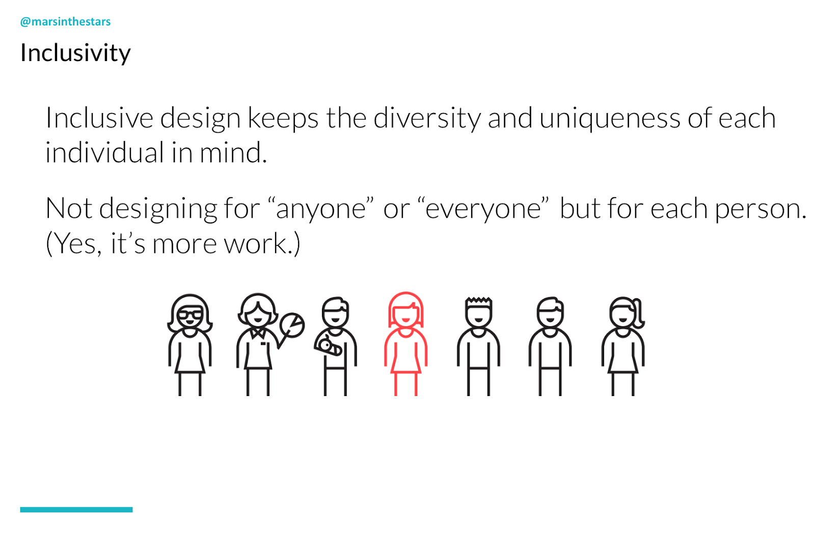
1. Inclusivity
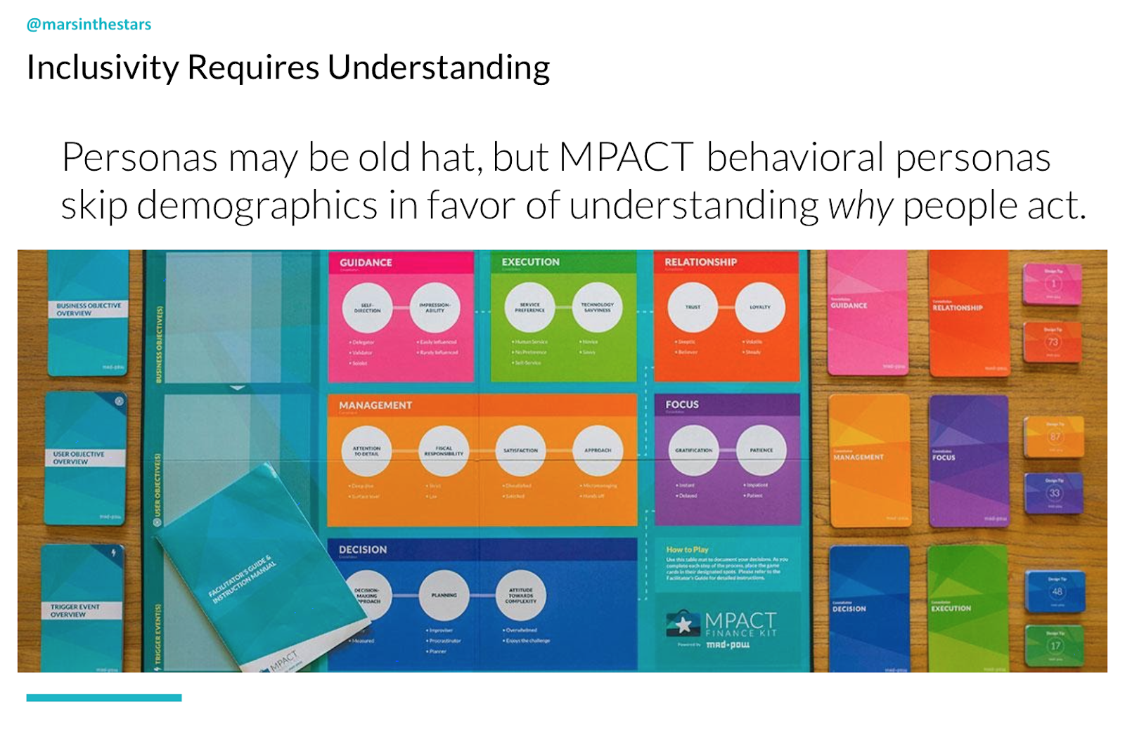
I start with inclusivity partially because I find it to be the least understood of those three - inclusivity, accessibility and fun - and partially because it is to my mind, the first step. Inclusivity is different from accessibility or universality or just general empathy because it's not about designing one thing that will work for everyone, it's about learning about your audience and learning who the individuals are. And I'm not going to pretend that it makes our lives easier. It actually makes our lives more complex, but it makes our end designs and our end content much better. And what it requires is personas.
I know, I know you've been reading 18,000 articles out there about how "personas are dead, long live personas, they're useless. They're assumptions. They're not helpful.'" Well, I'm here to tell you that that's not quite true. Or rather, the reason personas get such a bad rep is because they tend to be demographic personas. They tend to be things about how old people are or how much money they have or whether they're like their parents or not. But really what we want to be paying attention to is what we can understand about why people may take the actions that they do, what their behaviours are. So one way that we've started to do this at Mad*Pow is through MPACT, which is a sort of board game that we created to create behavioural personas.
MPACT looks at not the demographics but actually, things like:
Does your audience tend to prefer to take things on independently or to look for help?
How much do they tend to trust organisations?
How much do they tend to pay attention to detail?
And all of these are on a spectrum. And by looking at all of these different attributes, we can understand how they would approach the objective that they are trying to accomplish, so that's one way. And there are others, but I love this approach partially because it's already set up for me and you can find this on Mad*Pow website.
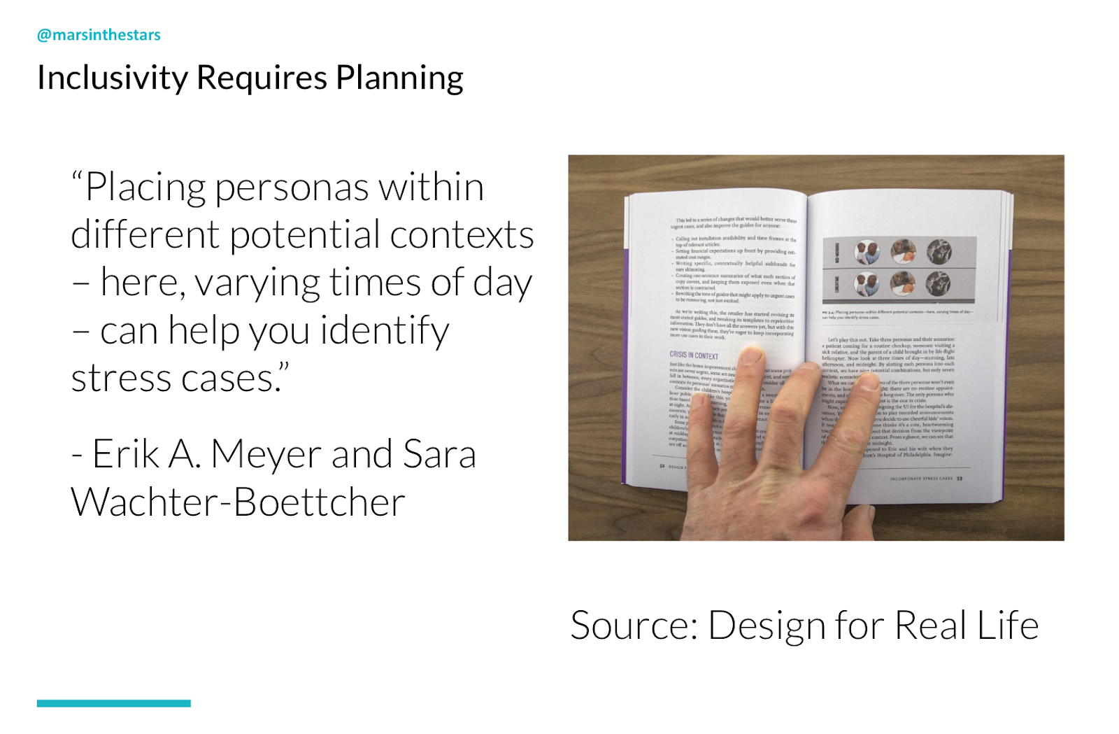
A second part of developing this inclusive understanding is to plan; to think about not only what we want someone to do but where they are. What is the scenario? And for this I'm thinking about and I've taken a lot of my cues from Eric Meyer and Sarah Wachter-Boettcher book Designed for Real Life. They've done an amazing job of changing the mindset from the sort of 80/20 perspective where we say, "okay well 80% of people do things the normal way and then there are edge cases." Well that's not really accurate, particularly when we get into complex types, complex industries, and complex areas. What we're really dealing with is not "normal and edge" cases, but actually "ideal and stress."
You see when you or I create a flow, and we say someone's going to come to our homepage and then they will click on this, and they will read through it and they will understand it and then they will click on this area to get more details and then they will purchase our product, or they will come and they will see the hours that we are available. And then they will come and see us and we will help them. Whatever that use case may be, those flows are idealised. In reality, the vast majority of people are dealing with stress cases. They're not calling because they're interested in getting a little bit of help with their washer and dryer and they've got plenty of time to chat with us and to go calmly through the website to find exactly what they need. No, the washer and dryer broke, they've got a screaming baby who just threw up over their last set of clean sheets. Their parents are coming to visit tomorrow and the house is a mess and they need somebody to come help them immediately.
They don't have time to read through calmly. They're scanning, they're stressed, they're frustrated. These kinds of stress cases are scenario-based and we need to think about "are they on their phone or their laptop or their tablet? What is going to pop out to them and how can we make this as easy as possible?" Another way of thinking about inclusivity is to think that we are not even just dealing with their scenario, we're dealing with their whole lives.
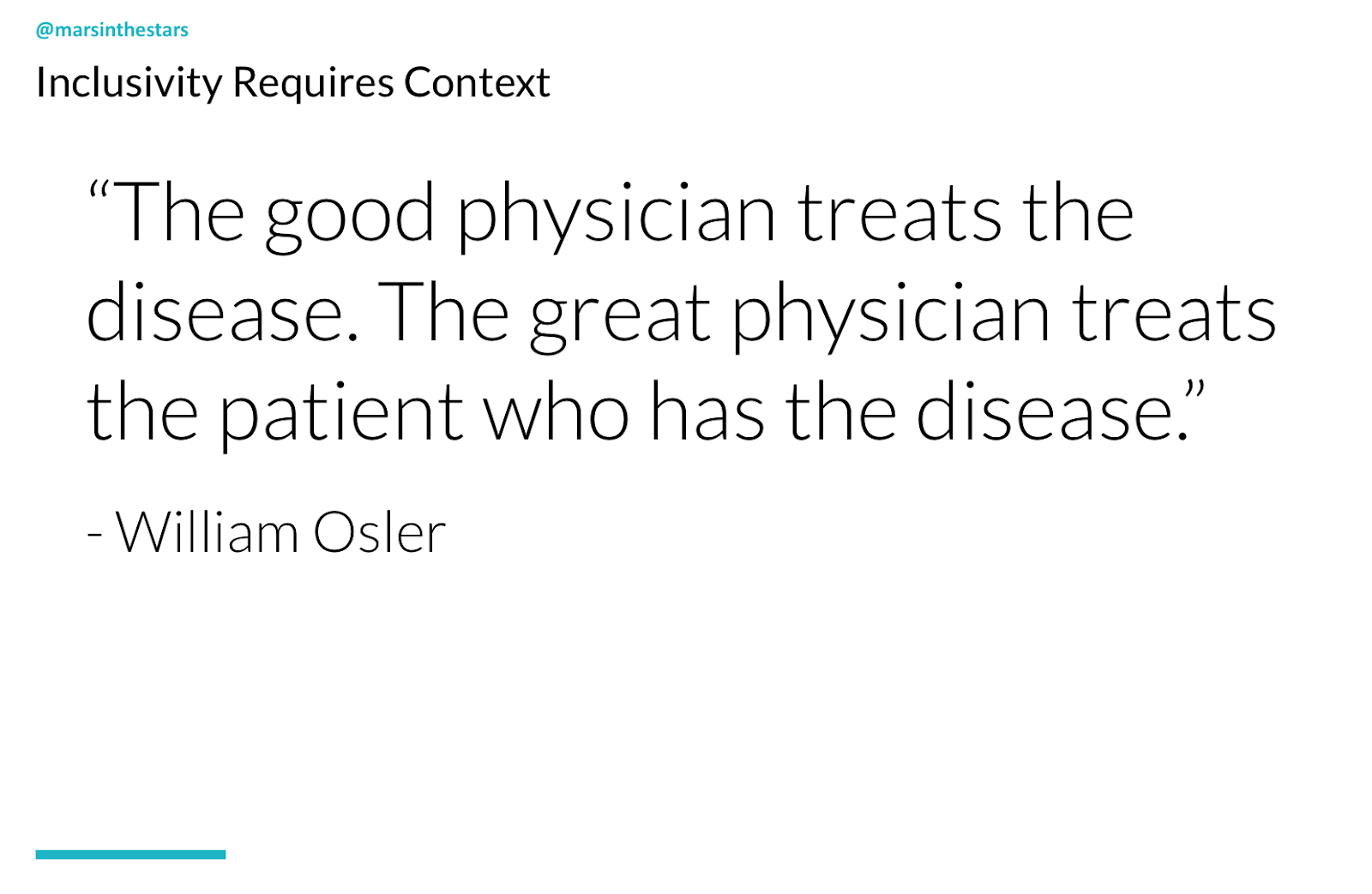
William Osler was a physician in the early nineteen hundreds and he said, "the good physician treats the disease, but the great physician treats the patient who has the disease." I love this. In the States we have a huge problem with people getting treated for their health.
A lot of providers typically have 15 minute windows to see patients. They do not have the time to do more than read their notes and send them on to someone else. And yet what patients really need is someone who sees them as a human being, who can see not only "you have this rash and here's a possible ointment and we can assume it might be this thing because 80% of people have this", but actually, "oh you have this rash and you were traveling to this area and that's an area where this actually very rare thing is much more prevalent."
So I gave you these different examples to bring us about to the fact that we as content creators need to think about our plain language in the case of scenarios. We need to think about our plain language as not only what makes sense to me, or what is the simplest way to say something, but actually what language does my audience use in their day-to-day life?
So maybe I call something an "auto loan", because I work in the car industry, but my audience calls it their "payments." Now, "payments" to me sounds too vague, too broad. As a good content strategist, I would avoid such a vague term. But not if I know my audience, and not if I understand their context enough to make sure that I'm speaking about their payments in a way that they're seeing it at the right time and the right place and that it will make sense to them, because it's tied to the button that they need to get to, or because it's right there on the main screen, because I've learned that the most stressful moment for them is when they have an overdue bill. I mentioned talking about the process that we go through for health literacy.
Health literacy
In 2010 former President Obama started an initiative in the States to focus on improving health literacy across all 50 states. One of the areas that this really took charge was identifying these health literacy levels.
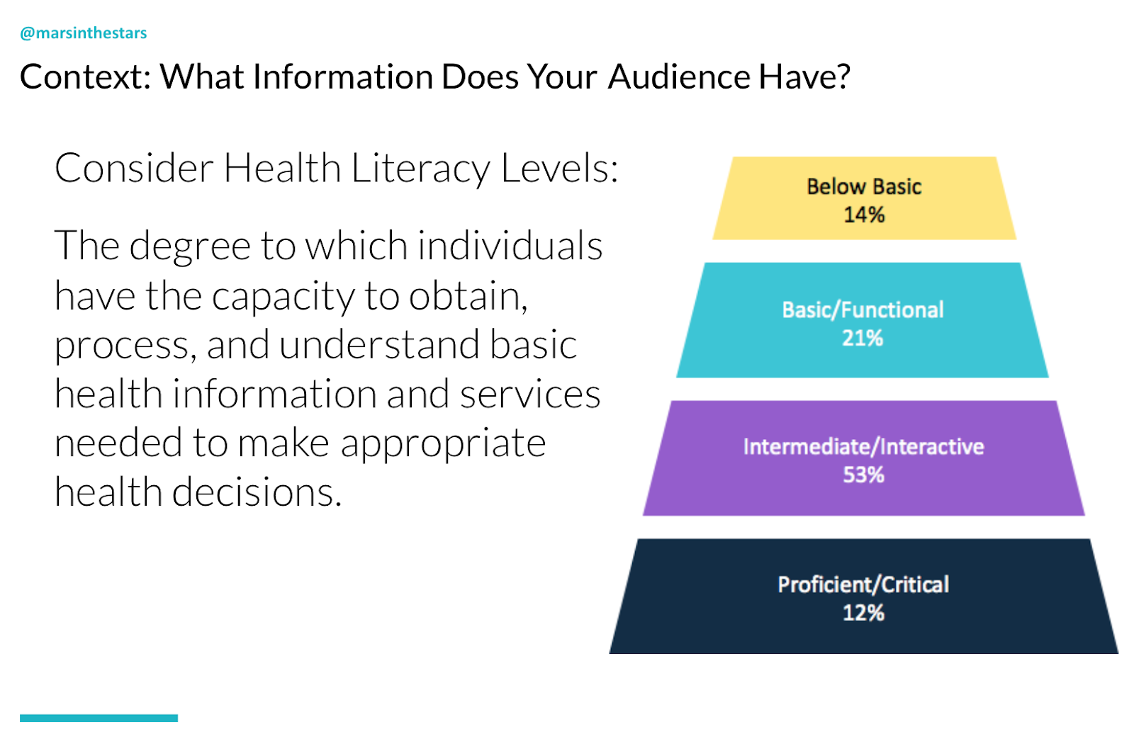
And what they said was, a basic health literacy level is saying that you can understand a form, you can fill out your information, you can say, "yes, I agree to this privacy practice." You understand those basics. You can read the information, it's readable, it's just at base level, you can do that. But above that there's actually an intermediate or an interactive level of health literacy, which is that "I've got past the forms which I did on my own, but I also am comfortable and confident speaking with a provider, asking questions, maybe even interrupting them or asking for a second opinion if I didn't understand my options. If they're suggesting surgery, then I'm comfortable before going to hospital, actually speaking with a few other providers to see if they agree with that." But that's not even enough to take care of yourself.
In order to truly care for your own health, you need to have a proficient or critical level of health literacy. That means that you're able to hear those different second opinions and then evaluate them. There's almost a mathematical part to this of understanding the percentages, and what I love about the way that health literacy levels look at things (and I actually think this applies to all industries) is that in a moment of crisis, you don't stay at your level of proficient or critical. Even if you work in healthcare every day, you might bop way back down to below basic and not even be able to focus on enough to fill out your form because you just found out about a terrible diagnosis or a family member who was in an accident. As you can see, and this is specific to the States, the research showed that only 12% of people at any given time have proficient or critical health literacy.
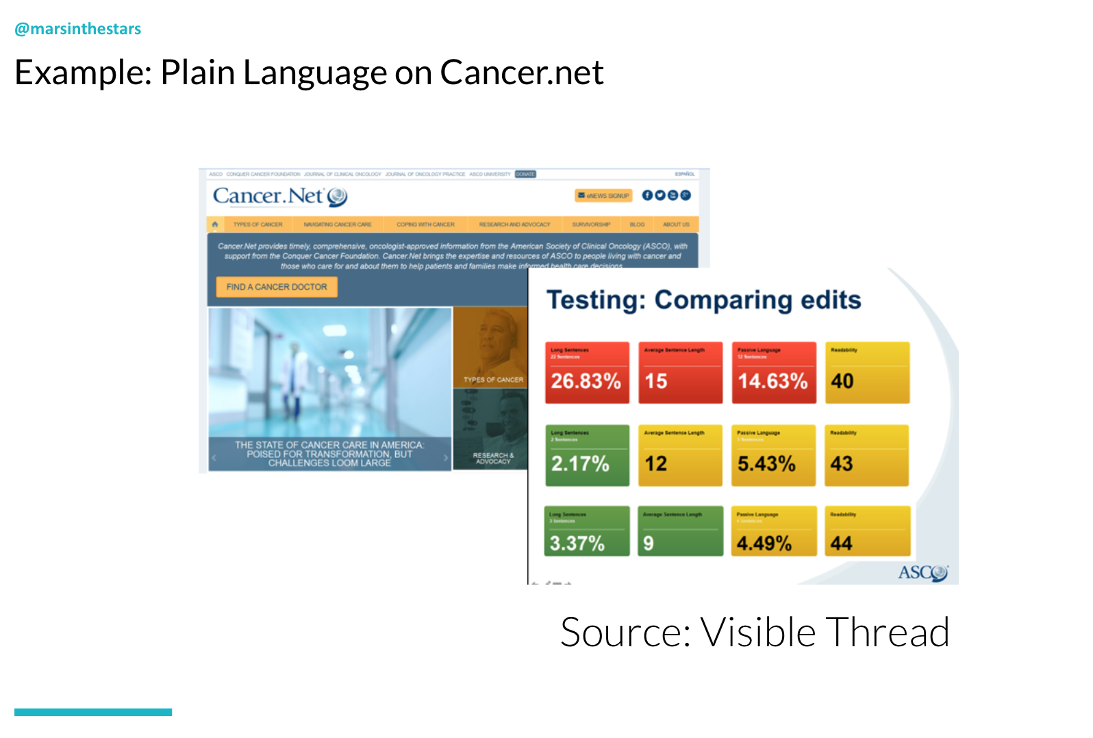
I would love if we could take that idea and that knowledge of how difficult it is to have proficient or critical literacy and apply it to all industries. Because that is where we, as language creators, can start to focus on how can we pull out that most basic information and make sure that we are providing it in a way that makes sense at this moment. Quick example from Visible Thread:
I gave a presentation a few years ago that I absolutely loved where they talked about their work working with cancer.net. They found that most people coming to cancer.net were people who have either just received a diagnosis or just found out that a loved one had a diagnosis, and yet when they did an evaluation using their specific tool, they found that over 26% of the sentences were exceedingly long. They found that the readability level was, I mean the whole thing was just terrible. It was just not a good situation.
Over time, they were able to update the content and get all of the levels significantly better to a point where the readability level was at such a point that people who had no idea what was going on and were terrified could actually read it and understand it, and this to me is just such a great success story. A large organisation like cancer.net could work with an outside agency and could understand that this wasn't about being 100% oncologically accurate in every single moment, it was about creating something that was useful to people in the moment.
Finance
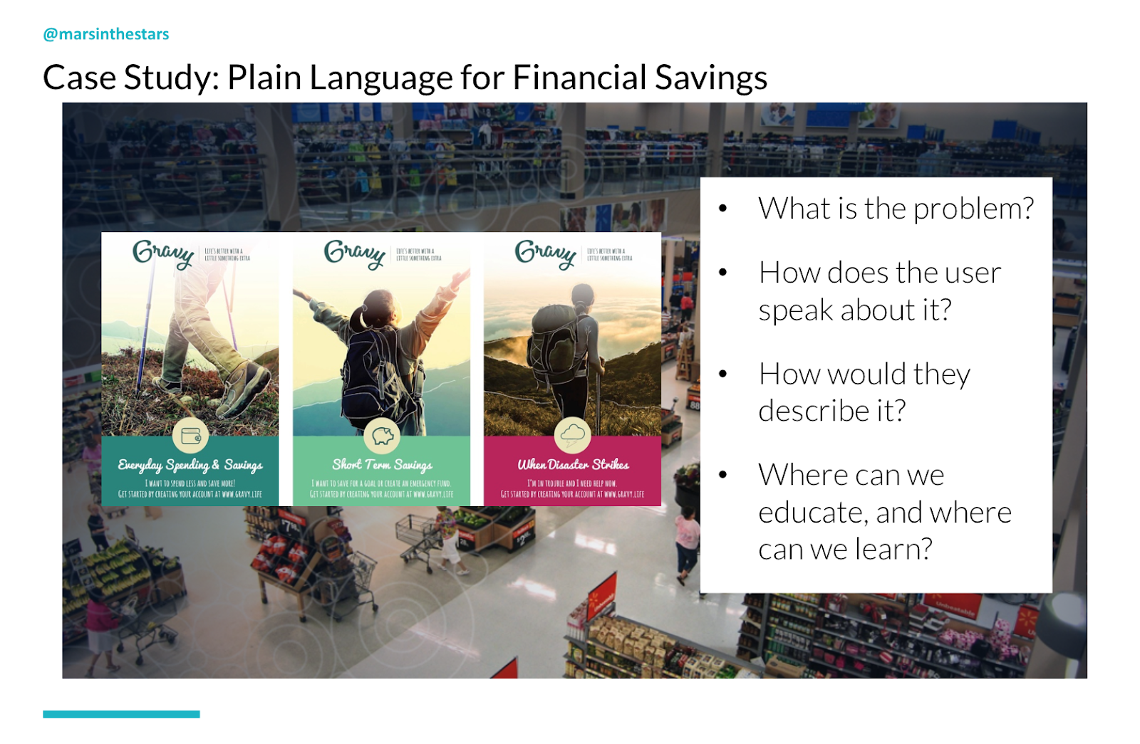
Another example outside of healthcare is a project I worked on a few years ago. This was to help people to understand and improve their financial savings and specifically people who were in a low-income bracket.
Now, what was interesting about this and what I want to call attention to is the process that we used. Instead of saying, 'let's start by taking complex content and just writing it more easily,' we started by asking people, by doing research and saying to them, "what are you struggling with?"
You see, we thought that the problem was that they needed to learn how to budget. But when we spoke with them, we learned that a lot of the people in this low-income bracket were working jobs where they received a different pay check every week. Their pay checks were hourly, not exact. And so although they may have known that they, for our budget needed $500 a month to live off of, each week they were receiving a pay check once for $100, once for $300 once for $50 and so when these pay checks were coming in, it was very difficult for them to connect that to their budget because you can't just wait until the end of the month to spend any of your money. You have to pay rent at the beginning of the month. You have to buy food throughout the month. Plenty of things come up, and so we changed our entire approach. We listened to how they talked about their money and instead of forcing them to "learn budgeting," we instead looked for where they actually needed education.
Did they actually need to learn budgeting or did we need to learn from them about how they lived their lives and create content that help them to spend less and save more, for example? Or pick a goal and create an emergency fund, which many people need, but most people don't have? Or were they already in sort of a disaster zone where they were in debt, they were struggling, there had been a problem and they needed to find a way to get access to their money? So the program that we ended up creating was much more focused on plain language for this audience and much less focused on this idea of just common sense language.
2. Accessibility
Next up, accessibility. We've accounted for the fact that everyone's different, now let's account for the fact that we're all the same because when we think about accessibility, it's really easy for other people to say, "oh yeah, there are people who are blind or there are people who are deaf, but it's not everyone. Right?" Well, actually, we are all just temporarily abled. I love this quote, I love this idea. And Microsoft, of all organisations, create a phenomenal inclusive design toolkit where they touch on what it is about accessibility that is so universal.
You see, sure, there are elements of accessibility that are permanent. There are people who do struggle with blindness or deafness, but there are also times that we are all temporarily struggling. That means things like:
Maybe with an arm injury, that means we can't type with both hands
Cataracts, which can be cured, but means that temporarily you really can't see and you're using a screen reader
An ear infection for example, could stop you from being able to hear temporarily
And then there are situational elements. Think about the number of times that you've had your hand and a bag or something in the other. You are just as unable to use both hands as you would be if any other situation were coming up that had you dealing with a disability. And that's not to say that we shouldn't be incredibly conscious of the ways that disabilities affect people. It's actually to say that we should be more conscious, that we should stop thinking about this as another separate element. And one way to remember that honestly is to think of everyone as dealing with various disabilities at any given time.
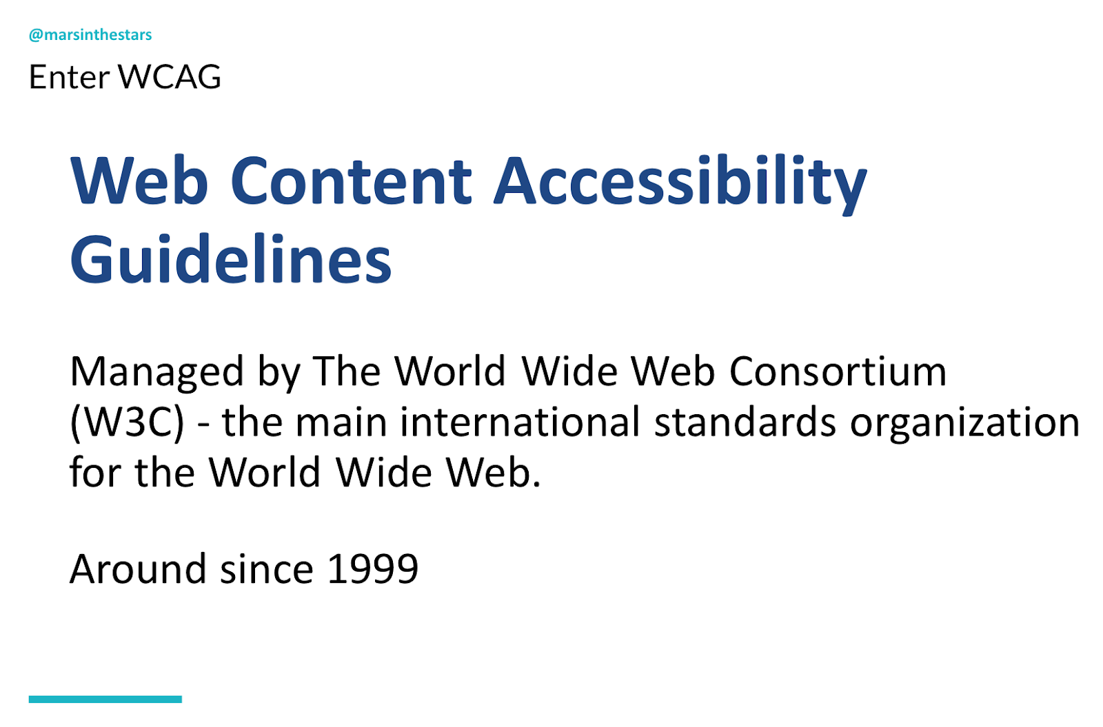
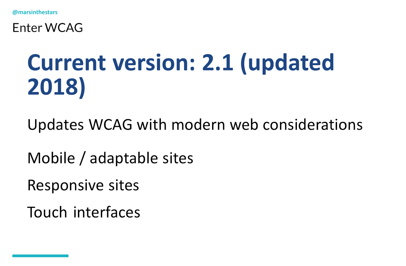
Luckily the Web Content Accessibility Guidelines are here to help us. They started around 1999, they were updated just a year ago and they don't get updated very often, so that's exciting news. Unluckily the web content accessibility guidelines are incredibly difficult to use.
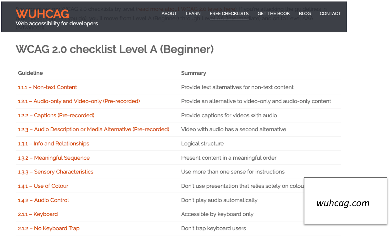
Even with the updated version from I guess it was now two years ago, they've made great improvements in addressing mobile sites, responsive sites, touch interfaces, but this is not plain language when it comes to accessibility. So there are a couple of different organisations out there that have taken a stab at making them more accessible as it were. There's one called WUHCAG, which I think is pretty funny. They have done what they can to take each of those areas and break it out and describe it in a little bit better of a summary.
But I also took a stab at this and I said, "okay, what are the main areas of WUHCAG that are not intended for developers but are actually things that we as content creators should be keeping in mind?" And I'm going to pull out a few for you. So first of all, WUHCAG is broken into four main areas and so these are the numbers that you're seeing at the top. The fourth area you can just draw out of your mind altogether. It's about the development elements needed to make all content and design accessible via different screen readers and other assistive technologies. So that's not something that we as content creators can do much about aside from reminding people that they should work on it. So we're going to focus on areas from one, two and three and within one, two and three there are many different elements.
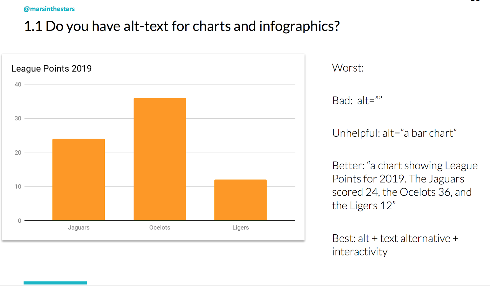
Alt-text
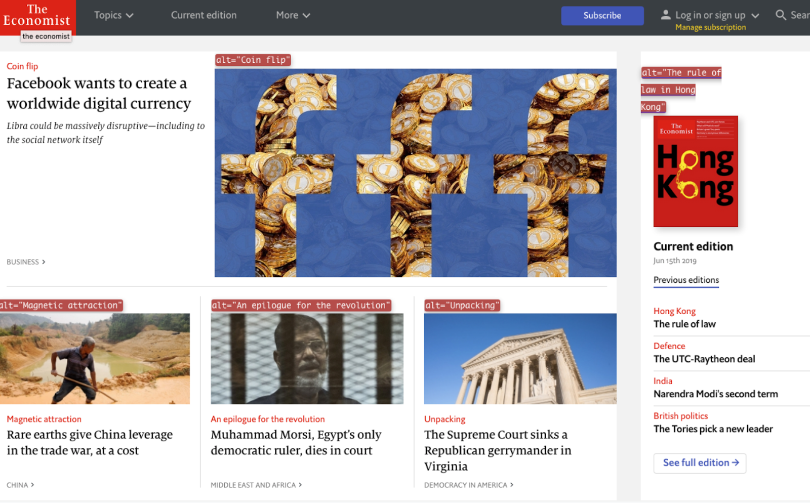
One good one for us to focus on is 1.1, which is alt-text. And not just alt-text, but good alt-text. You see there's alt-text that is not helpful. Alt-text is what a screen reader reads when somebody can't see an actual image, it's also what you get when you sometimes hover over or right click on something. So if we said "red Doritos bag" on this Amazon site, that's not particularly helpful as an alt tag. But when you describe the actual product, then it might be more useful. Here are a couple of examples on The Economist of truly terrible alt-text. You see, The Economist includes these images to help engage you, to make you more likely to click on a specific article. But when I see "coin flip" as the alt-text for this image, it doesn't tell me anything more. In fact, it doesn't tell me anything at all about this article and it doesn't make me more likely to click on it, so it's not being successful.
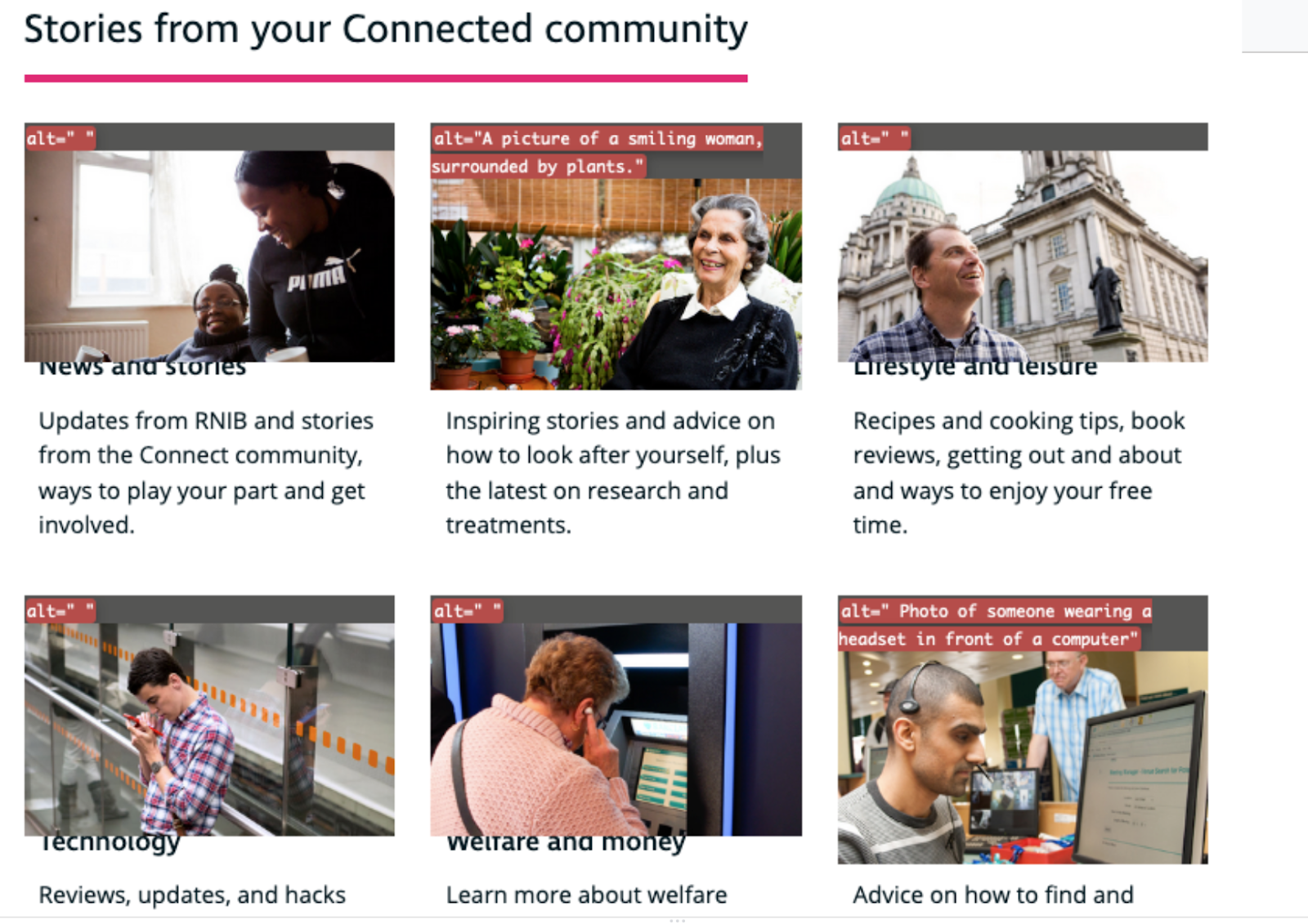
On the other hand, on a different website we're looking at, we have images where they made the strategic decision to exclude alt-text if the image itself was not valuable or likely to encourage people.
In this case simply because of the way that their layout is set up, they need to have an image for every blurb, but for a few of these they decide they don't think the images that were chosen are very helpful and others, they think that by telling you that, for example, "there's a picture of a smiling woman surrounded by plants", you might be more interested to check out some of these inspiring stories. So they're not only describing the image, they're describing it contextually.
Alt-text is also really helpful for any chart and any infographic. In fact, it's often necessary because a lot of articles will say something like "as the chart shows" or "see the chart" without describing it in the text, and while you could always just describe it in the text, you could also provide helpful alt-text for the chart itself.
I should note section one of WUHCAG is "perceivable", which is literally "can you see the information?" so that's what we're focusing on here.
Colour
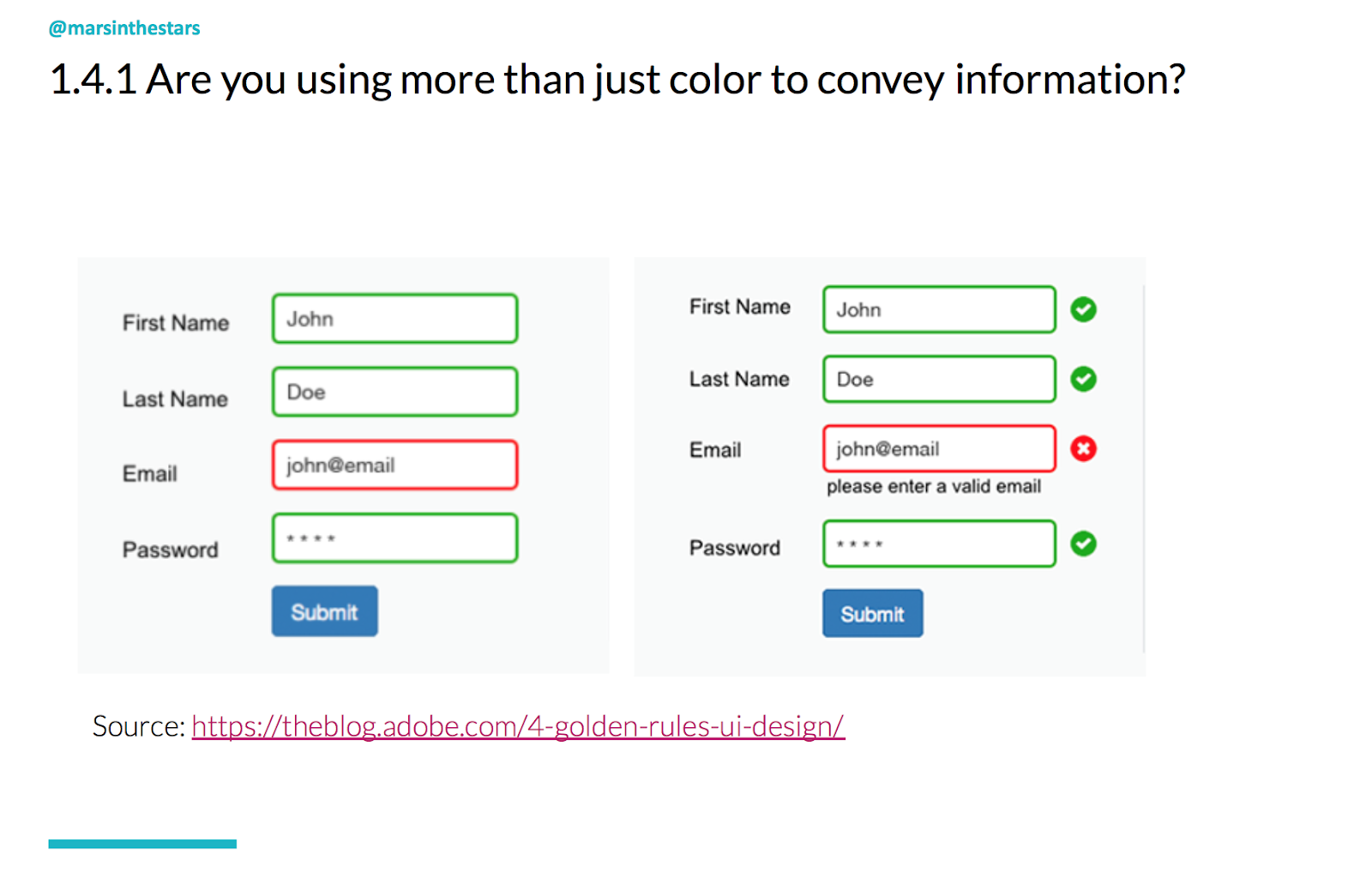
Another area is to make sure that our visual designers don't focus just on colour. For one thing, colour doesn't mean the same thing in every culture. For another, a large percentage of the population is colourblind and they can't tell the difference between red and green, which we in most Western cultures associate with right and wrong. It's so easy to fix. It doesn't mean you can't use colour if you think it's appropriate for your audience, thinking inclusively, it just means that we need to also include another way to get that information across. For example, a check mark or an X.
Links
Another area of accessibility that is great to focus on is making sure that your links make sense. This is again, one of those things that may have started for screen readers because with a screen reader, you can actually tell it to just read the calls to action, in which case it's just going to read, "click here, click here, click here, click here, click here." But it's also great for those stress cases when someone's scanning and they're only going to see the links, or the buttons or whatever it is that's being called out. For all of these different situations we want to make sure that when someone sees the link, they know what they're clicking on. So think about the difference between, "do you want to read more about accessibility?" "Click here" and just simplifying your content and making the link read about accessibility.
Now if you're thinking to yourself, "that's all well and good, but every time I sit down to create a good link it ends up exceedingly long or making no sense" then I've come up with a bit of a trick. The secret to good links is specificity.
We know, or if you don't know, then now you will know, that links should typically include a verb because someone is doing something by clicking. So instead of saying "click", you're telling them to, for example, "download" or "read". The more actionable the verb, often, the better. So "read" over "see,"but that's not enough because download doesn't tell us anything. So a verb and a noun like "download PDF", that's a little better. But again, if you're just seeing that you don't know what that PDF is about. So whenever possible you want a verb and a descriptive noun, not necessarily an adjective, we don't want to "download a lovely PDF", we want a descriptive noun. "Download accessibility PDF". In that way we can keep our links not terribly long, not make our designers want to kill us, but also actually being helpful to our audience. And then one other area I want to focus on is readability.
Readability
So we talk a lot about readability. There are a lot of different ideas about how readability works. For those who aren't familiar with it, it's typically a measure of how well people can read your content. And there are a couple of different measurements out there. The one I really love is Flesch-Kincaid. It's well researched, well created and Flesch-Kincaid was initially based on the concept of grade levels, specifically American grade levels. So a first grade reading level is what a six year old could read, an eighth grade reading level is what someone in the eighth grade typically 13 to 14 years old could read. But what's interesting about readability, and I think is important to remember, is that just because you graduated from the 12th grade, which most Americans do around the age of 18 does not mean that you have a 12th grade reading ability. It means that you have a 12th grade reading level when in a quiet library by yourself with your book and possibly a thesaurus.
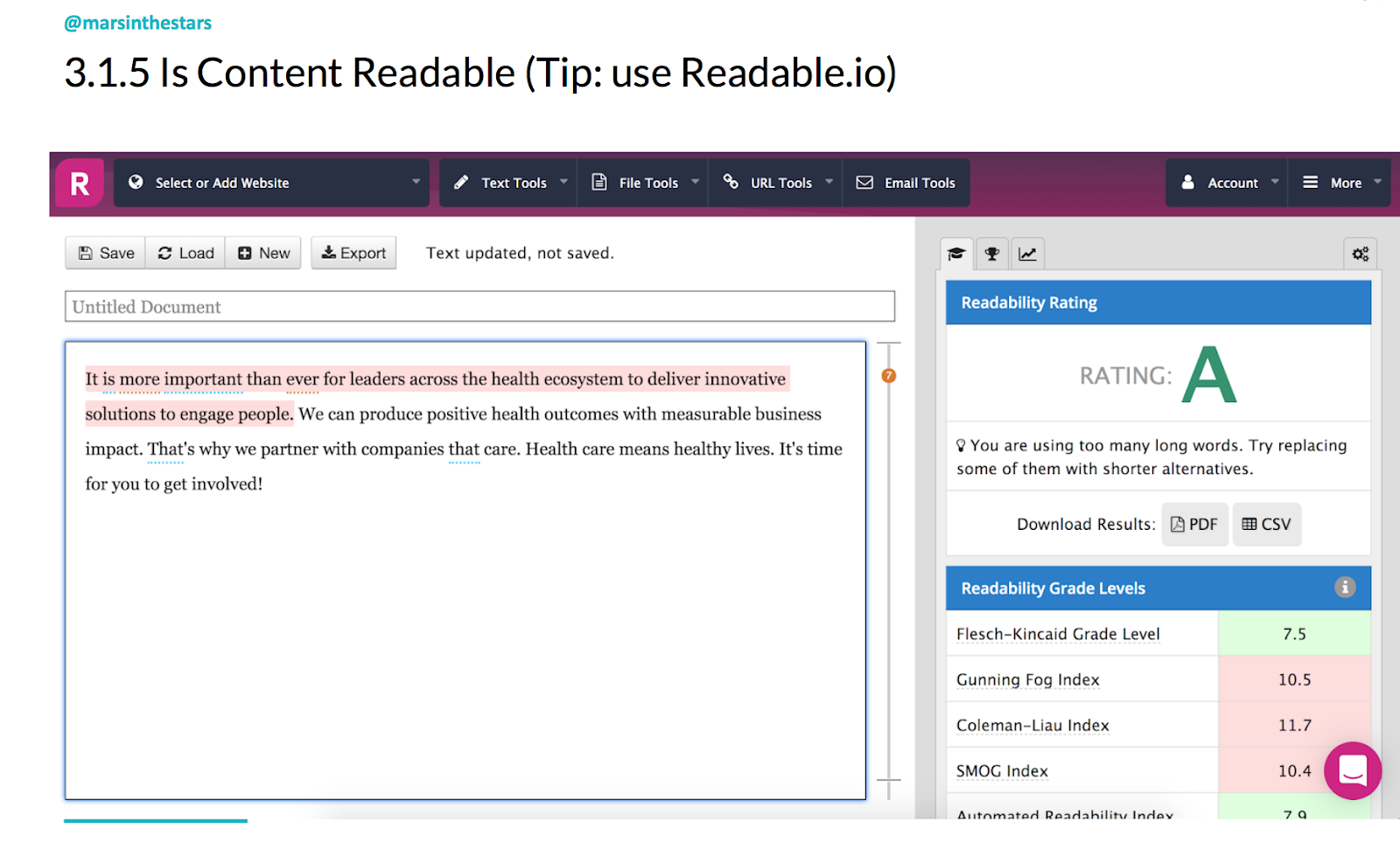
Most people on a day-to-day level read at about a seventh grade reading level. When they're reading things that are particularly difficult or complicated, that drops to maybe a sixth grade reading level because they're already trying to understand the topic without having to also understand. And when they're in a stress case that can drop to a fourth or fifth grade readability level. So when writing for readable content, my recommendation is that you find a tool that will give you your Flesch-Kincaid grade level. I like readable.io. It's free for the first several that you use and then it's not overly expensive. I also mentioned Hemingway app. I don't like that one as much because of the algorithm that they use to calculate. But all of this is new, using these different algorithms such as sentence length, number of large words, things like that. I think this is still a sort of new thing that we're exploring and learning how to do well. So yeah, but if there's one that I would recommend, it's readable.io.
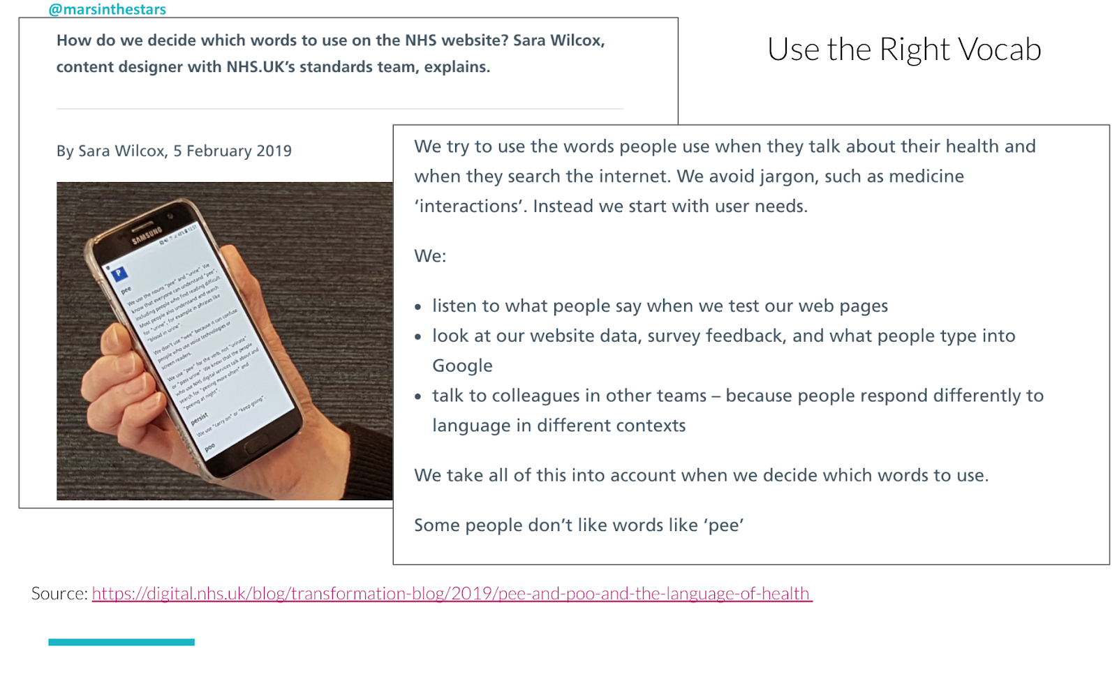
One thing that I also like is that when I work with healthcare companies, obviously terms like "oncologist" which might be necessary are going to make the grade level jump up so that to me is a flag. It might mean that yes, we need a slightly higher grade level than we would like to use, but it doesn't mean we just excuse it. What we do instead is make sure that any word that is flagging in the readability tool gets defined in another way. So we might keep the word oncologist in there, but say you're a doctor for cancer, afterwards. The NHS did a great job with this. They wrote an article last year that I absolutely love where they actually talked about trying to decide what terminology to use:
They even talk about things like "urine" versus "pee", and they had to consider both what the readability of it was, but also what the context was going to be and if people were going to find problems with using the word "pee" if it was going to bother them. So a very fun article, well-written and brings about a couple of great points there.
Error messages
One example in another area that we should focus on is our error messages.
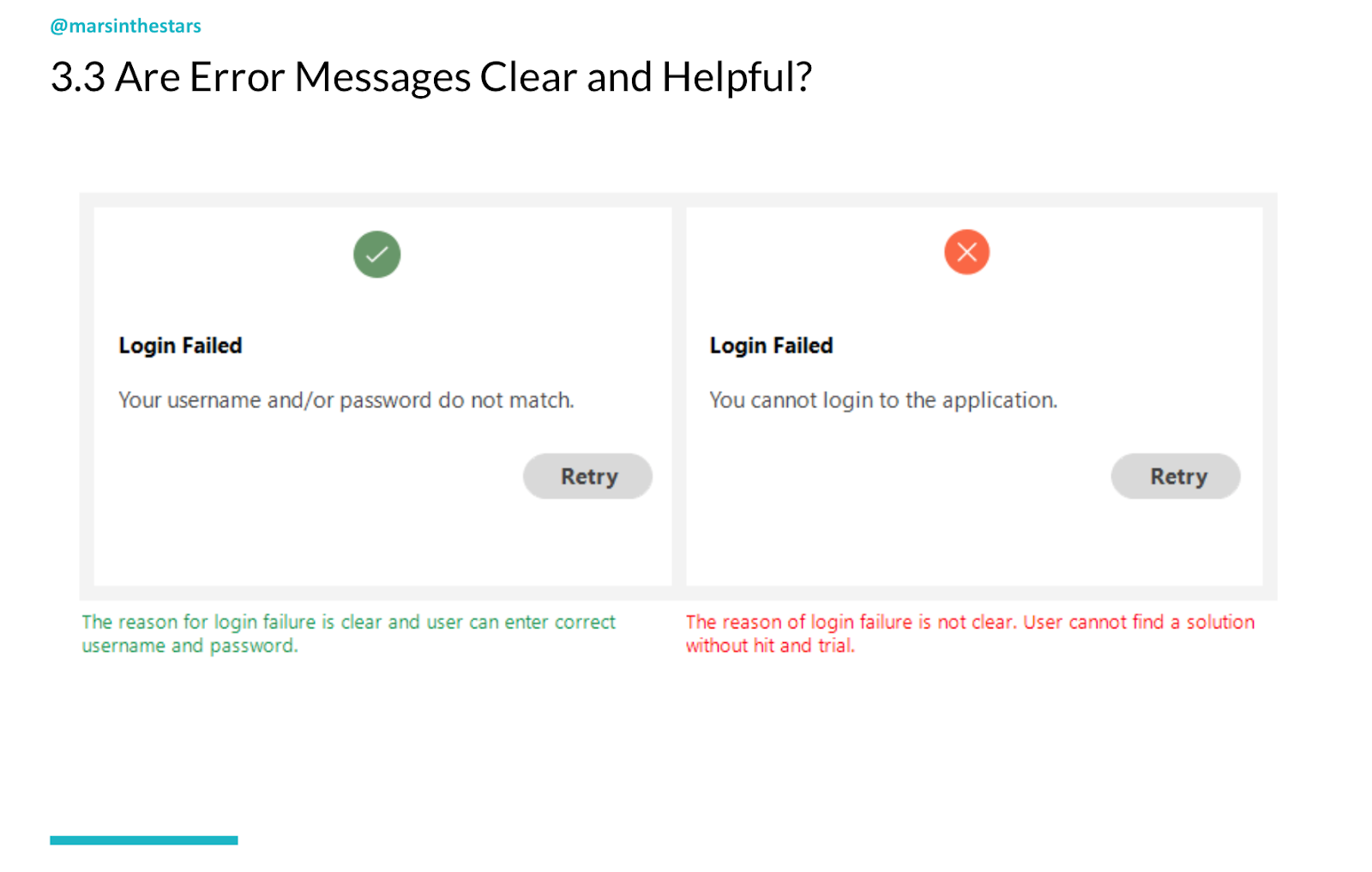
Now, anyone who's on the content strategy Facebook group or any microcopy groups has heard quite a bit about the problems with error messages. There's so many bad ones out there and anyone who's worked in any kind of secure organisation knows the problems with error messages. It's really hard to write one that's secure, because it doesn't give too much information. So what do we do? Well, I look for ways that we can help identify what the next step should be. Yes, it's ideal if we can say "your username does not match" or "I'm sorry, your username does not meet our requirements, here are the requirements." Or even better, "you don't have a username here, that is not a username that we see in our system." But I understand that for a lot of financial institutions, the best that they can get is "your username and/or password do not match" because it's a security issue.
So what I would look for, even though in this example we're showing how "retry" is better than simply, "you cannot log into the application. Retry." I think we can even go further though. I think we can offer an option for, "if you can't find your username, click this link to reset it or speak with one of our service agents to get more details." Some type of actionable element so that we're not simply saying "our error message is about telling you what the error is, and if we can't tell them what the error is, then oh well that's unfortunate." But actually saying "our error messages, they're action messages, they're solution messages, they're more than stating you have a problem. They're saying, here's how you can solve your problem."
All right, so I haven't gone through all of the elements that are in this accessibility checklist, but I did work with a design colleague of mine and we created this checklist so that if you don't want to dig through all of WUHCAG, you can download this accessibility checklist:
Ironically, we need to create a new version because the visual designer we brought in didn't follow our own checklist and it is not accessible, but we're working on that. We'll have new version out soon and I highly recommend that you follow these great ideas. There are also some more tools. I'm a huge fan of the NoCoffee vision simulator. You can download it onto Chrome or other browsers and you can actually click on specific buttons that will show you what your website looks like to somebody dealing with specific vision issues. So lots of great tools out there, lots of resources, and we can all do better.
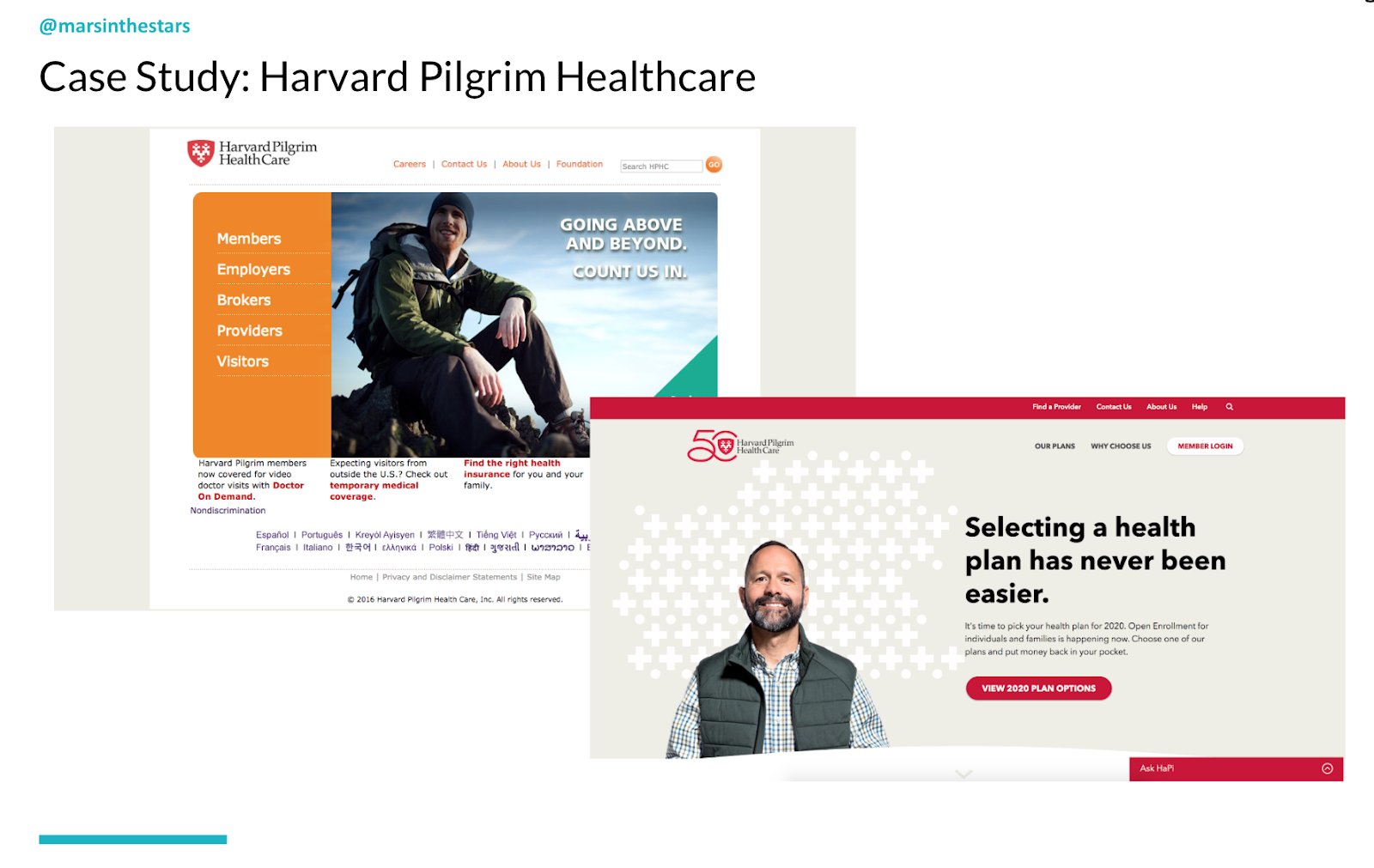
One example of where we got to use this was working with an organisation called Harvard Pilgrim and Harvard Pilgrim had asked us to understand what their audience needed, create plain language and make their site more usable and accessible.
I hate the fact that there is an insidious rumour out there that accessible content has to be dry and accessible design has to be ugly. It's plain and simple not true. In fact, our new website for Harvard Pilgrim does a better job of using their brand and pulling out the visual elements of their brand while also making it easier to read than their old site did. I'm incredibly proud of this. I think it's a great example of how information architecture or plain language, content creation and visual design can all come together to create a good experience, a phenomenal experience that is extremely accessible.
3. Fun
So last but not least, I want to touch on what I just said about how accessibility and plain language shouldn't be dry. If we're reading those Dick and Jane books, remember that's not plain language, that's just a kid's book. Well, we want information that's easy to understand, information that's readable, that's usable, but also information that understands our audience, gets at their needs, looks to their behaviors, creates actionable elements for them and makes them feel connected to us, engages them.
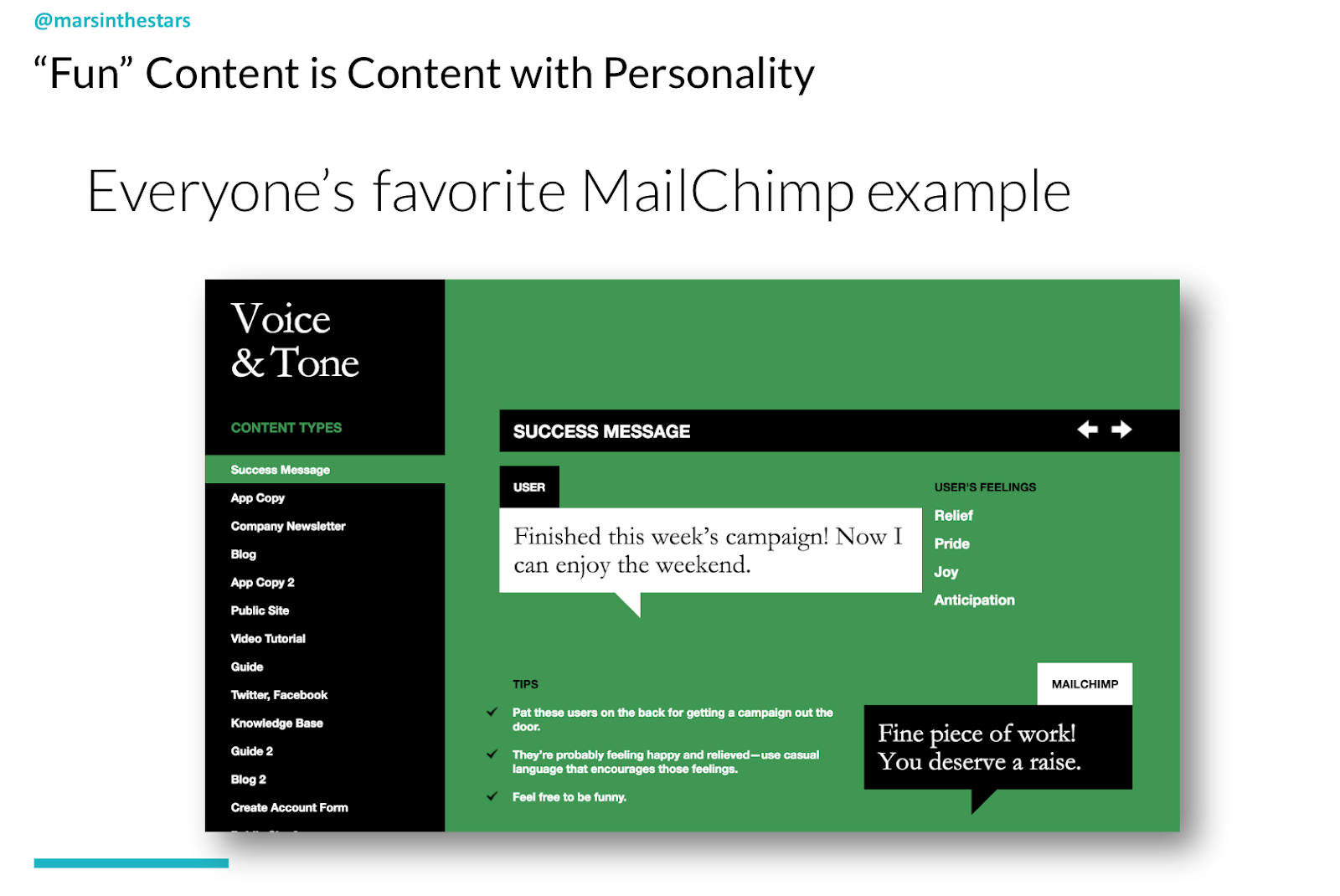
So when I say fun, I'm not saying "yes, when you are telling someone about terrible diagnosis, they should enjoy it." No, I'm saying they should feel connected to you. They should feel engaged. They shouldn't feel like they're going to fall asleep from what they're reading. And that brings me to voice and tone. Now I'm very sad to say that MailChimp has completely changed their voice and tone. So I'll still be pulling from our favorite MailChimp example, their former website:
They do have the site voice and tone and they did a great job in those early days of teaching people what a voice could do, of showing that we shouldn't just be saying "this is what we want to sound like, here's some examples of what that could be," but actually saying, "here's what we want to sound like and here's why. Here's how it responds to what our audience says." Remembering that everything we create is a conversation, so the user has feelings, and we need to respond to what they're really thinking or asking because, even though we can't hear them, we need to know what we're responding to.
What I recommend when creating your own voice and tone is taking those accessibility elements, taking what we know about our audience and then synopsising it.
When we've got those adjectives of "we want to be professional but not dry", well, why does that matter? What did we learn when we created our behavioral personas? What did we learn about our audience? What do we know about them? What is it about being professional but not dry that appeals to them and how do we do it? Is it elements of how accessible we are? Is it in the way that we use bullet points? Is it in the way that we choose to capitalise or not capitalise certain elements? So we want to get at sort of the mechanics of how we do it in that section.
Then we get into examples, and I like in this particular one I have, a "what it sounds like" and "what it sounds like on the website," because this was for a company that had in-person, a call centre and a website that people were using. You might also want to look at what it sounds like for video, and what it sounds like for social media because for all those different areas you want to play with, you need to think about how you're going to use those accessible elements and why it matters for that specific scenario, for that specific channel.
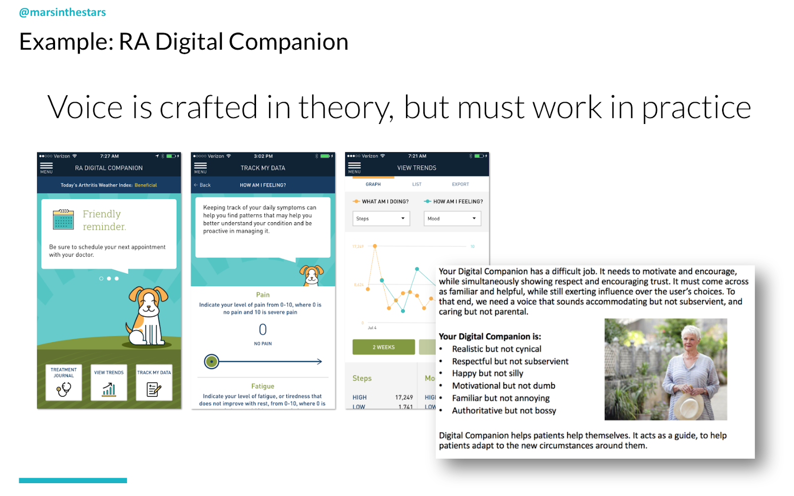
One example of a project I worked on, it's on the app store now, is that we created a voice for a digital companion for people struggling with rheumatoid arthritis. Now, rheumatoid arthritis is a tough illness because it doesn't actually have a cure. When people, ideally patients, should treat their rheumatoid arthritis, but they should be treating it because it can improve their quality of life, and a lot of people don't see the value in that. They're in pain most mornings when they wake up, they're frustrated. They've had to change a lot of the things that they do and this idea that they should be doing all of this PT, all of these exercises, they should be doing treatments. They should be meeting with providers, they should be taking medication, all to what? Not cure this?It's a hard thing to buy. So when we created the voice, I started by just saying, "here's what we know about our audience." This whole section over here with this lovely image of Judi Dench was just me saying, "here's what we know about our audience."
This is why the digital companion has a difficult job. These are the type of things that it needs to incorporate. From here I was then able to take those adjectives, "realistic, but not cynical, respectful, but not subservient". And for each one, get into the details of why that matters, how that pulls in what we know about the audience and how we do that and what it sounds like. And I like to think about a specific character in a book or a film, always fictional, who exemplifies what this voice sounds like to me. I don't like to choose real people because real people change too much. God forbid I actually chose Judi Dench and then she went off and I don't know, had an affair and ruined someone's life. And I said, nope, nobody's going to want her as your digital companion. But her character from a Best Exotic Marigold Hotel will still remain true. She will never change.
So that was helpful for me in thinking, in hearing what I needed to hear. But since I'm not going to be the only content creator, I needed to create this voice with these elements of inclusivity and accessibility so that other content creators could use it as well.
SEO
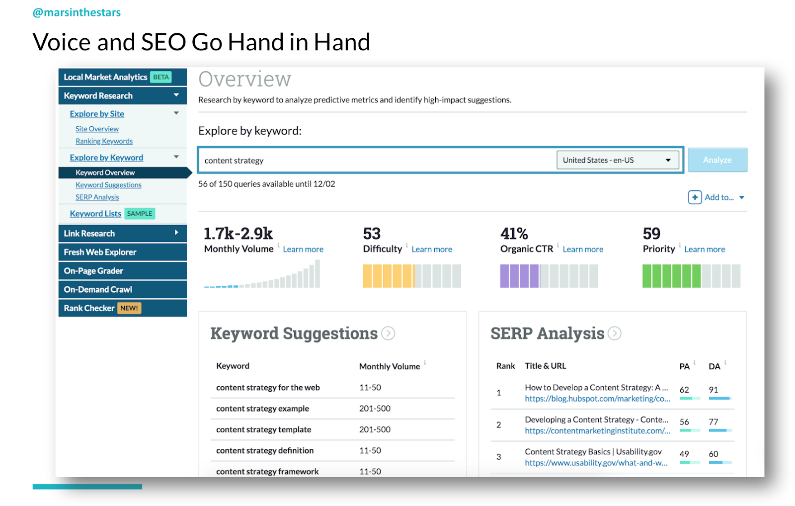
Now, I promised we would talk a little about SEO. I used to be the biggest, "I hate SEO" person in the world, but I've come around and part of the reason is honestly because SEO has gotten better. Google does a great job of trying to learn what people are actually looking for and then changing the rules of SEO so that people can cheat it less. This screenshot is from a tool called Moz. I'm a big fan of Moz. I like the way they approach SEO. I like the way that they write their articles. It's very easy for content strategists and content creators to understand. One of the things that they've taught me, honestly, through some of their tools is how SEO can further what we need to be doing to create good, useful content.
I'll just go very quickly through some of the ways that SEO can imply good content:
One thing that SEO requires you to do is choose one word or phrase to be the focus of a page of content. Great. That focuses what we're writing about. This is fantastic. The reason they require that is because that's what our audience looks for. They need us to use that term in our title as well as in the page text and the headers. Not too much, but enough so that at a glance someone would know that was the focus. Good SEO tools look for external and internal pages related to whatever that phrase is, so that we are both calling on other experts rather than just promoting ourselves, but also to show that this isn't just a one-off page that we created to try to get our audience. There was a time once long ago when a hospital I worked with put "black cats" and "trick-or-treating" as their main keywords across their site for Halloween, for the month of October, because they knew people were going to be searching for that.
You can't do that anymore. Now you would get cut out and I love that this is now the case. Good SEO means using language your audience uses. We actually get rated on that on tools like Moz and on the algorithms that Google uses, and you need to use alt-text for your images and your charts. Good SEO means creating that alt-text. So really all comes full circle.
And if you take nothing else away from today, just remember that by using inclusive language, by making everything accessible and by making the information easy to read and engaging, we can create plain language that helps people become healthy, wealthy and wise. Thank you.
Marli Mesibov is the VP of content strategy at the digital UX agency Mad*Pow, and she works on strategy and experiences across industries with a particular interest in healthcare, finance and education. She is a frequent conference speaker and a former editor of the UX publication. Marli was also voted one of Mindtouch's top 25 content strategist influencers in 2016. This is a transcript of Marli's webinar: Plain language can be inclusive, accessible and fun, with slides for context.
Successful communication through plain language
Content strategy is about communication and for communication to be successful, that means that we have to be getting our messages to the right people, at the right time and the right place. Right?
That's a pretty common definition of content strategy, but it's not successful just because you get the message to the right people in the right place. I mean, sure, for a long time we said, great, there's all this content out there. There's videos, there's copy, there's articles and blog posts and websites and oh my God, the internet is so overcrowded. How are we going to get information to people? If only we could get to the right people, at the right place and the right time, great, content strategy to the rescue. But really, even if all of that happens, if our audience can't understand what we're saying to them, then it's not a success. We're not actually communicating. So with that in mind, that probably brings us to some of the reasons that you're here today.
Webinar goals
Maybe you came because you said, "okay, plain language, well, isn't that what we just do every day? Isn't that just common sense?" And I'm going to talk a little bit about why it's actually not, and in some cases why it is, but why common sense is perhaps not so common.
Some of you may be thinking, "yes, let's chat about what plain language is, but I don't really know how to make sure I'm doing it right." So we will look at some specific resources to help you. We'll look at specific best practices. I try to be as actionable as possible. Some of you may say, "I've got the tools, but really do we have to do SEO? What does it mean to use these readability tools?" So we go into a little bit of that and then of course we will also look at measurement itself, because we want to make sure that our plain language is successful, that we know that we are communicating with people, that we are helping them to do the things that they are trying to do.
So, what is plain language?
Let's hit that first bullet point first. We'll talk about what plain language actually is. Well, you might think of plain language as language that is easy to read. It's easy to understand. In that case, those Dick and Jane books that were so popular a couple of decades ago, that's plain language, right? But it's not, because that was created for an audience of five and six year olds learning to read. It was not created for the audience that you are probably trying to communicate with. And what differentiates plain language from just well-written content is that plain language is written with a specific context in mind. It's written with a strategy in mind. It's written with the understanding that there is a message that we need to get across, and that that message needs to be promoted while still being easy to read and easy to understand.
And you might think, or at least I often think, "okay, of course I can do that", but then I'll write something out and I'll realise I'm writing it because it's easy for me to read and understand, but I have a lot of assumptions in place that are not necessarily accurate for my audience. Let's be a little more specific here. We're talking about complex information, whether that is because you are selling a vacuum cleaner that has specific technical requirements and elements that make sense to the product owners and to the people building the vacuum cleaner, but not to the people trying to purchase it who actually don't want a vacuum cleaner, they want a clean house. Or whether you are working on some of the areas that I tend to focus on where a lot of my examples will come from which are healthcare, finance and education.
Why do people need plain language?
People don't want healthcare, they don't want wealth management. They certainly don't want higher education. They want to be healthy, wealthy, and wise. We will then get into what that means and really we're going to focus on the three areas that you should know because they were right there in the title of this webinar. We're going to talk about how plain language can be:
Inclusive
Accessible
Fun
Tools
A couple of the things that you can look out for are some tools that we're going to touch on. We're going to look at readable.io, the Hemingway app and Moz SEO.
Processes
We also are going to look at a few specific processes. We're going to talk about health literacy, which is very applicable to all industries. It just so happens that healthcare in the United States is one of the few areas that's created a specific literacy plan. We're going to talk about how to empathise with a full population and sympathise with full population as opposed to individually, and we're going to look at some ways, some processes for eliminating jargon. Let's dive in.
1. Inclusivity
I start with inclusivity partially because I find it to be the least understood of those three - inclusivity, accessibility and fun - and partially because it is to my mind, the first step. Inclusivity is different from accessibility or universality or just general empathy because it's not about designing one thing that will work for everyone, it's about learning about your audience and learning who the individuals are. And I'm not going to pretend that it makes our lives easier. It actually makes our lives more complex, but it makes our end designs and our end content much better. And what it requires is personas.
I know, I know you've been reading 18,000 articles out there about how "personas are dead, long live personas, they're useless. They're assumptions. They're not helpful.'" Well, I'm here to tell you that that's not quite true. Or rather, the reason personas get such a bad rep is because they tend to be demographic personas. They tend to be things about how old people are or how much money they have or whether they're like their parents or not. But really what we want to be paying attention to is what we can understand about why people may take the actions that they do, what their behaviours are. So one way that we've started to do this at Mad*Pow is through MPACT, which is a sort of board game that we created to create behavioural personas.
MPACT looks at not the demographics but actually, things like:
Does your audience tend to prefer to take things on independently or to look for help?
How much do they tend to trust organisations?
How much do they tend to pay attention to detail?
And all of these are on a spectrum. And by looking at all of these different attributes, we can understand how they would approach the objective that they are trying to accomplish, so that's one way. And there are others, but I love this approach partially because it's already set up for me and you can find this on Mad*Pow website.
A second part of developing this inclusive understanding is to plan; to think about not only what we want someone to do but where they are. What is the scenario? And for this I'm thinking about and I've taken a lot of my cues from Eric Meyer and Sarah Wachter-Boettcher book Designed for Real Life. They've done an amazing job of changing the mindset from the sort of 80/20 perspective where we say, "okay well 80% of people do things the normal way and then there are edge cases." Well that's not really accurate, particularly when we get into complex types, complex industries, and complex areas. What we're really dealing with is not "normal and edge" cases, but actually "ideal and stress."
You see when you or I create a flow, and we say someone's going to come to our homepage and then they will click on this, and they will read through it and they will understand it and then they will click on this area to get more details and then they will purchase our product, or they will come and they will see the hours that we are available. And then they will come and see us and we will help them. Whatever that use case may be, those flows are idealised. In reality, the vast majority of people are dealing with stress cases. They're not calling because they're interested in getting a little bit of help with their washer and dryer and they've got plenty of time to chat with us and to go calmly through the website to find exactly what they need. No, the washer and dryer broke, they've got a screaming baby who just threw up over their last set of clean sheets. Their parents are coming to visit tomorrow and the house is a mess and they need somebody to come help them immediately.
They don't have time to read through calmly. They're scanning, they're stressed, they're frustrated. These kinds of stress cases are scenario-based and we need to think about "are they on their phone or their laptop or their tablet? What is going to pop out to them and how can we make this as easy as possible?" Another way of thinking about inclusivity is to think that we are not even just dealing with their scenario, we're dealing with their whole lives.
William Osler was a physician in the early nineteen hundreds and he said, "the good physician treats the disease, but the great physician treats the patient who has the disease." I love this. In the States we have a huge problem with people getting treated for their health.
A lot of providers typically have 15 minute windows to see patients. They do not have the time to do more than read their notes and send them on to someone else. And yet what patients really need is someone who sees them as a human being, who can see not only "you have this rash and here's a possible ointment and we can assume it might be this thing because 80% of people have this", but actually, "oh you have this rash and you were traveling to this area and that's an area where this actually very rare thing is much more prevalent."
So I gave you these different examples to bring us about to the fact that we as content creators need to think about our plain language in the case of scenarios. We need to think about our plain language as not only what makes sense to me, or what is the simplest way to say something, but actually what language does my audience use in their day-to-day life?
So maybe I call something an "auto loan", because I work in the car industry, but my audience calls it their "payments." Now, "payments" to me sounds too vague, too broad. As a good content strategist, I would avoid such a vague term. But not if I know my audience, and not if I understand their context enough to make sure that I'm speaking about their payments in a way that they're seeing it at the right time and the right place and that it will make sense to them, because it's tied to the button that they need to get to, or because it's right there on the main screen, because I've learned that the most stressful moment for them is when they have an overdue bill. I mentioned talking about the process that we go through for health literacy.
Health literacy
In 2010 former President Obama started an initiative in the States to focus on improving health literacy across all 50 states. One of the areas that this really took charge was identifying these health literacy levels.
And what they said was, a basic health literacy level is saying that you can understand a form, you can fill out your information, you can say, "yes, I agree to this privacy practice." You understand those basics. You can read the information, it's readable, it's just at base level, you can do that. But above that there's actually an intermediate or an interactive level of health literacy, which is that "I've got past the forms which I did on my own, but I also am comfortable and confident speaking with a provider, asking questions, maybe even interrupting them or asking for a second opinion if I didn't understand my options. If they're suggesting surgery, then I'm comfortable before going to hospital, actually speaking with a few other providers to see if they agree with that." But that's not even enough to take care of yourself.
In order to truly care for your own health, you need to have a proficient or critical level of health literacy. That means that you're able to hear those different second opinions and then evaluate them. There's almost a mathematical part to this of understanding the percentages, and what I love about the way that health literacy levels look at things (and I actually think this applies to all industries) is that in a moment of crisis, you don't stay at your level of proficient or critical. Even if you work in healthcare every day, you might bop way back down to below basic and not even be able to focus on enough to fill out your form because you just found out about a terrible diagnosis or a family member who was in an accident. As you can see, and this is specific to the States, the research showed that only 12% of people at any given time have proficient or critical health literacy.
I would love if we could take that idea and that knowledge of how difficult it is to have proficient or critical literacy and apply it to all industries. Because that is where we, as language creators, can start to focus on how can we pull out that most basic information and make sure that we are providing it in a way that makes sense at this moment. Quick example from Visible Thread:
I gave a presentation a few years ago that I absolutely loved where they talked about their work working with cancer.net. They found that most people coming to cancer.net were people who have either just received a diagnosis or just found out that a loved one had a diagnosis, and yet when they did an evaluation using their specific tool, they found that over 26% of the sentences were exceedingly long. They found that the readability level was, I mean the whole thing was just terrible. It was just not a good situation.
Over time, they were able to update the content and get all of the levels significantly better to a point where the readability level was at such a point that people who had no idea what was going on and were terrified could actually read it and understand it, and this to me is just such a great success story. A large organisation like cancer.net could work with an outside agency and could understand that this wasn't about being 100% oncologically accurate in every single moment, it was about creating something that was useful to people in the moment.
Finance
Another example outside of healthcare is a project I worked on a few years ago. This was to help people to understand and improve their financial savings and specifically people who were in a low-income bracket.
Now, what was interesting about this and what I want to call attention to is the process that we used. Instead of saying, 'let's start by taking complex content and just writing it more easily,' we started by asking people, by doing research and saying to them, "what are you struggling with?"
You see, we thought that the problem was that they needed to learn how to budget. But when we spoke with them, we learned that a lot of the people in this low-income bracket were working jobs where they received a different pay check every week. Their pay checks were hourly, not exact. And so although they may have known that they, for our budget needed $500 a month to live off of, each week they were receiving a pay check once for $100, once for $300 once for $50 and so when these pay checks were coming in, it was very difficult for them to connect that to their budget because you can't just wait until the end of the month to spend any of your money. You have to pay rent at the beginning of the month. You have to buy food throughout the month. Plenty of things come up, and so we changed our entire approach. We listened to how they talked about their money and instead of forcing them to "learn budgeting," we instead looked for where they actually needed education.
Did they actually need to learn budgeting or did we need to learn from them about how they lived their lives and create content that help them to spend less and save more, for example? Or pick a goal and create an emergency fund, which many people need, but most people don't have? Or were they already in sort of a disaster zone where they were in debt, they were struggling, there had been a problem and they needed to find a way to get access to their money? So the program that we ended up creating was much more focused on plain language for this audience and much less focused on this idea of just common sense language.
2. Accessibility
Next up, accessibility. We've accounted for the fact that everyone's different, now let's account for the fact that we're all the same because when we think about accessibility, it's really easy for other people to say, "oh yeah, there are people who are blind or there are people who are deaf, but it's not everyone. Right?" Well, actually, we are all just temporarily abled. I love this quote, I love this idea. And Microsoft, of all organisations, create a phenomenal inclusive design toolkit where they touch on what it is about accessibility that is so universal.
You see, sure, there are elements of accessibility that are permanent. There are people who do struggle with blindness or deafness, but there are also times that we are all temporarily struggling. That means things like:
Maybe with an arm injury, that means we can't type with both hands
Cataracts, which can be cured, but means that temporarily you really can't see and you're using a screen reader
An ear infection for example, could stop you from being able to hear temporarily
And then there are situational elements. Think about the number of times that you've had your hand and a bag or something in the other. You are just as unable to use both hands as you would be if any other situation were coming up that had you dealing with a disability. And that's not to say that we shouldn't be incredibly conscious of the ways that disabilities affect people. It's actually to say that we should be more conscious, that we should stop thinking about this as another separate element. And one way to remember that honestly is to think of everyone as dealing with various disabilities at any given time.
Luckily the Web Content Accessibility Guidelines are here to help us. They started around 1999, they were updated just a year ago and they don't get updated very often, so that's exciting news. Unluckily the web content accessibility guidelines are incredibly difficult to use.
Even with the updated version from I guess it was now two years ago, they've made great improvements in addressing mobile sites, responsive sites, touch interfaces, but this is not plain language when it comes to accessibility. So there are a couple of different organisations out there that have taken a stab at making them more accessible as it were. There's one called WUHCAG, which I think is pretty funny. They have done what they can to take each of those areas and break it out and describe it in a little bit better of a summary.
But I also took a stab at this and I said, "okay, what are the main areas of WUHCAG that are not intended for developers but are actually things that we as content creators should be keeping in mind?" And I'm going to pull out a few for you. So first of all, WUHCAG is broken into four main areas and so these are the numbers that you're seeing at the top. The fourth area you can just draw out of your mind altogether. It's about the development elements needed to make all content and design accessible via different screen readers and other assistive technologies. So that's not something that we as content creators can do much about aside from reminding people that they should work on it. So we're going to focus on areas from one, two and three and within one, two and three there are many different elements.
Alt-text
One good one for us to focus on is 1.1, which is alt-text. And not just alt-text, but good alt-text. You see there's alt-text that is not helpful. Alt-text is what a screen reader reads when somebody can't see an actual image, it's also what you get when you sometimes hover over or right click on something. So if we said "red Doritos bag" on this Amazon site, that's not particularly helpful as an alt tag. But when you describe the actual product, then it might be more useful. Here are a couple of examples on The Economist of truly terrible alt-text. You see, The Economist includes these images to help engage you, to make you more likely to click on a specific article. But when I see "coin flip" as the alt-text for this image, it doesn't tell me anything more. In fact, it doesn't tell me anything at all about this article and it doesn't make me more likely to click on it, so it's not being successful.
On the other hand, on a different website we're looking at, we have images where they made the strategic decision to exclude alt-text if the image itself was not valuable or likely to encourage people.
In this case simply because of the way that their layout is set up, they need to have an image for every blurb, but for a few of these they decide they don't think the images that were chosen are very helpful and others, they think that by telling you that, for example, "there's a picture of a smiling woman surrounded by plants", you might be more interested to check out some of these inspiring stories. So they're not only describing the image, they're describing it contextually.
Alt-text is also really helpful for any chart and any infographic. In fact, it's often necessary because a lot of articles will say something like "as the chart shows" or "see the chart" without describing it in the text, and while you could always just describe it in the text, you could also provide helpful alt-text for the chart itself.
I should note section one of WUHCAG is "perceivable", which is literally "can you see the information?" so that's what we're focusing on here.
Colour
Another area is to make sure that our visual designers don't focus just on colour. For one thing, colour doesn't mean the same thing in every culture. For another, a large percentage of the population is colourblind and they can't tell the difference between red and green, which we in most Western cultures associate with right and wrong. It's so easy to fix. It doesn't mean you can't use colour if you think it's appropriate for your audience, thinking inclusively, it just means that we need to also include another way to get that information across. For example, a check mark or an X.
Links
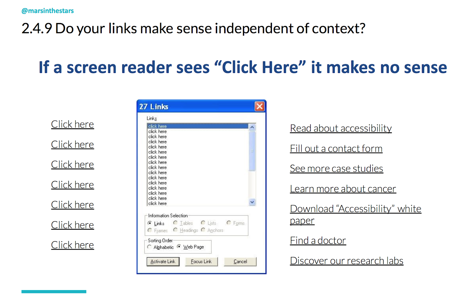
Another area of accessibility that is great to focus on is making sure that your links make sense. This is again, one of those things that may have started for screen readers because with a screen reader, you can actually tell it to just read the calls to action, in which case it's just going to read, "click here, click here, click here, click here, click here." But it's also great for those stress cases when someone's scanning and they're only going to see the links, or the buttons or whatever it is that's being called out. For all of these different situations we want to make sure that when someone sees the link, they know what they're clicking on. So think about the difference between, "do you want to read more about accessibility?" "Click here" and just simplifying your content and making the link read about accessibility.
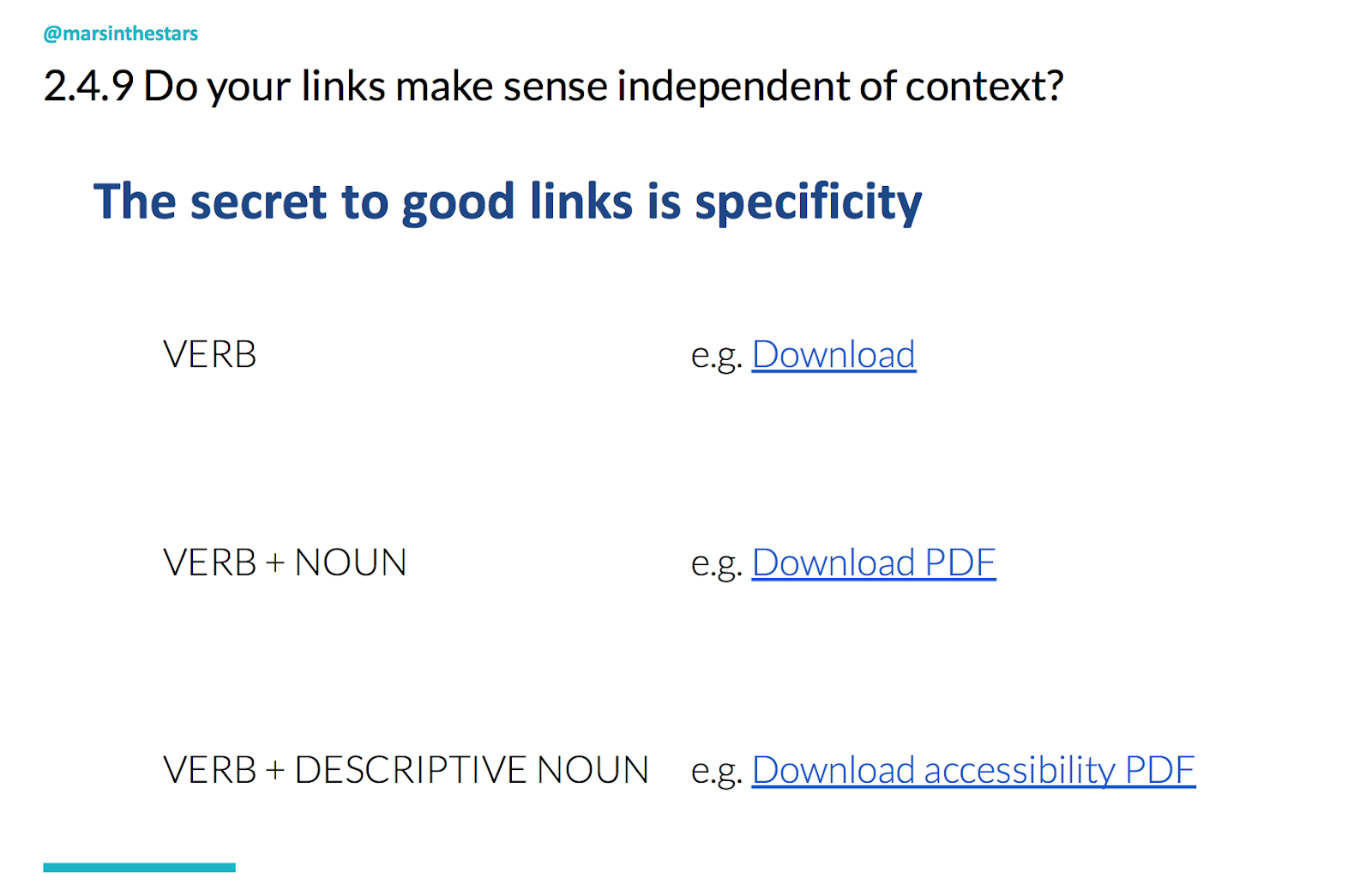
Now if you're thinking to yourself, "that's all well and good, but every time I sit down to create a good link it ends up exceedingly long or making no sense" then I've come up with a bit of a trick. The secret to good links is specificity.
We know, or if you don't know, then now you will know, that links should typically include a verb because someone is doing something by clicking. So instead of saying "click", you're telling them to, for example, "download" or "read". The more actionable the verb, often, the better. So "read" over "see,"but that's not enough because download doesn't tell us anything. So a verb and a noun like "download PDF", that's a little better. But again, if you're just seeing that you don't know what that PDF is about. So whenever possible you want a verb and a descriptive noun, not necessarily an adjective, we don't want to "download a lovely PDF", we want a descriptive noun. "Download accessibility PDF". In that way we can keep our links not terribly long, not make our designers want to kill us, but also actually being helpful to our audience. And then one other area I want to focus on is readability.
Readability
So we talk a lot about readability. There are a lot of different ideas about how readability works. For those who aren't familiar with it, it's typically a measure of how well people can read your content. And there are a couple of different measurements out there. The one I really love is Flesch-Kincaid. It's well researched, well created and Flesch-Kincaid was initially based on the concept of grade levels, specifically American grade levels. So a first grade reading level is what a six year old could read, an eighth grade reading level is what someone in the eighth grade typically 13 to 14 years old could read. But what's interesting about readability, and I think is important to remember, is that just because you graduated from the 12th grade, which most Americans do around the age of 18 does not mean that you have a 12th grade reading ability. It means that you have a 12th grade reading level when in a quiet library by yourself with your book and possibly a thesaurus.
Most people on a day-to-day level read at about a seventh grade reading level. When they're reading things that are particularly difficult or complicated, that drops to maybe a sixth grade reading level because they're already trying to understand the topic without having to also understand. And when they're in a stress case that can drop to a fourth or fifth grade readability level. So when writing for readable content, my recommendation is that you find a tool that will give you your Flesch-Kincaid grade level. I like readable.io. It's free for the first several that you use and then it's not overly expensive. I also mentioned Hemingway app. I don't like that one as much because of the algorithm that they use to calculate. But all of this is new, using these different algorithms such as sentence length, number of large words, things like that. I think this is still a sort of new thing that we're exploring and learning how to do well. So yeah, but if there's one that I would recommend, it's readable.io.
One thing that I also like is that when I work with healthcare companies, obviously terms like "oncologist" which might be necessary are going to make the grade level jump up so that to me is a flag. It might mean that yes, we need a slightly higher grade level than we would like to use, but it doesn't mean we just excuse it. What we do instead is make sure that any word that is flagging in the readability tool gets defined in another way. So we might keep the word oncologist in there, but say you're a doctor for cancer, afterwards. The NHS did a great job with this. They wrote an article last year that I absolutely love where they actually talked about trying to decide what terminology to use:
They even talk about things like "urine" versus "pee", and they had to consider both what the readability of it was, but also what the context was going to be and if people were going to find problems with using the word "pee" if it was going to bother them. So a very fun article, well-written and brings about a couple of great points there.
Error messages
One example in another area that we should focus on is our error messages.
Now, anyone who's on the content strategy Facebook group or any microcopy groups has heard quite a bit about the problems with error messages. There's so many bad ones out there and anyone who's worked in any kind of secure organisation knows the problems with error messages. It's really hard to write one that's secure, because it doesn't give too much information. So what do we do? Well, I look for ways that we can help identify what the next step should be. Yes, it's ideal if we can say "your username does not match" or "I'm sorry, your username does not meet our requirements, here are the requirements." Or even better, "you don't have a username here, that is not a username that we see in our system." But I understand that for a lot of financial institutions, the best that they can get is "your username and/or password do not match" because it's a security issue.
So what I would look for, even though in this example we're showing how "retry" is better than simply, "you cannot log into the application. Retry." I think we can even go further though. I think we can offer an option for, "if you can't find your username, click this link to reset it or speak with one of our service agents to get more details." Some type of actionable element so that we're not simply saying "our error message is about telling you what the error is, and if we can't tell them what the error is, then oh well that's unfortunate." But actually saying "our error messages, they're action messages, they're solution messages, they're more than stating you have a problem. They're saying, here's how you can solve your problem."
All right, so I haven't gone through all of the elements that are in this accessibility checklist, but I did work with a design colleague of mine and we created this checklist so that if you don't want to dig through all of WUHCAG, you can download this accessibility checklist:
Ironically, we need to create a new version because the visual designer we brought in didn't follow our own checklist and it is not accessible, but we're working on that. We'll have new version out soon and I highly recommend that you follow these great ideas. There are also some more tools. I'm a huge fan of the NoCoffee vision simulator. You can download it onto Chrome or other browsers and you can actually click on specific buttons that will show you what your website looks like to somebody dealing with specific vision issues. So lots of great tools out there, lots of resources, and we can all do better.
One example of where we got to use this was working with an organisation called Harvard Pilgrim and Harvard Pilgrim had asked us to understand what their audience needed, create plain language and make their site more usable and accessible.
I hate the fact that there is an insidious rumour out there that accessible content has to be dry and accessible design has to be ugly. It's plain and simple not true. In fact, our new website for Harvard Pilgrim does a better job of using their brand and pulling out the visual elements of their brand while also making it easier to read than their old site did. I'm incredibly proud of this. I think it's a great example of how information architecture or plain language, content creation and visual design can all come together to create a good experience, a phenomenal experience that is extremely accessible.
3. Fun
So last but not least, I want to touch on what I just said about how accessibility and plain language shouldn't be dry. If we're reading those Dick and Jane books, remember that's not plain language, that's just a kid's book. Well, we want information that's easy to understand, information that's readable, that's usable, but also information that understands our audience, gets at their needs, looks to their behaviors, creates actionable elements for them and makes them feel connected to us, engages them.
So when I say fun, I'm not saying "yes, when you are telling someone about terrible diagnosis, they should enjoy it." No, I'm saying they should feel connected to you. They should feel engaged. They shouldn't feel like they're going to fall asleep from what they're reading. And that brings me to voice and tone. Now I'm very sad to say that MailChimp has completely changed their voice and tone. So I'll still be pulling from our favorite MailChimp example, their former website:
They do have the site voice and tone and they did a great job in those early days of teaching people what a voice could do, of showing that we shouldn't just be saying "this is what we want to sound like, here's some examples of what that could be," but actually saying, "here's what we want to sound like and here's why. Here's how it responds to what our audience says." Remembering that everything we create is a conversation, so the user has feelings, and we need to respond to what they're really thinking or asking because, even though we can't hear them, we need to know what we're responding to.
What I recommend when creating your own voice and tone is taking those accessibility elements, taking what we know about our audience and then synopsising it.
When we've got those adjectives of "we want to be professional but not dry", well, why does that matter? What did we learn when we created our behavioral personas? What did we learn about our audience? What do we know about them? What is it about being professional but not dry that appeals to them and how do we do it? Is it elements of how accessible we are? Is it in the way that we use bullet points? Is it in the way that we choose to capitalise or not capitalise certain elements? So we want to get at sort of the mechanics of how we do it in that section.
Then we get into examples, and I like in this particular one I have, a "what it sounds like" and "what it sounds like on the website," because this was for a company that had in-person, a call centre and a website that people were using. You might also want to look at what it sounds like for video, and what it sounds like for social media because for all those different areas you want to play with, you need to think about how you're going to use those accessible elements and why it matters for that specific scenario, for that specific channel.
One example of a project I worked on, it's on the app store now, is that we created a voice for a digital companion for people struggling with rheumatoid arthritis. Now, rheumatoid arthritis is a tough illness because it doesn't actually have a cure. When people, ideally patients, should treat their rheumatoid arthritis, but they should be treating it because it can improve their quality of life, and a lot of people don't see the value in that. They're in pain most mornings when they wake up, they're frustrated. They've had to change a lot of the things that they do and this idea that they should be doing all of this PT, all of these exercises, they should be doing treatments. They should be meeting with providers, they should be taking medication, all to what? Not cure this?It's a hard thing to buy. So when we created the voice, I started by just saying, "here's what we know about our audience." This whole section over here with this lovely image of Judi Dench was just me saying, "here's what we know about our audience."
This is why the digital companion has a difficult job. These are the type of things that it needs to incorporate. From here I was then able to take those adjectives, "realistic, but not cynical, respectful, but not subservient". And for each one, get into the details of why that matters, how that pulls in what we know about the audience and how we do that and what it sounds like. And I like to think about a specific character in a book or a film, always fictional, who exemplifies what this voice sounds like to me. I don't like to choose real people because real people change too much. God forbid I actually chose Judi Dench and then she went off and I don't know, had an affair and ruined someone's life. And I said, nope, nobody's going to want her as your digital companion. But her character from a Best Exotic Marigold Hotel will still remain true. She will never change.
So that was helpful for me in thinking, in hearing what I needed to hear. But since I'm not going to be the only content creator, I needed to create this voice with these elements of inclusivity and accessibility so that other content creators could use it as well.
SEO
Now, I promised we would talk a little about SEO. I used to be the biggest, "I hate SEO" person in the world, but I've come around and part of the reason is honestly because SEO has gotten better. Google does a great job of trying to learn what people are actually looking for and then changing the rules of SEO so that people can cheat it less. This screenshot is from a tool called Moz. I'm a big fan of Moz. I like the way they approach SEO. I like the way that they write their articles. It's very easy for content strategists and content creators to understand. One of the things that they've taught me, honestly, through some of their tools is how SEO can further what we need to be doing to create good, useful content.
I'll just go very quickly through some of the ways that SEO can imply good content:
One thing that SEO requires you to do is choose one word or phrase to be the focus of a page of content. Great. That focuses what we're writing about. This is fantastic. The reason they require that is because that's what our audience looks for. They need us to use that term in our title as well as in the page text and the headers. Not too much, but enough so that at a glance someone would know that was the focus. Good SEO tools look for external and internal pages related to whatever that phrase is, so that we are both calling on other experts rather than just promoting ourselves, but also to show that this isn't just a one-off page that we created to try to get our audience. There was a time once long ago when a hospital I worked with put "black cats" and "trick-or-treating" as their main keywords across their site for Halloween, for the month of October, because they knew people were going to be searching for that.
You can't do that anymore. Now you would get cut out and I love that this is now the case. Good SEO means using language your audience uses. We actually get rated on that on tools like Moz and on the algorithms that Google uses, and you need to use alt-text for your images and your charts. Good SEO means creating that alt-text. So really all comes full circle.
And if you take nothing else away from today, just remember that by using inclusive language, by making everything accessible and by making the information easy to read and engaging, we can create plain language that helps people become healthy, wealthy and wise. Thank you.
Rob is Founder of Fourth Wall Content working with clients on content strategy, creation and marketing. Previously, in his role as Head of Content at GatherContent he managed all of the organisation's content output and content operations.