If an organisation publishes content, they have some form of content operations (ContentOps). There will be a person (or people), a process, and technology involved in delivering their content.
These ContentOps might not be deliberate or planned, they may be the result of years of content not being prioritised and haphazard ways of working, they may not be that efficient, but they are how an organisation gets content done.
The trouble is, content is hard and so without a conscious investment in people, process, and technology, ContentOps aren’t scalable or repeatable. The outcome is content that isn’t effective for the business or the audience.
You need to have certain internal capabilities if you want to create effective content. That being content that reaches and resonates with your audience on whatever device they’re using or whenever they want it, and ultimately serves a purpose and is of value to your organisation and the people that interact with it.
Angus Edwardson, GatherContent
Achieving a lot of this comes down to how organisations work internally. Including:
Changing people’s roles and responsibilities
Coming up with new approaches to technology for structured content
Adopting Agile ways of working
Implementing governance models for content
Creating new teams and training programs
There’s definitely a lot to be juggled behind the scenes. From chatting to many organisations over the past few years, we’ve seen there are thousands of different ways to do this, but there’s one theme which is present across all of them and it’s best summarised as an investment in ContentOps.
The components of ContentOps
Our ContentOps Venn diagram shows three main components of people, process and technology, which make up content operations.
I’m sure we’ve all worked in organisations where they might not have a plan on how to communicate with their audience, or even know who their audience is and what on earth you’re trying to do. There may not be a very clear plan or strategy. But it’s very rare for there not to be some form of these three things.
ContentOps sits after, or is autonomous from your plan, or your strategy. Similarly, it sits before your delivery tools or publishing channels like your CMS, your help centre, and social media channels.
Visualising ContentOps
A more visual way of defining content operations involves a lot of dots.
This is a way we’ve been explaining the need for content operations for a while, where each of the orange dots represents a publishing channel. They could be anything like your website, your app, your help desk, emails, a blog and so on. Essentially somewhere your organisation publishes content.
We’ve seen organisations in Higher Ed that have up to a thousand CMSs alone. Columbia's Medical School alone have around 350 different instances of CMS'. It doesn’t take into account all the social channels and non-digital content too. There are an ever-increasing number of publishing channels for organisations to utilise these days.
The scale of content that we’re talking about is vast.
Each of these grey dots could represent a person or a team of people. It could be subject matter experts that are responsible for creating content. It could be stakeholders that are involved in the approval of content. It could be people that involved with the publishing and structuring of content. Again, our research shows us there is a definite spectrum for people too. There could be a few hundred, or a few thousand. In some, perhaps extreme cases, there could be hundreds of thousands of people that are involved in content.
As we move towards the high end of the scale, lots of people can be dangerous, in the nicest possible way, because if we think about how they interact when it comes to content, then it can end up looking like a grey, spaghetti chaos.
Somewhere deep in the depths of this grey matter, there’s a plan, or ideally a content strategy. It’s being held back from your audience by this tangle of people, or of technology and of process. This is how we have been visualising the problem with bad content operations, or un-deliberate content operations. Which raises the question of what good, or what deliberate content operations would look like?
That neat purple structure would be those deliberate processes, the people and the technology inside the organisation connecting the strategy neatly to the audience, and to the delivery channels. A nice way to put the objective of this is to make the organisation more healthy.
What good ContentOps looks like
It looks considered and deliberate! The neat purple structure in our above visualisation represents the processes, people, and technology inside an organisation that are connecting the strategy neatly to the audience and to the delivery channels. The objective of investing in ContentOps is to make the organisation more healthy and efficient when it comes to creating content, to enable the business to create effective content.
An even simpler way to think about, and visualise, all of this is through layers.
Starting with a content strategy or plan, content operations is the means to get there, and content delivery is the outcome.
Visualising 'real-life' ContentOps
Visualising (or even just listing) the people, process and technology you use in your organisation to create and publish content is a great way to start a conversation about your own content ecosystem. We've spoken to some teams in higher education and visualised their ContentOps.
Here's a key to explain what the colours mean in the following examples:
A one way connection is content going from A to B (such as from GatherContent into a CMS). The coloured dots include the three components of ContentOps we have already covered, with the addition of content and publishing channels.
Keele University - Email Campaigns
The diagram above is from Keele University in the UK who are currently undergoing a big digital transformation project to improve the way that they produce and deliver effective content. This diagram represents the before as they’ve become more deliberate about content operations, and this is the process they’re looking to improve.
It looks pretty complicated and this is for only one content type, email marketing. What we were mapping out here was their CRM email production process.
This one starts with a Marketing Service Manager, a grey dot, having a plan for an email and suggesting some content. They also have a plan for some digital assets, so the media asset requirement has a different process.
Focusing on the email creation, the first step is that the requirement or brief is sent to the subject matter expert and to the marketing officer, so those two grey dots work together via email and they work on some content to start off the process of getting something together for an email that they’re going to publish.
The marketing officer then goes away on their own, and they design the content for user needs, start thinking about personalisation and they start doing some initial drafts, these are all processes that they’re going through. They’re starting to produce something and they do this in Google Drive.
Google Drive emails are then put into Mailchimp, to structure them into HTML templates. This process would be the email being designed into a template. You’ve still got the marketing email and this is done by the marketing officer. The HTML is exported, so Mailchimp isn’t actually used to deliver the email, it’s just used to build the actual templates.
The problem is that the HTML and the CSS are two separate files. They have to go through this process of opening the file in Notepad, running it through a CSS inliner, then save it in Notepad as HTML. And they then move that file into Google Drive.
From here, content is pulled into their actual CRM. At this point, it’s purple because it’s not really a publishing tool here, it’s just being used to organise the content.
The CRM technical admin formats the content of the marketing email and finally gets it into the CRM, where they define the audience and publish it.
That’s impressive in terms of the amount of steps to go through, and it doesn’t cover the process of working with student ambassadors across email, using Google Drive to create videos, put them on YouTube and embedding them into web pages. Or the process of working with photographers that are commissioned to create photographs or media for these emails.
What it really illustrates is the amount of different tools content goes through, not to mention people and processes. Google Drive, Mailchimp, YouTube, emails, digital asset management system. All quite disconnected with a lot of friction between them, although Keele are doing some amazing digital transformation work and have included CRM in their content strategy. This is just one content type too, so imagine all of the other content Keele are creating.
The university set out to create a single agnostic version of the prospectus, or viewbook, which is then published to both print and digital.
The Postgraduate prospectus (visualised above) has a slightly different process to the Undergraduate prospectus. Visualised here:
Both are organised in GatherContent, where a lot of processes happen, such as the production and approval of content.
At the top of the diagram you can see loop with GatherContent and the governance of course content. Because they have all of their content for the prospectus in a single place, and they're maintaining it throughout the year in GatherContent, it means the digital version which lives in Sitecore and GatherContent is governed by this neat process where courses are systematically and consistently updated when changes happen.
It means next year when they produce their prospectus again, as it is an annual requirement for admissions content, all of the course content is up to date.
Any investment in people, process and technology is a big one, often requiring a change in culture and buy-in from stakeholders across an institution. A good way to approach this is to start small and then scale. The University of Leicester used GatherContent and initiated this new way of working on a pilot project involving 10 departments for the Undergraduate prospectus. Following the project's success they then worked the same way on the Postgraduate prospectus which involved 24 departments.
By investing in their ContentOps to streamline their processes, the University benefited from:
Reduced email traffic between marketing team and academic departments
Content delivered and approved on time
Content consistent in format and style across all departments
Clear guidelines and structure for contributors
As well as being able to do more with less and meet business goals, improving your content operations can also create a better content experience for your audience, as our next example shows.
New York University - Staff profiles and service descriptions
Another mention of Angus. He recently visited New York University and needed to find the details of the person he was meeting. Naturally he Googled said person and the search results were a picture, name, and a 240 character description of what their job was. In Angus' own words this was 'nicely written with a clear purpose.'
Underneath that search result was further information including a phone number, location, opening hours and research guides that person had been involved in.
Angus met the person to discuss how they were using GatherContent and it turns out it was being used to structure and create the staff profiles and service descriptions Angus had just experienced. Serendipitous.
In this case the orange dots are two types of content - a YAML flat file CMS with two developers managing it, and also these small one-off Google sites.
The green line represents that it is completely synchronised with GatherContent, where all their employee generated data is managed in GatherContent. 350 employees update their own staff profile in GatherContent whenever changes are needed. This automatically synchronises with their website and merges with their HR data repository.
The outcome, as discovered first-hand by Angus, is a nice experience and useful content as a result of deliberate content operations. Imagine how hard it would be to manage 350 employees in a Word Documents, project management tools, or within the CMS. Especially if there is high turnover of staff, or changes of roles.
Understanding your own ContentOps
If you want tot get started in understanding the state of your own ContentOps you can keep it simple and list all of the people, processes and technology involved in delivering a piece of content. Or you could start visualising it with coloured dots. It also works as a practical exercise with a team, using coloured post-it notes and collaboratively mapping out your ContentOps. The value here is that it's only when you understand the current state of play that you can begin to identify gaps, overlaps, inefficiencies, utmost efficiency, what's scalable and what's repeatable. All with a view to make your content operations efficient in order to deliver effective content.
If an organisation publishes content, they have some form of content operations (ContentOps). There will be a person (or people), a process, and technology involved in delivering their content.
These ContentOps might not be deliberate or planned, they may be the result of years of content not being prioritised and haphazard ways of working, they may not be that efficient, but they are how an organisation gets content done.
The trouble is, content is hard and so without a conscious investment in people, process, and technology, ContentOps aren’t scalable or repeatable. The outcome is content that isn’t effective for the business or the audience.
You need to have certain internal capabilities if you want to create effective content. That being content that reaches and resonates with your audience on whatever device they’re using or whenever they want it, and ultimately serves a purpose and is of value to your organisation and the people that interact with it.
Angus Edwardson, GatherContent
Achieving a lot of this comes down to how organisations work internally. Including:
Changing people’s roles and responsibilities
Coming up with new approaches to technology for structured content
Adopting Agile ways of working
Implementing governance models for content
Creating new teams and training programs
There’s definitely a lot to be juggled behind the scenes. From chatting to many organisations over the past few years, we’ve seen there are thousands of different ways to do this, but there’s one theme which is present across all of them and it’s best summarised as an investment in ContentOps.
The components of ContentOps
Our ContentOps Venn diagram shows three main components of people, process and technology, which make up content operations.
I’m sure we’ve all worked in organisations where they might not have a plan on how to communicate with their audience, or even know who their audience is and what on earth you’re trying to do. There may not be a very clear plan or strategy. But it’s very rare for there not to be some form of these three things.
ContentOps sits after, or is autonomous from your plan, or your strategy. Similarly, it sits before your delivery tools or publishing channels like your CMS, your help centre, and social media channels.
Visualising ContentOps
A more visual way of defining content operations involves a lot of dots.
This is a way we’ve been explaining the need for content operations for a while, where each of the orange dots represents a publishing channel. They could be anything like your website, your app, your help desk, emails, a blog and so on. Essentially somewhere your organisation publishes content.
We’ve seen organisations in Higher Ed that have up to a thousand CMSs alone. Columbia's Medical School alone have around 350 different instances of CMS'. It doesn’t take into account all the social channels and non-digital content too. There are an ever-increasing number of publishing channels for organisations to utilise these days.
The scale of content that we’re talking about is vast.
Each of these grey dots could represent a person or a team of people. It could be subject matter experts that are responsible for creating content. It could be stakeholders that are involved in the approval of content. It could be people that involved with the publishing and structuring of content. Again, our research shows us there is a definite spectrum for people too. There could be a few hundred, or a few thousand. In some, perhaps extreme cases, there could be hundreds of thousands of people that are involved in content.
As we move towards the high end of the scale, lots of people can be dangerous, in the nicest possible way, because if we think about how they interact when it comes to content, then it can end up looking like a grey, spaghetti chaos.
Somewhere deep in the depths of this grey matter, there’s a plan, or ideally a content strategy. It’s being held back from your audience by this tangle of people, or of technology and of process. This is how we have been visualising the problem with bad content operations, or un-deliberate content operations. Which raises the question of what good, or what deliberate content operations would look like?
That neat purple structure would be those deliberate processes, the people and the technology inside the organisation connecting the strategy neatly to the audience, and to the delivery channels. A nice way to put the objective of this is to make the organisation more healthy.
What good ContentOps looks like
It looks considered and deliberate! The neat purple structure in our above visualisation represents the processes, people, and technology inside an organisation that are connecting the strategy neatly to the audience and to the delivery channels. The objective of investing in ContentOps is to make the organisation more healthy and efficient when it comes to creating content, to enable the business to create effective content.
An even simpler way to think about, and visualise, all of this is through layers.
Starting with a content strategy or plan, content operations is the means to get there, and content delivery is the outcome.
Visualising 'real-life' ContentOps
Visualising (or even just listing) the people, process and technology you use in your organisation to create and publish content is a great way to start a conversation about your own content ecosystem. We've spoken to some teams in higher education and visualised their ContentOps.
Here's a key to explain what the colours mean in the following examples:
A one way connection is content going from A to B (such as from GatherContent into a CMS). The coloured dots include the three components of ContentOps we have already covered, with the addition of content and publishing channels.
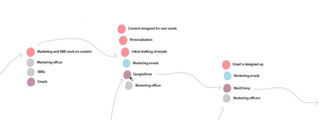
Keele University - Email Campaigns
The diagram above is from Keele University in the UK who are currently undergoing a big digital transformation project to improve the way that they produce and deliver effective content. This diagram represents the before as they’ve become more deliberate about content operations, and this is the process they’re looking to improve.
It looks pretty complicated and this is for only one content type, email marketing. What we were mapping out here was their CRM email production process.
This one starts with a Marketing Service Manager, a grey dot, having a plan for an email and suggesting some content. They also have a plan for some digital assets, so the media asset requirement has a different process.
Focusing on the email creation, the first step is that the requirement or brief is sent to the subject matter expert and to the marketing officer, so those two grey dots work together via email and they work on some content to start off the process of getting something together for an email that they’re going to publish.
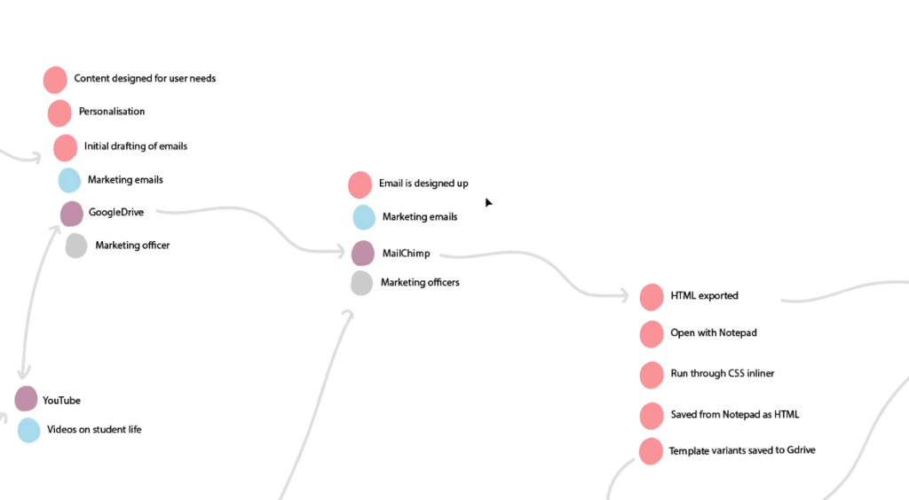
The marketing officer then goes away on their own, and they design the content for user needs, start thinking about personalisation and they start doing some initial drafts, these are all processes that they’re going through. They’re starting to produce something and they do this in Google Drive.
Google Drive emails are then put into Mailchimp, to structure them into HTML templates. This process would be the email being designed into a template. You’ve still got the marketing email and this is done by the marketing officer. The HTML is exported, so Mailchimp isn’t actually used to deliver the email, it’s just used to build the actual templates.
The problem is that the HTML and the CSS are two separate files. They have to go through this process of opening the file in Notepad, running it through a CSS inliner, then save it in Notepad as HTML. And they then move that file into Google Drive.
From here, content is pulled into their actual CRM. At this point, it’s purple because it’s not really a publishing tool here, it’s just being used to organise the content.
The CRM technical admin formats the content of the marketing email and finally gets it into the CRM, where they define the audience and publish it.
That’s impressive in terms of the amount of steps to go through, and it doesn’t cover the process of working with student ambassadors across email, using Google Drive to create videos, put them on YouTube and embedding them into web pages. Or the process of working with photographers that are commissioned to create photographs or media for these emails.
What it really illustrates is the amount of different tools content goes through, not to mention people and processes. Google Drive, Mailchimp, YouTube, emails, digital asset management system. All quite disconnected with a lot of friction between them, although Keele are doing some amazing digital transformation work and have included CRM in their content strategy. This is just one content type too, so imagine all of the other content Keele are creating.
The university set out to create a single agnostic version of the prospectus, or viewbook, which is then published to both print and digital.
The Postgraduate prospectus (visualised above) has a slightly different process to the Undergraduate prospectus. Visualised here:
Both are organised in GatherContent, where a lot of processes happen, such as the production and approval of content.
At the top of the diagram you can see loop with GatherContent and the governance of course content. Because they have all of their content for the prospectus in a single place, and they're maintaining it throughout the year in GatherContent, it means the digital version which lives in Sitecore and GatherContent is governed by this neat process where courses are systematically and consistently updated when changes happen.
It means next year when they produce their prospectus again, as it is an annual requirement for admissions content, all of the course content is up to date.
Any investment in people, process and technology is a big one, often requiring a change in culture and buy-in from stakeholders across an institution. A good way to approach this is to start small and then scale. The University of Leicester used GatherContent and initiated this new way of working on a pilot project involving 10 departments for the Undergraduate prospectus. Following the project's success they then worked the same way on the Postgraduate prospectus which involved 24 departments.
By investing in their ContentOps to streamline their processes, the University benefited from:
Reduced email traffic between marketing team and academic departments
Content delivered and approved on time
Content consistent in format and style across all departments
Clear guidelines and structure for contributors
As well as being able to do more with less and meet business goals, improving your content operations can also create a better content experience for your audience, as our next example shows.
New York University - Staff profiles and service descriptions
Another mention of Angus. He recently visited New York University and needed to find the details of the person he was meeting. Naturally he Googled said person and the search results were a picture, name, and a 240 character description of what their job was. In Angus' own words this was 'nicely written with a clear purpose.'
Underneath that search result was further information including a phone number, location, opening hours and research guides that person had been involved in.
Angus met the person to discuss how they were using GatherContent and it turns out it was being used to structure and create the staff profiles and service descriptions Angus had just experienced. Serendipitous.
In this case the orange dots are two types of content - a YAML flat file CMS with two developers managing it, and also these small one-off Google sites.
The green line represents that it is completely synchronised with GatherContent, where all their employee generated data is managed in GatherContent. 350 employees update their own staff profile in GatherContent whenever changes are needed. This automatically synchronises with their website and merges with their HR data repository.
The outcome, as discovered first-hand by Angus, is a nice experience and useful content as a result of deliberate content operations. Imagine how hard it would be to manage 350 employees in a Word Documents, project management tools, or within the CMS. Especially if there is high turnover of staff, or changes of roles.
Understanding your own ContentOps
If you want tot get started in understanding the state of your own ContentOps you can keep it simple and list all of the people, processes and technology involved in delivering a piece of content. Or you could start visualising it with coloured dots. It also works as a practical exercise with a team, using coloured post-it notes and collaboratively mapping out your ContentOps. The value here is that it's only when you understand the current state of play that you can begin to identify gaps, overlaps, inefficiencies, utmost efficiency, what's scalable and what's repeatable. All with a view to make your content operations efficient in order to deliver effective content.
Rob is Founder of Fourth Wall Content working with clients on content strategy, creation and marketing. Previously, in his role as Head of Content at GatherContent he managed all of the organisation's content output and content operations.