I’m ready at my desk Monday morning, coffee in hand and booting my computer. Then the day grinds to a halt before it even gets started: For security reasons, you need to change your password. Please go to this obscure website (of course there's no link provided so I need to find it in that e-mail I saved two years ago), navigate through the site, which is badly structured, and click the “forgot password” function (even though I did not forget). Pick a password that’s a gazillion characters long and adheres to 15 other rules. Wait five minutes for the changes to take effect. Reboot the computer and then log in. Repeat after 28 days.
Most of us come across bad user experiences in our organisations’ IT-systems from time to time. Things that slow us down and are annoying. But they never get fixed because that particular problem is priority number 54 in the project pipeline. And somehow, we never get that far down the pipeline.
If we know this is our users’ main problem – because we are user experience designers and have researched it, or are in IT-support and have to answers this particular problem several times a day – how do we get this moved to the top of our organisation’s list of priorities? This is what this article is about.
When user data does not reach management
In many organisations, the order of projects in the IT-pipeline is prioritised by top management. So too at Aarhus University. The outcome is often that there is a discrepancy between what UX’ers and support know should be done to improve the user experience, and what is actually a priority. However, it is usually not my experience that the managers do not want to make a better user experience. They just never get the data that informs them about what are the users’ main problem or it is in a format that is not actionable. At best it reaches them as anecdotes about someone's cousin who had a problem when dealing with the IT-systems of this organisation. Or they get data about the problems in one particular system – not across systems and silos or in the gaps between them.
User journey mapping as a storytelling tool
One way to bridge the gap between what the front people know and what management believes, is by using user journey mapping as a storytelling tool. At Aarhus University we had quite a lot of data about our students' experience across systems. Data that was collected through workshops, interviews, usability tests and other kinds of research done in different projects. Across projects there were three main stories to tell:
With a strategy of buying off the shelf systems, the IT-landscape had become quite complex for our students. One system for curriculum, another for schedules, and yet other systems for handling exams, getting grades, finding the right building, booking rooms etc. Lots and lots of different systems. One student summed it up quite nicely when they said that getting a specific job done was like finding platform 9 ¾ in Harry Potter.
Sometimes our siloed organisation meant that gaps between processes would arise. One process would finish and a gap in time would commence before the following process would begin. With some touchpoints, these gaps could be quite critical. For example, in the admissions process, where future students would meet a gap just after being offered a place at Aarhus University. Even though the gap was only a few days long the students would become confused and start Googling or calling the admissions centre.
Then there was the issue of specific touchpoints in the overall user journey that was very frustrating to the students.
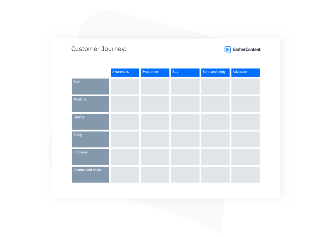
These were the pain points we wanted to highlight. To serve this purpose we crafted a user journey map. A map that was 2.5 meters long to tell the story of great complexity. With a storyline that was clearly broken in several places, to tell the story of gaps in our journey experience. And with sad, frustrated and exploding head emojis as well of expressive quotes from students to highlight the most dysfunctional touchpoints (fortunately along with several happy smileys for the places that did work well). It's in Danish, of course, and looks like this:
This user journey map was designed by Peter Mandrup, user experience designer at Aarhus University. You can also view the full version of the map.
The user journey map as a facilitation tool
As we started presenting this user journey in different forums, we found that it was a great facilitation and storytelling tool. We would pin the map to the wall in a meeting room, gather about 10 people around it and go through each phase of the map. Almost every time we found that there was a profound emotional response to seeing that actual students had these kinds of problems when meeting our organisation. Using the visual map as a tool for starting a dialogue, the participants became very committed to making the needed changes. I suspect even more so than using video, prototypes or other presentation formats that are often used to tell stories about UX vision.
Several of the pain points we highlighted were fixed soon thereafter because when the problems were acknowledged some of them were actually quite easy and quick to fix. As time passed, we got invited to present the journey map in more forums across our organisation, gaining responsiveness and respect for the user experience field in general.
Impact wise, some of the most interesting places to present were of course management forums. Turning back to the issue of getting on that priority list of projects we found that this visual tool gave us the opportunity to pose several impactful questions:
if we want to free time for our students to study, what is the biggest obstacle in our IT-systems standing in the way of that?
what are our users biggest pain points?
what is most important that we fix first if we want to give our users a better experience?
Adding “cost of delay” to the mix
The answers to these powerful questions could be further qualified with a discussion of “cost of delay” – as described by Joshua Arnold and Ozlem Yuce. How urgent is it to fix this particular pain point? And how much value is there to gain solving it? Have decision-makers discuss what it would be worth to the organisation to ship a feature one month earlier. And what would it cost if another was delayed by a month? This could combine the facts and figures with the language of management plus the impactful element of storytelling provided by the user journey map.
What we don’t want management discussing in these workshops or meetings are specific solutions to the pain points. Many of the issues the research has brought to light still need further exploration before a solution could be posed. But in organisations where the project pipeline is the responsibility of top management and leadership, it would be very relevant to have them choose the pain points that would be a priority to experiment towards fixing.
User journey mapping as a strategic tool in the product-driven organisation
In recent years some organisations have moved away from the management prioritised project pipeline to more permanent product teams. However, there is still need for coordination between teams, and focus on fixing the gaps and transitions between products. Maybe this is in the hands of a Chief Product Officer or in a product owner forum. For such organisations the user journey map could also be of value in getting a helicopter perspective on how the products work as a system to provide value to the users.
How to get started with user journey mapping
If you want to take a similar approach to user journey mapping as a strategic storytelling tool here are a few tips for getting started:
Start with the user data you have. If you have no data at all, you, of course, need to collect some. Do some interviews or focus groups. However, you do not need to know how every touchpoint is experienced in detail. The power of this tool is not in the details but in the broad journeys. If you get too caught up in the details, you never get the map of the ground. We have seen this happen in several organisations, so keep an eye out for analysis paralysis.
Distil the primary story or stories you want to tell with your map and craft it to tell these stories in a way that cause emotional resonance. Plot a 2.5-meter journey if your goal is to get management to reduce complexity. However, if this is not the story you are trying to tell, find a format that fits the story.
Keen to learn more about user journey mapping?
If you want to hear more about using user journey mapping as a strategic UX and product management tool, Marie Halkjær Kragelund and Peter Mandrup are giving a talk on this subject at The Digital Leadership Conference in Aarhus on 2nd to 5th. November. Marie and Peter will take this subject a step further and show how to use user journey mapping as a facilitation tool that moves an organisation from pain point repair to crafting a delightful experience and working more towards a product vision.
I’m ready at my desk Monday morning, coffee in hand and booting my computer. Then the day grinds to a halt before it even gets started: For security reasons, you need to change your password. Please go to this obscure website (of course there's no link provided so I need to find it in that e-mail I saved two years ago), navigate through the site, which is badly structured, and click the “forgot password” function (even though I did not forget). Pick a password that’s a gazillion characters long and adheres to 15 other rules. Wait five minutes for the changes to take effect. Reboot the computer and then log in. Repeat after 28 days.
Most of us come across bad user experiences in our organisations’ IT-systems from time to time. Things that slow us down and are annoying. But they never get fixed because that particular problem is priority number 54 in the project pipeline. And somehow, we never get that far down the pipeline.
If we know this is our users’ main problem – because we are user experience designers and have researched it, or are in IT-support and have to answers this particular problem several times a day – how do we get this moved to the top of our organisation’s list of priorities? This is what this article is about.
When user data does not reach management
In many organisations, the order of projects in the IT-pipeline is prioritised by top management. So too at Aarhus University. The outcome is often that there is a discrepancy between what UX’ers and support know should be done to improve the user experience, and what is actually a priority. However, it is usually not my experience that the managers do not want to make a better user experience. They just never get the data that informs them about what are the users’ main problem or it is in a format that is not actionable. At best it reaches them as anecdotes about someone's cousin who had a problem when dealing with the IT-systems of this organisation. Or they get data about the problems in one particular system – not across systems and silos or in the gaps between them.
User journey mapping as a storytelling tool
One way to bridge the gap between what the front people know and what management believes, is by using user journey mapping as a storytelling tool. At Aarhus University we had quite a lot of data about our students' experience across systems. Data that was collected through workshops, interviews, usability tests and other kinds of research done in different projects. Across projects there were three main stories to tell:
With a strategy of buying off the shelf systems, the IT-landscape had become quite complex for our students. One system for curriculum, another for schedules, and yet other systems for handling exams, getting grades, finding the right building, booking rooms etc. Lots and lots of different systems. One student summed it up quite nicely when they said that getting a specific job done was like finding platform 9 ¾ in Harry Potter.
Sometimes our siloed organisation meant that gaps between processes would arise. One process would finish and a gap in time would commence before the following process would begin. With some touchpoints, these gaps could be quite critical. For example, in the admissions process, where future students would meet a gap just after being offered a place at Aarhus University. Even though the gap was only a few days long the students would become confused and start Googling or calling the admissions centre.
Then there was the issue of specific touchpoints in the overall user journey that was very frustrating to the students.
These were the pain points we wanted to highlight. To serve this purpose we crafted a user journey map. A map that was 2.5 meters long to tell the story of great complexity. With a storyline that was clearly broken in several places, to tell the story of gaps in our journey experience. And with sad, frustrated and exploding head emojis as well of expressive quotes from students to highlight the most dysfunctional touchpoints (fortunately along with several happy smileys for the places that did work well). It's in Danish, of course, and looks like this:
This user journey map was designed by Peter Mandrup, user experience designer at Aarhus University. You can also view the full version of the map.
The user journey map as a facilitation tool
As we started presenting this user journey in different forums, we found that it was a great facilitation and storytelling tool. We would pin the map to the wall in a meeting room, gather about 10 people around it and go through each phase of the map. Almost every time we found that there was a profound emotional response to seeing that actual students had these kinds of problems when meeting our organisation. Using the visual map as a tool for starting a dialogue, the participants became very committed to making the needed changes. I suspect even more so than using video, prototypes or other presentation formats that are often used to tell stories about UX vision.
Several of the pain points we highlighted were fixed soon thereafter because when the problems were acknowledged some of them were actually quite easy and quick to fix. As time passed, we got invited to present the journey map in more forums across our organisation, gaining responsiveness and respect for the user experience field in general.
Impact wise, some of the most interesting places to present were of course management forums. Turning back to the issue of getting on that priority list of projects we found that this visual tool gave us the opportunity to pose several impactful questions:
if we want to free time for our students to study, what is the biggest obstacle in our IT-systems standing in the way of that?
what are our users biggest pain points?
what is most important that we fix first if we want to give our users a better experience?
Adding “cost of delay” to the mix
The answers to these powerful questions could be further qualified with a discussion of “cost of delay” – as described by Joshua Arnold and Ozlem Yuce. How urgent is it to fix this particular pain point? And how much value is there to gain solving it? Have decision-makers discuss what it would be worth to the organisation to ship a feature one month earlier. And what would it cost if another was delayed by a month? This could combine the facts and figures with the language of management plus the impactful element of storytelling provided by the user journey map.
What we don’t want management discussing in these workshops or meetings are specific solutions to the pain points. Many of the issues the research has brought to light still need further exploration before a solution could be posed. But in organisations where the project pipeline is the responsibility of top management and leadership, it would be very relevant to have them choose the pain points that would be a priority to experiment towards fixing.
User journey mapping as a strategic tool in the product-driven organisation
In recent years some organisations have moved away from the management prioritised project pipeline to more permanent product teams. However, there is still need for coordination between teams, and focus on fixing the gaps and transitions between products. Maybe this is in the hands of a Chief Product Officer or in a product owner forum. For such organisations the user journey map could also be of value in getting a helicopter perspective on how the products work as a system to provide value to the users.
How to get started with user journey mapping
If you want to take a similar approach to user journey mapping as a strategic storytelling tool here are a few tips for getting started:
Start with the user data you have. If you have no data at all, you, of course, need to collect some. Do some interviews or focus groups. However, you do not need to know how every touchpoint is experienced in detail. The power of this tool is not in the details but in the broad journeys. If you get too caught up in the details, you never get the map of the ground. We have seen this happen in several organisations, so keep an eye out for analysis paralysis.
Distil the primary story or stories you want to tell with your map and craft it to tell these stories in a way that cause emotional resonance. Plot a 2.5-meter journey if your goal is to get management to reduce complexity. However, if this is not the story you are trying to tell, find a format that fits the story.
Keen to learn more about user journey mapping?
If you want to hear more about using user journey mapping as a strategic UX and product management tool, Marie Halkjær Kragelund and Peter Mandrup are giving a talk on this subject at The Digital Leadership Conference in Aarhus on 2nd to 5th. November. Marie and Peter will take this subject a step further and show how to use user journey mapping as a facilitation tool that moves an organisation from pain point repair to crafting a delightful experience and working more towards a product vision.
Marie Halkjær Kragelund is team lead of the UX team at Aarhus University. Specialising in digital and UX strategy, product management and product leadership. Connect with Marie on LinkedIn.