Online course descriptions are a key part of your marketing and also informational content in higher ed. And they are important for a few reasons:
Attracting prospective students
Course description pages are a key part of the beginning of a student’s journey with your institution. So descriptions need to be thorough, compelling yet informative, and easy to understand.
The coronavirus pandemic
Thishas affected university content teams and prospective and current students alike. A study by PickleJar Communications found that many students preparing for university are feeling lost, unsure and disheartened because of the pandemic. Having enough high-quality, educational information online about courses is key for university marketing and content teams.
Helping people navigate through your website
Course descriptions might be looked at when a prospective student has read your prospectus and is ready to deep-dive into a course, or perhaps they are browsing online and considering options more broadly. You can use them to link to other pages on your site, guide people through your sales funnel and encourage them to sign up for an open day or for more information through calls to action. Students as consumers and consumer law
This means certain information must be up-to-date for current and pre-university students (especially course description content). GatherContent has an article on the blog about this, explaining what you need to do to make sure higher ed content is compliant with consumer law and why this is important at every stage in the customer journey.
As universities often offer 100s of courses, the need for some consistency and structure across different course descriptions is essential. Usually, these pages need to include the following:
Course title, UCAS code etc
Entry requirements and prerequisites
Fees and funding
How to apply
Course summary and overview of each year
Programme specification and descriptions of modules
Teaching, learning and assessment methods
Educational aims and learning objectives
Career opportunities and transferable skills
This is where content templates and guidelines can be useful for universities to help achieve consistency, especially when there are lots of contributors and subject matter experts (like academics) creating the content for these pages.
Deconstructing university course pages
I recently wrote an article analysing university content style guides, which was the inspiration for this one. In this article, I’ll deconstruct three high-quality course description pages:
1. Durham University
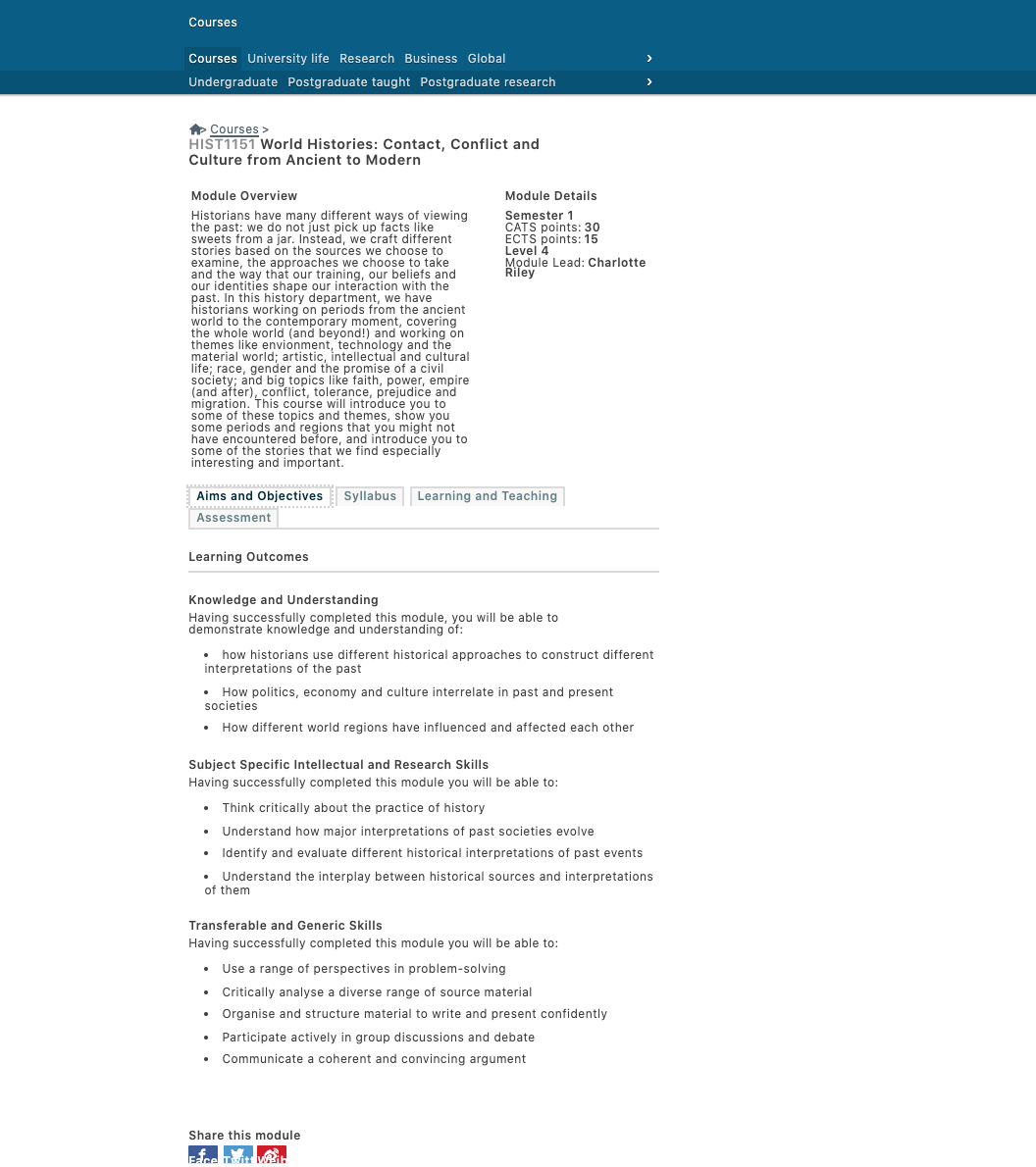
As course information pages generally adhere to conventions and standards mentioned in the list above, they are formal web pages and often available as long, downloadable documents. But this doesn't mean they have to include jargon.
Durham's university programme information is formal in its layout and design, but it is easy to navigate with sections split up nicely. You'll notice that all the key information is on the 'Essentials' page and they've used a table to make information easy to see. There are plenty of clear links to different pages.
You'll also notice they have put some information about the COVID-19 at the top, explaining that courses may be affected and are subject to change. They have said when they are going to provide specific information to applicants as well.
This is wise because consumer law for higher education states that the correct course information must be given to pre-contractual students, and any changes to the course must be communicated to students in advance.
The call-to-actions (CTAs) are used for conversions to good effect on this page — for things like graduate data, open days, prospectuses and applications. The 'similar courses' box is also a great addition. This page shows Durham understands their audience as people who are part-way through their journey, but they are also still likely to be undecided on a course.
2. University of Southampton
The University of Southampton has clear and responsive web pages for course descriptions. They have put all of the crucial information at the top with a CTA which stays there as you navigate and scroll through the pages with the sidebar. Their module section is laid out clearly, with nice big text and boxes. The arrows lead to deeper information on each module:
When you get into the module information, it is split up into tabs and bullet points. The description is compelling and in-depth but also simple, easy to skim and scan and in plain, easy to understand language. Remember, although course content is academic in nature, it still needs to be at a relatively low reading level for it to be accessible.
3. Macquarie University
Macquarie University has put crucial information for their course descriptions in a bright box with, which includes start dates, entry requirements and upfront tuition fees. Tuition fees are particularly important to include for consumer law. These are estimated, but they have stated that they are and have provided a link to further information.
Again, as with the other two, clear CTAs are used throughout the pages and they've separated sections using tabs. There's also a strong sense of branding with this page. What is interesting with this university is when you click the 'see 2020 course information', this then changes to 'see 2021 course information' so it is clear they are planning course changes ahead.
Career opportunities are one of the key reasons students go to university, and this is only increasing due to increasing fees. Macquarie have included long bulleted lists about this including further education specialisations, professions and a link to a salary guide.
High-quality course description content depends on a productive process
Working with lots of universities and colleges already, GatherContent is a purpose-built tool to handle your content operations and processes. Plan, create and manage content easily and productively across large, dispersed and siloed teams:
Online course descriptions are a key part of your marketing and also informational content in higher ed. And they are important for a few reasons:
Attracting prospective students
Course description pages are a key part of the beginning of a student’s journey with your institution. So descriptions need to be thorough, compelling yet informative, and easy to understand.
The coronavirus pandemic
Thishas affected university content teams and prospective and current students alike. A study by PickleJar Communications found that many students preparing for university are feeling lost, unsure and disheartened because of the pandemic. Having enough high-quality, educational information online about courses is key for university marketing and content teams.
Helping people navigate through your website
Course descriptions might be looked at when a prospective student has read your prospectus and is ready to deep-dive into a course, or perhaps they are browsing online and considering options more broadly. You can use them to link to other pages on your site, guide people through your sales funnel and encourage them to sign up for an open day or for more information through calls to action. Students as consumers and consumer law
This means certain information must be up-to-date for current and pre-university students (especially course description content). GatherContent has an article on the blog about this, explaining what you need to do to make sure higher ed content is compliant with consumer law and why this is important at every stage in the customer journey.
As universities often offer 100s of courses, the need for some consistency and structure across different course descriptions is essential. Usually, these pages need to include the following:
Course title, UCAS code etc
Entry requirements and prerequisites
Fees and funding
How to apply
Course summary and overview of each year
Programme specification and descriptions of modules
Teaching, learning and assessment methods
Educational aims and learning objectives
Career opportunities and transferable skills
This is where content templates and guidelines can be useful for universities to help achieve consistency, especially when there are lots of contributors and subject matter experts (like academics) creating the content for these pages.
Deconstructing university course pages
I recently wrote an article analysing university content style guides, which was the inspiration for this one. In this article, I’ll deconstruct three high-quality course description pages:
1. Durham University
As course information pages generally adhere to conventions and standards mentioned in the list above, they are formal web pages and often available as long, downloadable documents. But this doesn't mean they have to include jargon.
Durham's university programme information is formal in its layout and design, but it is easy to navigate with sections split up nicely. You'll notice that all the key information is on the 'Essentials' page and they've used a table to make information easy to see. There are plenty of clear links to different pages.
You'll also notice they have put some information about the COVID-19 at the top, explaining that courses may be affected and are subject to change. They have said when they are going to provide specific information to applicants as well.
This is wise because consumer law for higher education states that the correct course information must be given to pre-contractual students, and any changes to the course must be communicated to students in advance.
The call-to-actions (CTAs) are used for conversions to good effect on this page — for things like graduate data, open days, prospectuses and applications. The 'similar courses' box is also a great addition. This page shows Durham understands their audience as people who are part-way through their journey, but they are also still likely to be undecided on a course.
2. University of Southampton
The University of Southampton has clear and responsive web pages for course descriptions. They have put all of the crucial information at the top with a CTA which stays there as you navigate and scroll through the pages with the sidebar. Their module section is laid out clearly, with nice big text and boxes. The arrows lead to deeper information on each module:
When you get into the module information, it is split up into tabs and bullet points. The description is compelling and in-depth but also simple, easy to skim and scan and in plain, easy to understand language. Remember, although course content is academic in nature, it still needs to be at a relatively low reading level for it to be accessible.
3. Macquarie University
Macquarie University has put crucial information for their course descriptions in a bright box with, which includes start dates, entry requirements and upfront tuition fees. Tuition fees are particularly important to include for consumer law. These are estimated, but they have stated that they are and have provided a link to further information.
Again, as with the other two, clear CTAs are used throughout the pages and they've separated sections using tabs. There's also a strong sense of branding with this page. What is interesting with this university is when you click the 'see 2020 course information', this then changes to 'see 2021 course information' so it is clear they are planning course changes ahead.
Career opportunities are one of the key reasons students go to university, and this is only increasing due to increasing fees. Macquarie have included long bulleted lists about this including further education specialisations, professions and a link to a salary guide.
High-quality course description content depends on a productive process
Working with lots of universities and colleges already, GatherContent is a purpose-built tool to handle your content operations and processes. Plan, create and manage content easily and productively across large, dispersed and siloed teams:
Rob is Founder of Fourth Wall Content working with clients on content strategy, creation and marketing. Previously, in his role as Head of Content at GatherContent he managed all of the organisation's content output and content operations.